Re:Frame Typeface by
CARE Typography
AI Generated Font Problems

AI & Variable Type
New Challenges
“At Monotype, we are dedicated to protecting the
humanity of high-quality type. Whether the work
is done by our team or others in the industry, human
beings will remain central to typographic ideation.
(From 2025 Year End Monotype Report)
SO, THINGS WILL NEVER BE THE SAME AGAIN, but then again it never was the same as it once was. Our journey from scribes to the printing press, Linotype to phototype and now digital, has reduced type’s physicality to code. The typographic AI made by us will not be like us.”[1]
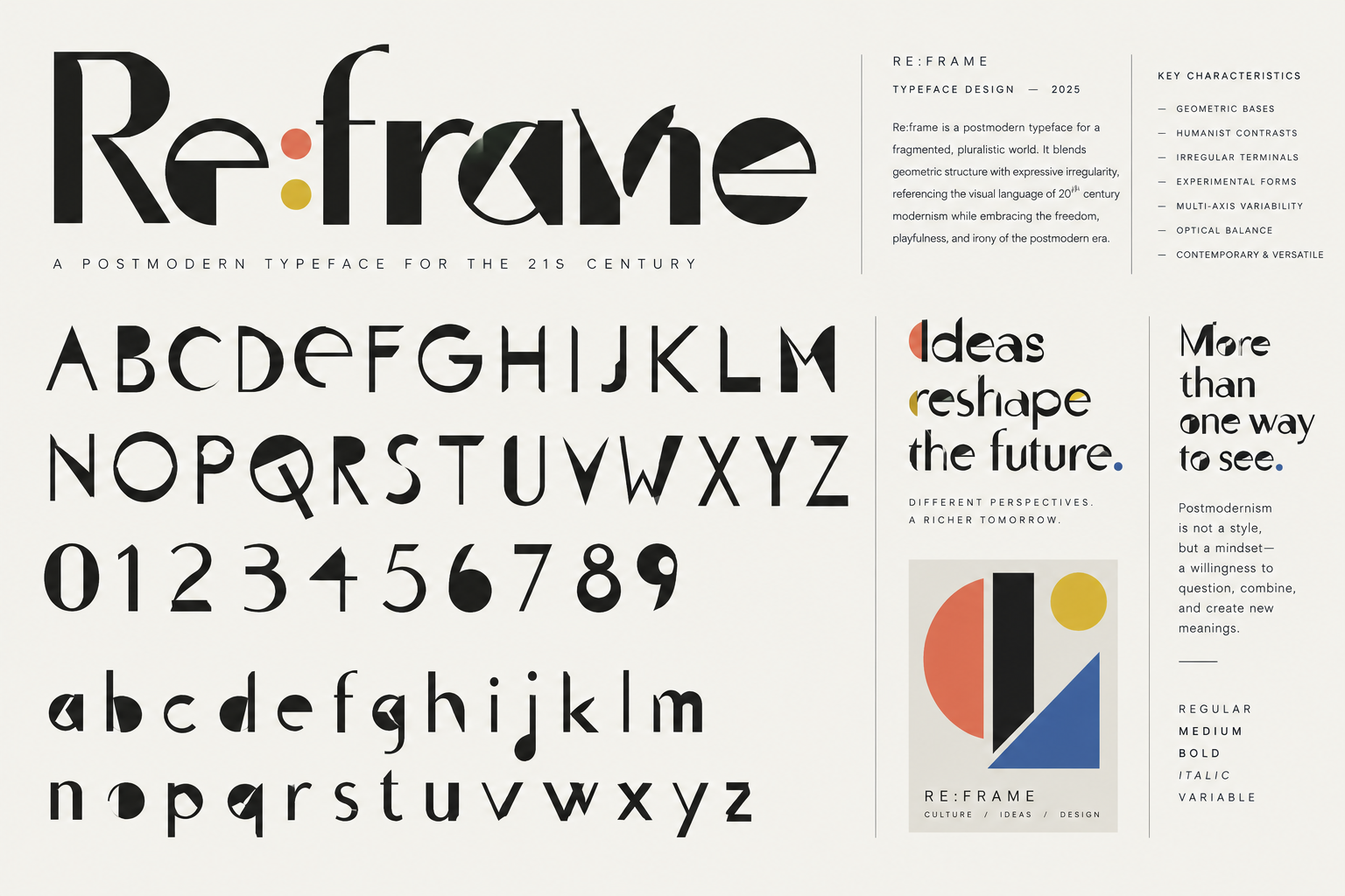
This declaration made by the Monotype Report at the end of 2025 attempts to weave a fine line between the technological benefits of artificial intelligence (AI) and the threats to humanity in the typographical world. Whether we value this newest “industrial revolution” or fear it, there is no doubt we are in the middle of it with regard to how type is conceived, drawn and marketed. The broken “S” in the opening versal of this chapter is actually a typeface made from a ChatGPT image of a postmodern font called Re:Frame.
While our present AI tools cannot actually create the actual typeface, it can approximate what a postmodern font would look like. So, Re:Frame is a “postmodern typeface for a fragmented, pluralistic world. It blends geometric structure with expressive irregularity, referencing the visual language of twentieth century modernism while embracing the freedom, playfulness, and irony of the postmodern era. Postmodernism is not a style, but a mindset — a willingness to question, combine and create new meanings.”[2]
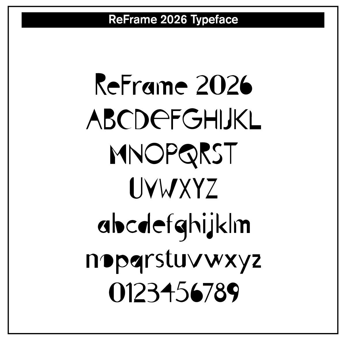
The actual typeface is offered, created by CARE Typography from the AI image — note especially the filled in parts of “A, B Q, R, 4, 6,” the geometric bases, humanist contrasts, irregular terminals, experimental forms, multi-axis variability, optical balance and contemporary look.
In fact, the AI tool Claude.ai will give font stylistic specifications that a professional typography can use to create the font Palimpsest, a variable sans-serif font that, in postmodern lingo, refuses to be one thing —
A palimpsest is a manuscript scraped and rewritten, where earlier texts bleed through. That is the postmodern condition rendered as letterforms: history quoted rather than continued, sincerity and irony occupying the same glyph, the machine and the hand overlaid.
The core move: every letter carries a “quotation” from a different typographic era, and the reader is meant to notice. Not the seamless neutrality of Helvetica or Inter, nor 1990s deconstruction that made text unreadable, but a legible pastiche —readable at paragraph size, unmistakably hybrid at display size.[3]
Each glyph (character) quotes a source with Didone contrast, blackletter joins, monospace slab and handwriting. In variable format it has what is called a “sincerity” axis that slides letterforms from earnest to knowingly deadpan. Contextual alternates deliberately break rhythm, and formal capitals sit with vernacular sign-painter lowercase.
How would you classify Palimpsest? It is a hybrid grotesque, static looking but with one contradictory detail per letter. It is truly a pastiche postmodern face.
But before we get ahead of ourselves, a bit of historical definition and development of variable fonts and postmodern theology is in order.
Variable Fonts
When many people think about fonts, they think of four basic font instances — regular (or book), italic, bold, and bold italic. Earlier typefaces highlighted these basic four. Suppose, however, you wanted something not quite as dark as a regular font, but you wanted the same typeface style. Consequently, instances such as thin, extra thin, light and extra light were added to a typeface. Those who wanted more bold than typical font bold developed extra bold and black and ultra black.
The set of characters in each font used to be limited to 256 characters. Therefore, to have a wider or thicker character, a new font had to be added to the font “family.” Added to the basic four could be an ultra bold or extra black bold and small caps along with a condensed form of the font. Variations abounded, but there was one font for each basic variation.
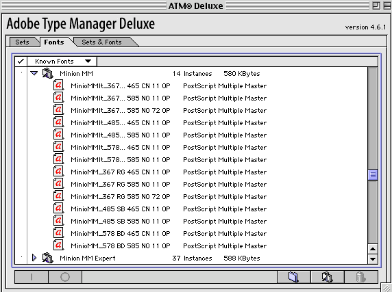
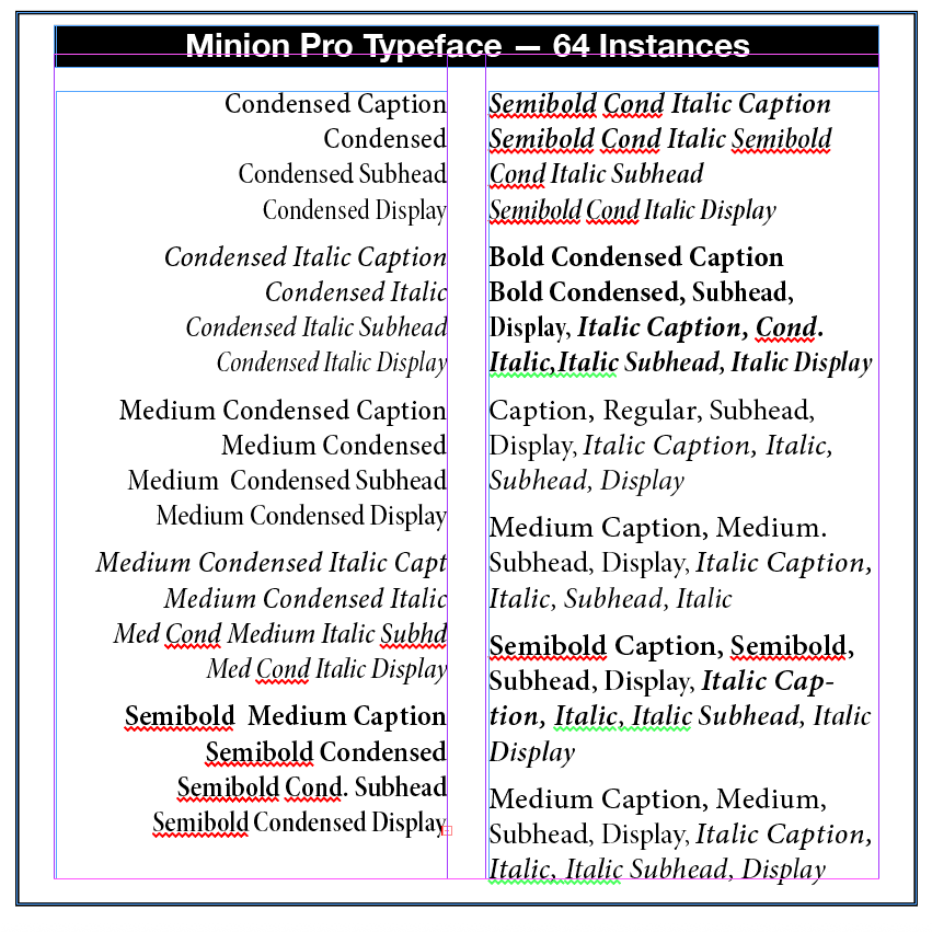
Adobe introduced MultipleMasters, such as Minion MultipleMasters, where smaller variations in font designs were included for different uses in different scenarios — “Called “Opticals,” these variations have been optimized for use at specific point sizes. Although the exact intended sizes vary by family, the general size ranges include: caption (6-8 point), regular (9-13 point), subhead (14-24 point) and display (25-72 point).”[4]
If you wanted a PC version of the same font, you had to translate the font characters to a PFB and a TTF version to use on a PC computer. True Type (TT) was then developed that gave one version of the font that worked on both Macs and PCs. Font management programs were then designed by Adobe and others, such as Adobe Type Manager (ATM) and ATM Deluxe and the Suitcase for managing and organizing the many fonts that became available.
Then, open type fonts came along. Contrasted with 256 character fonts, OpenType fonts can now have 65,000 characters, making them highly desirable for font creators and users — “which allows a single font file to contain many nonstandard glyphs, such as old-style figures, true small capitals, fractions, swashes, superiors, inferiors, titling letters, contextual and stylistic alternates, and a full range of ligatures.”[5] OpenType fonts work seamlessly on both Macs and PCs and no translation from one platform to another is needed. In fact, Adobe has translated all of its fonts to an OpenType format with the .otf marking them as such, such as Minion.otf.
This was wonderful, or so typographers and printers thought. The popular Minion typeface could have 64 instances.
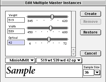
However, this MM technology failed for at least two reasons. First, users were forced to generate “instances” for each font variation, littering their hard drives with font bearing names, like MinioMMIt_519 wt 539 wd 42 op. This code was for the Minion Italic font with a weight of 519, a width of 539 and an optical size of 42.
The second reason for the MM discontinuance is that most font designers have generally preferred to release fonts in specific, individually fine-tuned weights and styles.
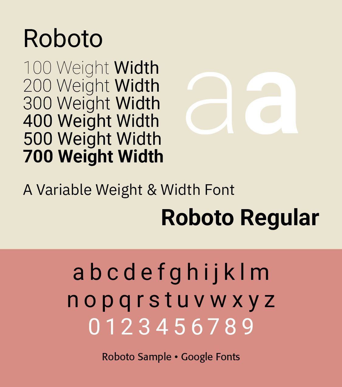
Another problem arose. With all the available instances of OpenType fonts, the computer sizes of each typeface increased greatly. For example, Roboto Static fonts consume 8.9 MB of space, while Roboto Variable takes only 492 KB.
Variable fonts are a single font file that behave like multiple fonts. The technology behind variable fonts has been around for a while. Starting in the 1990s, interpolation and extrapolation have been used to create different masters, and weights in typefaces. For example, by designing a regular and bold weight a semibold could be interpolated from the two masters.
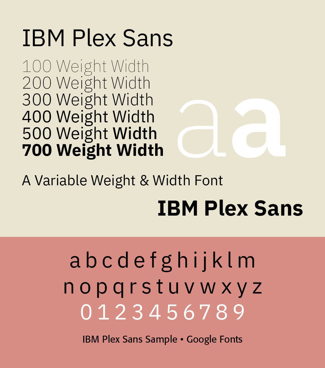
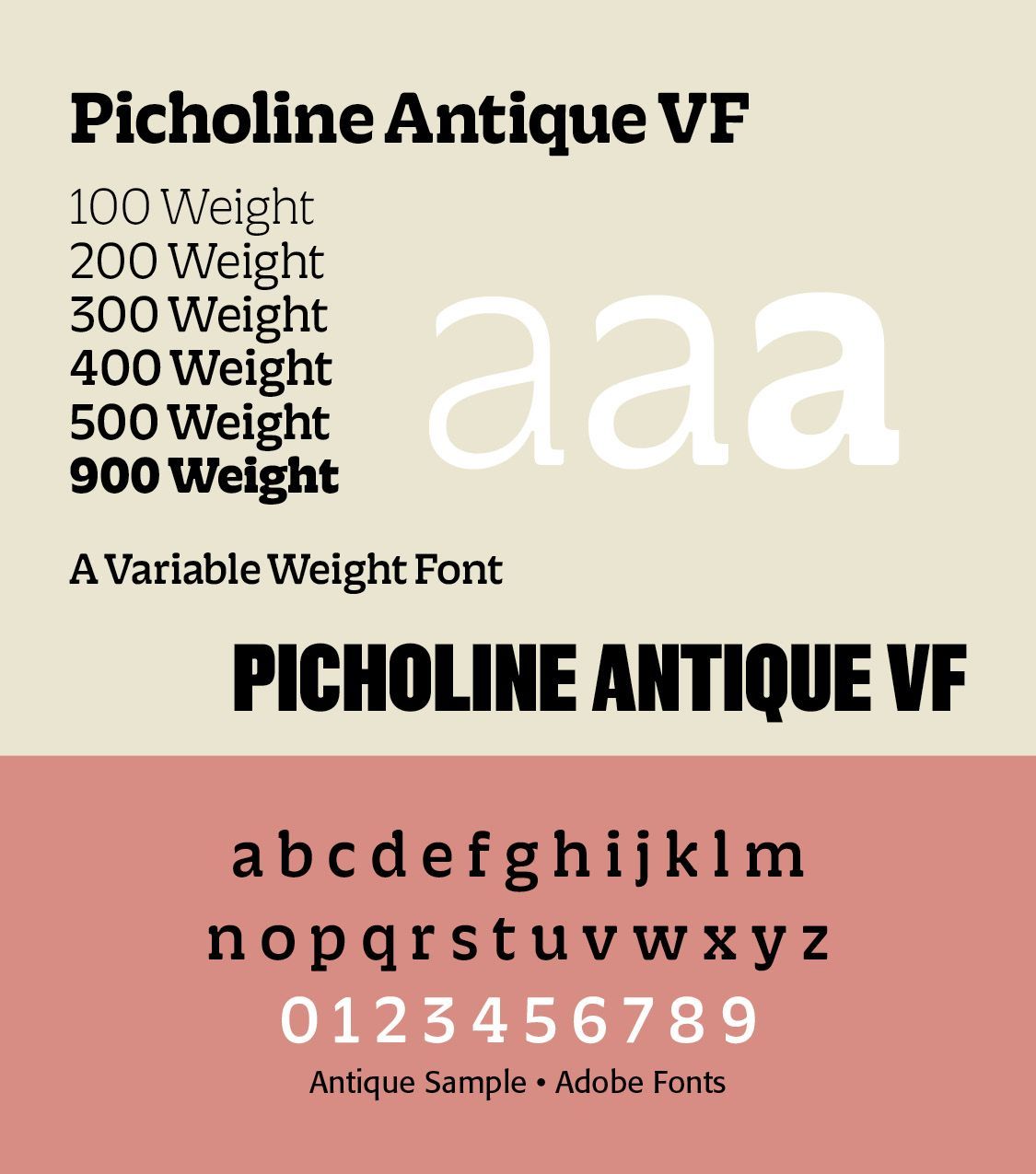
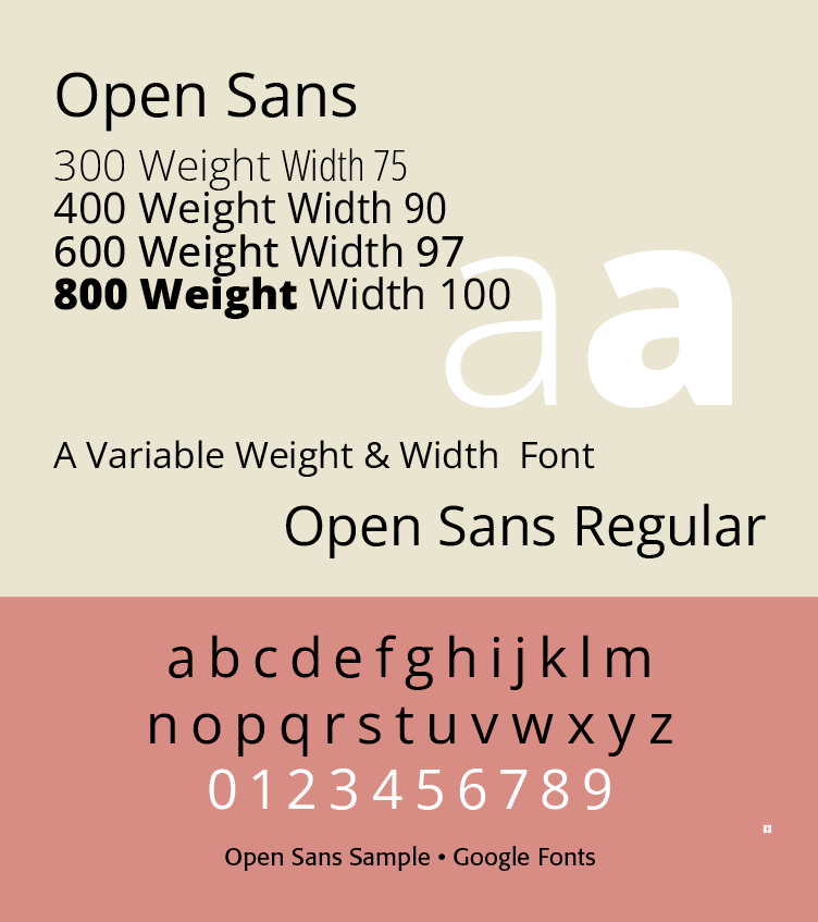
An Open Type Variable font contains one or more axes that each provide particular variation between different extremes of a typeface design. The format also allows for the possibility of intermediate designs, for the whole glyph set or for individual glyphs, to provide finer control over the design as it changes across the variations design space.
Unlike MM fonts, an Open Type Variable font contains only a single set of glyph outlines “and the other extremes or intermediate shapes are defined as deltas from those outlines. So, for example, a font may contain a set of glyph outlines that correspond to the regular weight and width of a typeface, and the lighter, heavier, narrower, and extended designs will be expressed in the font data as movements of outline nodes relative to that outline.”[6]
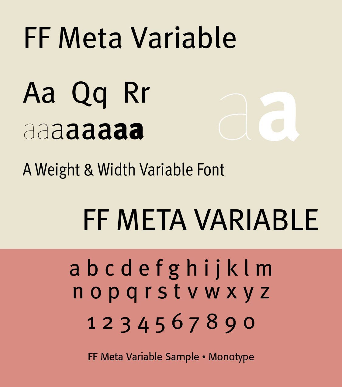
Any position within the design space can be a named instance. Variable fonts allow a continuous design space containing potentially thousands or millions of possible instances. For typography, this means greater control over hierarchy, responsive design, spacing, readability, branding, and visual expression, while often requiring fewer font files.
What is neat or scary, depending on what you are able to imagine, is that these “axes” of variable fonts can be not merely the standard weight, width, optical size and so forth. They can include custom axes, like casual, softness, distorted forms, informality, extended character proportions, lowercase height and uppercase height. Even the axis labeled “Wonky” is part of the Express Fraunces Variable typeface.
In his masterfully illustrated and written Stop Stealing Sheep: Find Out How Type Works by Erick Spiekermann, he highlights the “softness” axis in Express Fraunces. This is “a stylish and contemporary Old Style with a “Softness” axis to control the ‘wetness’ or ‘inkiness’ of the typeface. Although it is drawn entirely with rounded serifs, it achieves crispness in the “Sharp” area of the design space with extremely high contrast. See more at fraunces.undercase.xyz.”[7]
The variable Antimatter typeface by Federico Parra Barrios is a digital design informed by the very physical condition of light. It alludes to a future where AI could become a sandbox for generating and prototyping any conceivable physical condition on type.[8]
With variable font technology through AI, the question of the human equation comes to the forefront of discussion. The Monotype team in their 2025 report put it this way — “The typographic AI made by us will not be like us. It will not be emotionally attached to “craft.” It will take from the past and let go of the past. It will simply seek to function efficiently. Our near future will be a remix of our collective history within the bounds of what is known — the owned IP, the typographic training data that a model has digested, defined, and reiterated. . . . So, let us be clear – we will not use fonts from our partners to train AI for new font designs. As AI becomes more prevalent in design, it’s also important to distinguish machine-generated
content.”[9]
Postmodern Typography Theology
Postmodern theology is not a single theological system but a broad collection of so-called Christian approaches that emerged especially from the 1970s onward in response to modernism, Enlightenment rationalism, and the assumptions of classical liberal theology. It asks how Christian faith should be understood in a world skeptical of universal explanations, objective foundations, and claims to detached rational certainty.
Postmodern theology represents an attempt to think Christianly after the collapse of confidence in the Enlightenment project of neutral, universal, purely rational knowledge. Its most important contribution may be its insistence that Christian truth is not merely a set of detached propositions but is encountered through revelation, Scripture, narrative, community, worship, language, and lived practice.[10]
The leading question of such theology is not, “How do we establish Christianity as an objective certain system?,” but rather “How do language, community, tradition, culture, narrative, and interpretation shape our understanding of God?” In early, and even much of traditional modernistic, typography, there was an attempt to either frame the type in ways pleasing to God who rules over all or honor Him in typographical ideation.
John D. Wilsey noted in a penetrating essay about civilization —
"The culture was thoroughly Augustinian—meaning, people understood authority to be beyond question and saw the world of the eternal as superior to the world of the temporal. Such was pre-modernity. Modernity emerged slowly from the soil of Thomas Aquinas’s synthesis of Christian theology with the philosophy of Aristotle, the nominalism of William of Occam and his via moderna, the humanism of the Renaissance, the discovery and colonization of the Americas, and the biblio-centrism of the Reformation."[11]
In postmodern typography God either doesn’t count, doesn’t exist, or we frame our own understanding and theology of God. God is either “dead” (Friedrich Nietzsche) or merely an expression of the cultural-linguistic language of faith Christians use (George Lindbeck). There is no objectifiable revelation from God to us on which to base our type or our lives.
Adapting the famous modernistic Descartes dictum, “I think; therefore, I am,” postmodern designers would say, “I design; therefore I am!” This is far different from a classic pre-Enlightenment approach that says, “I design; God is!” People will say that such typography is individualistically freeing and reveals our independence. The tragedy of such individualistic autonomistic typographical freedom is type that is not grounded in biblical revelation or tested and tried theological structures. It is type that is culturally bound, offering freedom without control or historical perspective. The Re:Frame type example generated by AI is an instance of such type.
What About AI and Type?
“The true menace of AI is not so much what it’s capable of doing today, but rather that it doesn’t rest. An AI program can learn, evolve, iterate, and work 24/7. Give it a job and it will toil sleeplessly until the task is complete. That’s a wonderful advantage if the job is, say, parsing cancer research data, but less so if it’s practicing and refining a creative craft that threatens to eventually put thousands of people out of work.”[12]
As a Christian typographer and thinker, I am reminded of the biblical story of the tower of Babel in Genesis 11 — “This is autonomous self-aggrandizement and bringing God down to us rather than us worshipping him. Babel stood—and still stands today—as a type of the earthly city, in rebellion against God. . . . They name their city Bab-el, Akkadian for “gate of the gods,” but God makes their ambition a byword for babel: a near homonym for the Hebrew word meaning “confusion.” God gives Babel or Babylon a different destiny and meaning and forces his sovereign will on mankind.”[13]
To be made in God’s image means we are not just able to process and display, but we are called to create and express ourselves. This is a wonderful, glorious thing. But when we use that creativity to fashion something to think, speak, and create for us, we start to abdicate our role as Imago Dei and in a sense become less human. By delegating our God-given task to coding, we deny who we are and who God is.
The technology manager of the Seminary I attended noted this —
"When the massive flood of AI-generated content drowns out both the well-crafted painting shared on Instagram and the random shower-thought posted to X, we might finally understand that the punishment for the idol maker is true. Our voices will be buried under the rising volume of AI-content, our vision will be blinded by the warping and blending of reality, and our hearing will be deafened by the noise of AI voices speaking AI-generated opinions.”[14]
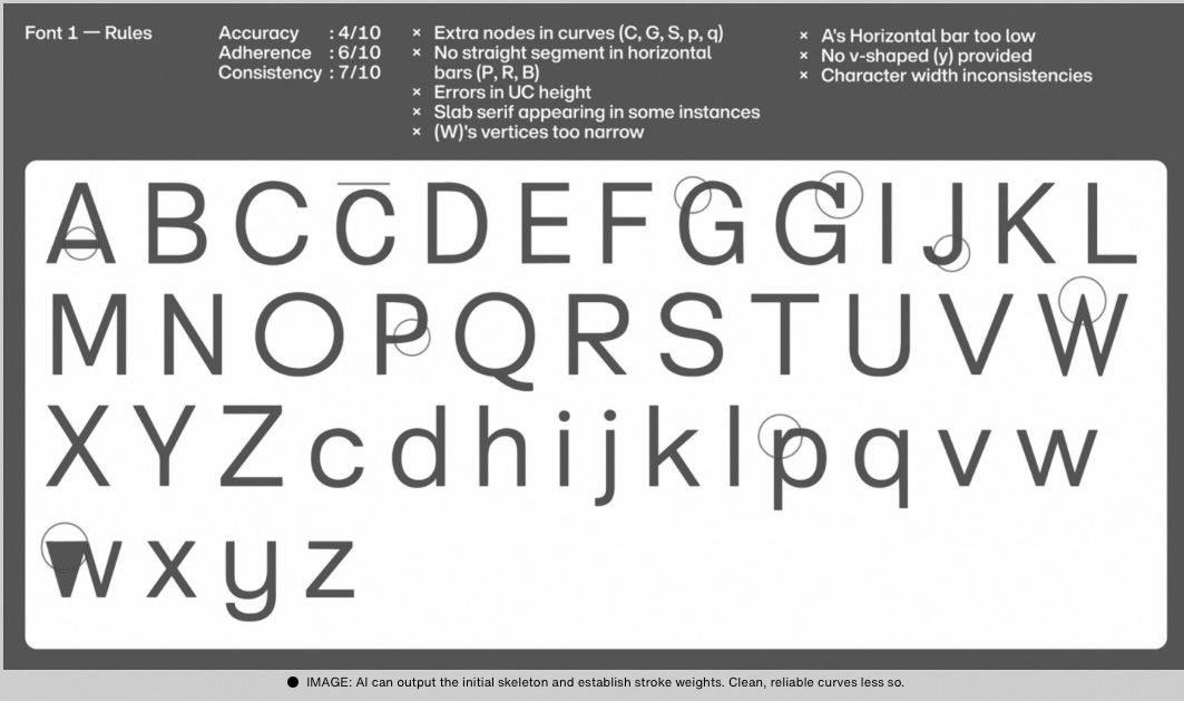
What is it that we do that a machine will never be able to do? What Monotype found out in their reporting about AI now is that the technology is clearly lacking in typographical preciseness and artistic coherence. “But for better or for worse, it turns out that AI is fairly bad at drawing letters. In a recent piece in The Atlantic (a piece that, it should be noted, was sponsored by Google), writer Drew Campbell observed that while AI knows many words and may already know all the words there are to know, it “stumbles” when “creating the literal letterforms that construct each syllable, clause, and paragraph.”[15]
Campbell goes on to say that “To recreate the work that designers have been doing since the days of illuminated manuscripts and the Gutenberg Bible is no simple feat,” Campbell rightly points out. “At this stage in the evolution of AI tools, the models built on statistical probabilities struggle to recreate the simple beauty of well-designed, meticulously crafted typography.”[16]
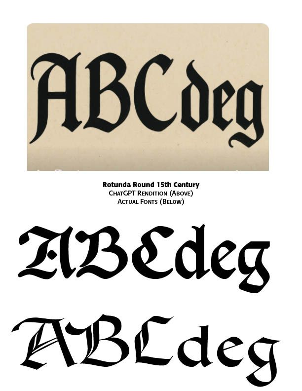
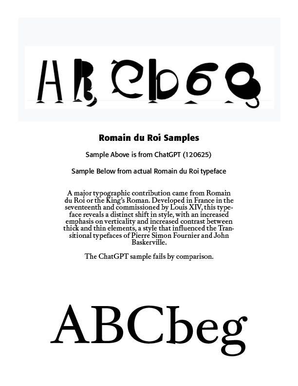
In my own experimentation with AI tools in typographic design, I asked ChatGPT to give me a typeface in Rotunda rounded Gothic type of the fifteenth century in the letters, ABCdeg. This is what it came up with. Looks “like” rounded Gothic, but not really. I also asked AI to give me those letters with the typeface of Romaine du Roi, a very carefully crafted typeface of the Enlightenment Period in the 1700s. It came up with these letters, a terrible rendering.
Of course, this does not mean that AI cannot ever duplicate these typographical periods and faces. But it does point to the need for “human” based typographical input and guidance and critique. Monotype’s conclusion — “Whether the work is done by our team or others in the industry, we believe human beings should remain central to typographic ideation.”
Christopher Penn offers four ethical tests or guards to be applied to AI which can easily apply to typographical standards and creations —”Respect — Does our use of AI respect the values we’ve established? Harm people? Devalue people? Accountability — Who is responsible for AI outputs? Does the AI dodge liability? Fairness — What known biases does any given AI model have? Transparency — The more transparency, interpretability, and explainability there is in any AI system, the safer it is. The more trustworthy it is.”[17]
“AI should not be feared, but designers are yet to form a consensus. What feels pertinent is that we as design “humans” define the value we bring to our role in ideation and execution. If nothing else, AI has prompted introspection on creative methodologies, a reappraisal of our relationship to technology.”[18]
From a Christian ethical point of view, “We must engage these issues, rather than respond after their effects are widely felt. But we don’t have to face today or tomorrow with fear. God is sovereign and his Word is sufficient for every good work, so we are able to walk with confidence as we apply his Word to these challenges with wisdom and guided by his Spirit.”[19]
Austin Gravley, a former Social Media Manager of The Gospel Coalition, and now the Director of Youth Ministry at Redeemer Christian Church in Amarillo, TX, is writing a book on AI and the digital revolution taking place. He compares this Digital Babylon and its captivity and its exiles to Christians living under the overwhelming influence of an active anti-Christian developing AI. Piecing together his comments with those of many others on the advancing scene of AI on our lives, several themes come to mind.
First, AI is not God. While there are some in the Silicon Valley who might wish or see AI as a unifying, ontological force that can shape or rule our lives — the Super Machine —others remind us that this is only technology. And as advanced as AI is and becomes, God is still sovereignly in control of it and our lives. Jason Thacker, professor of philosophy and ethics at Southern Seminary and Boyce College, writes — “We must engage these issues, rather than respond after their effects are widely felt. But we don’t have to face today or tomorrow with fear. God is sovereign and his Word is sufficient for every good work, so we are able to walk with confidence as we apply his Word to these challenges with wisdom and guided by his Spirit.”[20]
A recent storm that darkened my community and scuttled Internet services reminded me of that. Even AI data centers, growing to over 3,000 in 2025 nationwide, are not immune to power disruptions and total blackouts. AI pundits may claim to have control procedures to keep the Internet and AI running cannot promise it to be so. We need to keep this in mind in the Digital Babylon age, as was needed to be kept in mind by Israel in the Babylonian Empire age in biblical times. Babylon went through many iterations, but will be defeated by God at the end of the day, as noted in Revelation. Digital Babylon will experience the same demise. This is not prediction, just Bible truth. We as believers need to hold on to such truth.
Second, AI is still technology. Indeed, advanced and advancing technology, but not human. Matthew Schultz in a recent mereorthodoxy.com article notes —
"Technology has existed since the Garden and is an integral component of our cultural mandate. We should also remember that one of the core distinctions between the Creator and his creatures is that we never create matter but merely (!) rearrange it. This becomes clear whether we consider an ancient farmer in Mesopotamia irrigating a plot of soil, a medieval peasant in Northumbria weaving a basket from flax, or a young musician in London taking the raw outputs of machine sound, adjusting its pitch, volume, and length, and incorporating it into a DAW loop. While there are all sorts of important distinctions and qualifications between pre- and post-industrial craft, there is no metaphysical distance between the two.”[21]
AI may be the harbinger of a new Industrial Age, but though changes will be major and sometimes severe, the human side of the equation cannot be discounted or counted out.
Part of my retired status as a pastor and theologian is that of a typographer restoring old type faces and doing a deep dive into the history of type. Two historical typographical truths stand out. Although the Renaissance age brought movable type from Gutenberg and others into the machine age, the typographical flair of those ancient scribes with pen-drawn exquisite type remained a stylistic standard. The second note is that with the Industrial Age, while affecting the quantity and speed of type development and printing, master type craftsmen rebelled against machine driven type for more organic typefaces.
This was seen, for instance, in the type movement spawned by William Morris (1834–1896). William Morris was an Arts & Crafts designer who founded the Kelmscott Press (1891), reviving hand craftsmanship in printing. His work influenced the twentieth century private press and type revival movements. Lettering became a vehicle for breaking convention. Led by figures such as Morris, there was a decided reaction against industrialization, seeing machine-made goods as dehumanizing and ugly. Handcraftmanship, honesty in materials and utility fused with beauty made up much of what was called the Arts & Crafts Movement. That movement was rooted in medieval guild ideals and morality in design.[22]
Third, AI affects everyone everywhere. Austin Gravely raises and answers the query —
"'So what?’, you may think. ‘I’m not an Internet technician. I’m not a fan of AI. I’m not planning to change how I use the Internet. Why does any of this matter to me?’ To put it bluntly: you are naive if you think these disruptions won’t directly affect you, or indirectly affect you through the effect they will have on others. If the iPhone, social media, and AI have taught us anything, it is that you are impacted by these events regardless of whether you participate in them or not.”[23]
He goes on to say — “A changing Internet will change you. It will change you in ways you can see and in ways you can’t. It will change those you live with, work with, play with, build with, and fight with. It will change what is possible, probable, permissible, and prohibited in your life, your vocation, your church, your neighborhood, and any other physical space the Internet touches.”[24]
I recall my 99 year old mother who passed away a couple of years ago in a nursing facility. She was one of those survivors of the Great Depression and World War Two who dismissed the first moon landing and had her flat screen TV removed from her room for fear the government was watching. She lasted for nine years in the same private room in a modern nursing center. She was attended by doctors and nurses and staff who used AI on their computers and other care devices. She even had a modern digital phone removed from her room and refused to learn it. While she personally rebelled against her AI driven machine age, she could not escape those who used such technology for her care. We cannot isolate ourselves from AI and its advancing development, no matter how isolated we try to be.
Fourth, AI can be either a blessing or a curse. Again, Matthew Schultz notes — “Our task is not to develop a unique theology of AI but to catechize our members into a people who can wield this technology without becoming captive to its internal logic. Like alcohol, artificial intelligence will become a test of character, a dangerous good that divides the foolish from the wise.” He says —
"Yet the greatest danger is both more pervasive and less obvious: AI is much more likely to be deployed as a multiplicative layer that allows ever more efficient micro-targeting of digital services and physical products by industries that already profit from compulsive behavior. The advent of hyper-personalized, real-time engagement strategies will require legislative safeguards, especially if AI leads to video advertisements generated in real time for an exhaustively mapped individual profile.”[25]
We must seek to “humanize” AI and employ it “humanly.” We must resist the phenomenological bent toward unbelief in AI development and pressures. We must once again learn to think critically and pervasively and biblically about AI. Our young people must be taught prescriptive critical thinking practices, rather than unwittingly and ignorantly giving in to what their phones and computers spit out. Church and ministry pastors must pastor rather than let AI bots plan, prepare and even give their sermons. We must learn to smartly negotiate with the “Magnificent Seven”— Apple, Microsoft, Alphabet, Amazon, Meta, Nvidia and Tesla — rather than blindly following their lead. Convenience and speed must not be allowed to overtake and overcome careful, sustained and critical thinking and acting.
To give language to this change, we must take the best of Christian thinking regarding the social and political imaginary and apply it to the economic imaginary of life under the glowing shores of Digital Babylon, and that kind of work cannot be done with quick hot takes. It will take slow, deep, and thoughtful meditation to apply the riches of Christian thought to making sense of the companies that got us here and where they are taking us.”[26]
I am both excited and wary of AI. I have learned to be much more cautious about social media and the videos and photos and information they give. Much of it has been and is being AI produced and tweaked. Spammers use AI technology to wrest thousands of dollars from unsuspecting senior citizens. Schools are requiring students to turn off their cell phones or “bag” them until after school hours because of the insidious nature of AI generated stuff. I value more and more of a face-to-face approach in teaching and learning and mentoring others. And we must adopt a state of “believing is seeing” rather than a non-Christian scientifically sanctioned “seeing is believing” approach to truth and justice, including our typography.
Notes
1. Re-Vision Report, Monotype, Winter 2025 at https://bit.ly/4aEUePf.
2. ChatGPT describing Re:Frame.
3. A result of asking Claude.ai to give me a postmodern typeface.
4. See Adobe’s report for more explanation at https://www.adobe.com/products/type/opentype.html
5. Ibid.
6. At https://medium.com/variable-fonts.
7. Erick Spiekermann, Stop Stealing Sheep: Find Out How Type Works (Italy: Grafiche Antiga, Crocetta del Montello, 2022), 183.
8. Re-Vision Report 2025.
9. Ibid.
10. Postmodern theology summary from ChatGPT.
11. John D. Wilsey, “Modernity, Secularism, and the Struggle for a Christian Civilization,” in mereorthodoxy.com, November 21, 2025.
12. Re-Vision Report 2025.
13. Christopher Watkin, Biblical Critical Theory: How The Bible’s Unfolding Story Makes Sense of Modern Life and Culture (Zondervan, 2022), 207–221.
14. Paul Quiram, Mgr. Ed Tech, Westminster Theological Seminary, Philadelphia, PA.
15. Monotype and see “Typography Reconsidered,” Drew Campbell, The Atlantic at https://www.theatlantic.com/sponsored/google/typography-reconsidered/3886/.
16. Ibid.
17. Christopher Penn, Almost Timely News: The Ethics of AI, August 17, 2025.
18. Monotype Report.
19. Jason Thacker, The Age of AI: Artificial Intelligence and the Future of Humanity, (Zondervan, 2020).
20. Ibid.
21. Matthew Schultz, “Artificial Intelligence Is A Technology,” mereorthodoxy.com, Feb. 26, 2026.
22. For an expanded history of type development, see “Advances in Typography: A Historical Sketch — Three Parts” in the blogs by CARE Typography, www.caretypography.com, Nov. 8, 2025, Nov. 18, 2025 and Nov. 20, 2025.
23. Austin Gravely, “The State of the Internet: 2026,” mereorthodoxy.com, March 30, 2026.
24. Ibid.
25. Schultz, Feb. 26, 2026.
26. Gravely, March 30, 2026.