
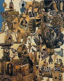
Cut with the Kitchen Knife Dada through the Beer Belly of the Weimar Republic,
Hannah Höch, 1919
Dadaism & Beauty
“To make their angled typography, they had to use the tool in the wrong way, and at its best, Dada typography is an inspiring reminder that sometimes the best results come from breaking the rules.”
(French and D’Andrade, The Type Project Book)
DISDAIN FOR CONVENTION marks the Dada period of typography, if we can rightly call it typography. Dadaists were influenced by Futurist typography, which celebrated energy and disorder. Whereas Futurists glorified progress, Dada questioned meaning itself.
This avant-garde movement rejected order and logic, which it regarded as having failed to prevent the catastrophic First World War. This frightfully horrific war trashed former utopian dreams of a wonderful, orderly and helpful society. Dada was nihilistic and used dynamic, non-linear text to express anger and emotion. The term “Dada” has no actual meaning. It is a childlike word used to describe lack of reason or logic in artwork and typography.
Hugo Ball’s famous Karawane (1916), composed of invented words, emphasized performance and phonetics over readability —
"Karawane
jolifanto bambla o falli bambla
großiga m’pfa habla horem
egiga goramen
higo bloiko russula huju
hollaka hollala
anlogo bung
blago bung blago bung
bosso fataka
ü üü ü
schampa wulla wussa olobo
hej tatta gorem
eschige zunbada
wulubu ssubudu uluwu ssubudu
tumba ba-umf
kusa gauma
ba - umf"
Note the poem’s fragmented structure and nonsensical language, with its lack of punctuation and syntax. The use of onomatopoeia and invented words creates a whimsical and disorienting sound and rhythm.
Two leading Dada artists were Hannah Höch and Raoul Hausmann, both married to each other for a short, tumultuous time, who created photomontages, where type was a visual element, not just a medium for language.[1]
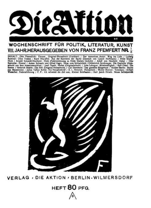
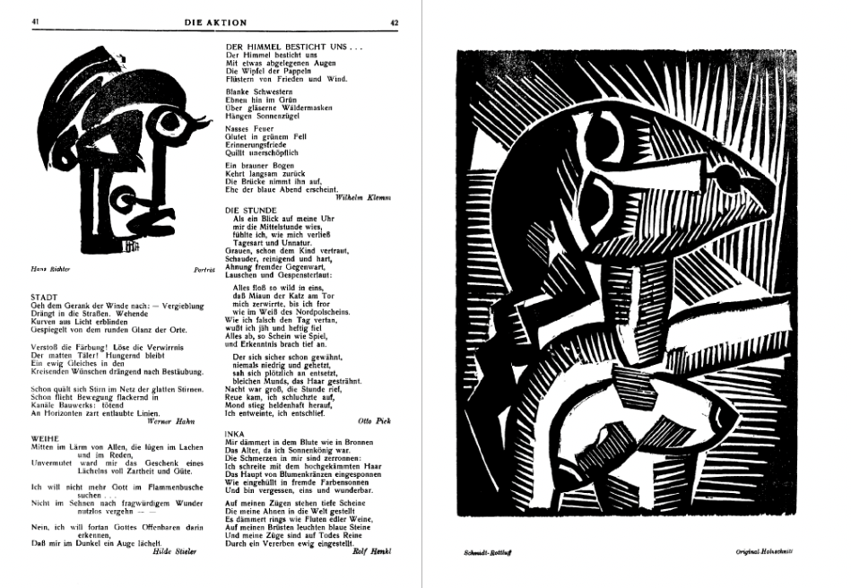
A leading Dada magazine of the period, Die Aktion (“The Action”), emphasized literary Expressionism and was published between 1911 and 1932 in Berlin. It stood for socialistic left-wing politics.[2]
From a typographical standpoint, Die Aktion was in the quarto format (the format of a book or pamphlet produced from full sheets printed with eight pages of text, four to a side, then folded twice to produce four leaves) with double line spacing. Begun in the Blackletter Fraktur typeface, it was changed to Antiqua in 1912.
Beginning in the nineteenth century, the use of Fraktur versus Antiqua was the subject of controversy in Germany. The dispute continued until 1941 when the Nazi government banned Fraktur as a typeface. Fraktur derives from the Latin fractura (“ a break”) with the beginnings and ends of the individual strokes that make up each letter clearly visible and emphasized.
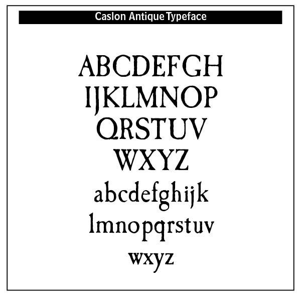
Antiqua typefaces, on the other hand, presented letters that are designed to flow in a continuous fashion. These faces mimicked handwriting or calligraphy during the fifteenth and sixteenth centuries. Antiqua faces are serif (with feet) typefaces designed between 1470 and 1600, cut by Nicolas Jenson and Aldus Manutius. They are thus known as Venetian types and called old style, differentiated from modern styles by the uniform thickness of all strokes and by slanted serifs.
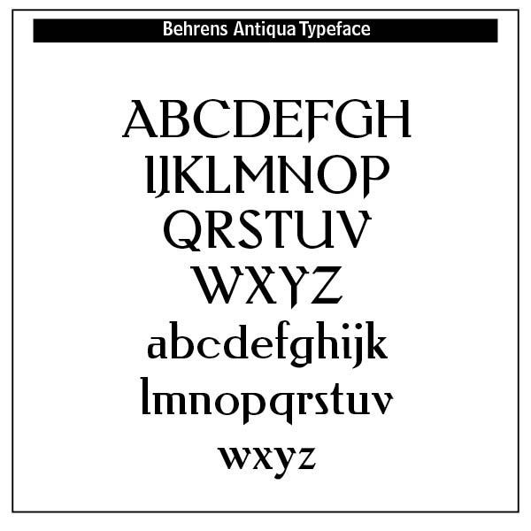
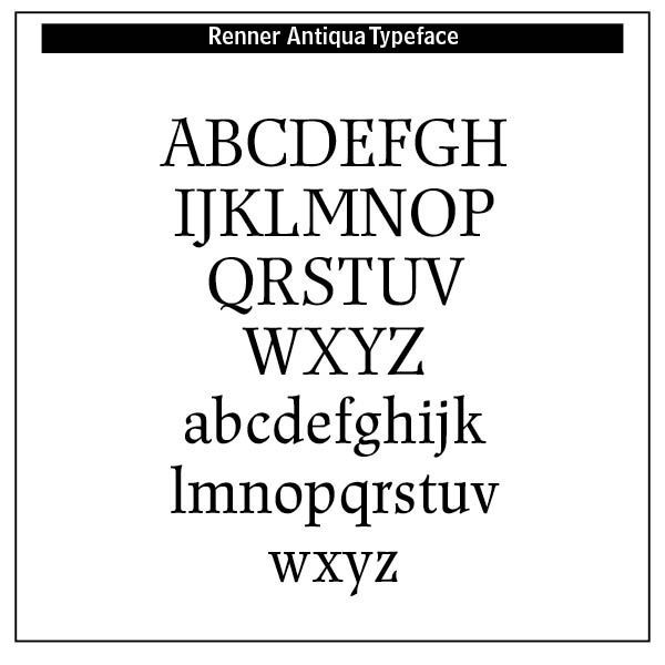
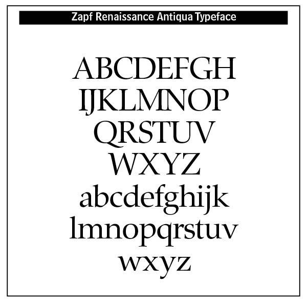
Different usable versions of the Antiqua typeface exist. Berne Nadall (1869–1932), American designer, created Caslon Antique (1896–98). Peter Behrens (1868–1940), German architect and graphic designer, created Behrens Antiqua (1907–1909). Vojtěch Preissig (1873–1944), Czech designer influential in the areas of book and type design, created Preissig Antiqua (1923–25) specifically for the Czech language. Paul Renner (1878–1956), created Renner Antiqua (1939).³ Renner also created the typeface Futura. Hermann Zapf (1918–2015), created Zapf Renaissance Antiqua (1984–87).⁴ Samples are shown.
Dada undermined the rules and distinctions between reading and viewing. Meaning was derived from form, not syntax. Dada artists used type in manifestos that were typographically explosive and politically provocative. Logic and coherence were readily attacked. Type danced, shouted and clashed. Type disrupted, questioned and awakened. Dada’s typographic innovations laid the groundwork for later movements like Surrealism, Situationism, Fluxus and Punk graphic design.[5]
Is Dada beautiful? An interesting Christian perspective here goes back to the Tower of Babel in the Bible. Christopher Watkin in his Biblical Critical Theory has this to say about the Tower —
"The concept of détournement is helpful for understanding the Bible’s own counterspectacle. In Genesis 11 we witness a delicious subversion of the tower builders’ self-aggrandizing pretentions. They name their city Bab-el, Akkadian for “gate of the gods,” but God makes their ambition a byword for babel: a near homonym for the Hebrew word meaning “confusion.” The subversion is brilliant: every time the term “Gate of the Gods” is evoked in lofty tones by those proud of making a name for themselves, someone can be heard in the background whispering under their breath “Bait for the Clods, more like,” raising a titter from all present and bursting Babel’s bubble of bombast.[6]
Later Situationists resistance to society is called in the French détournement, the tactic of taking something that exists and changing it to give a different message to that which was originally intended. Dada typography and adherents were Situationists in typography.
In the Dadaists rejection of order and logic in typography, using as many different fonts they wanted, and liberating typography from the grid of letter press, printing horizontally, vertically and diagonally on the same page, their rejectionist typography inspired the visual arts, literature, and theater. That influence is still being felt today. French and D’Andrade in their Type Project Book note that “it’s almost as if there is a logical argument in favor of illogic!”[7]
In terms of Christian based beauty, Dadaists rejected the gratuitous nature of beauty as reflecting the eternal gratuity and self-giving of the Trinity. Their autonomous rejection included a rejection of God’s order and rule in beauty.
However, their typography and art lives “before the eyes of the beholder,” making an objective statement about beauty, and rather appealing to society in general.
Difference and distance typographically in Dadaism could under God be made to reflect the unity and diversity of God. God providentially has used Dadaist typography to challenge, to awaken, to express the disorder in this sin-fallen world. Typography was no longer passive, but performative, disruptive and deeply expressive. Type can speak, in other words, in ways that grab our attention about the disorder of this world and even point us to the God who rules over such disorder.
Clearly, Dadaism crossed traditional boundaries, going across barriers of tribe, tongue and nation, breaking through the barriers of one culture’s preference and spills into others.
Is Dadaism desirable? Is it “fitting?” Is it appropriate in some way? Christianity would point to the ugly and repulsive crucifixion of Jesus Christ — “At every point, Christ proves superior, and at the most important moment in history, the beauty of Christ shines most brightly as the ugliest being is undone by the greatest act of beauty.”[8] That greatest act of beauty is the ugly cross. One writer thus points out, “If this is true, then our understanding of beauty needs to not only capture what draws us in, but what might repulse us and yet still be supremely valuable.”[9] We need to include the spiritual purpose of things when assessing beauty.
Perhaps Dadaism’s ultimate function is to force us away from our neatly contrived autonomy and consider what makes us who we are. Type and typography would never be the same after Dadaism. In modern graphic design, especially Swiss typography, echoes of Dada’s experimentation live on, though often more refined. This type-based rebellion lasts!
Notes
1. Photomontage from the works of Hannah HÖch in https://en.wikipedia.org/wiki/Hannah_Höch.
2. Sample of Die Aktion magazine from Internet Archive at https://archive.org/details/DieAktion08jg1918/page/n13/mode/2up. Edited by Franz Pfemfert and published between 1911 and 1932, this magazine “speaks up for the ideas of the large German left-wing parties, without attaching itself to any particular political party. Die Aktion wants to encourage the impressive thoughts of an ‘Organizing of Intelligence,’ and to help recapture the brillance of the long frowned-upon words ‘cultural war.’ In the areas of art and literature, Die Altion is looking to create a counterbalance between the sorry habits of the pseudo-liberal press to simply value new movements from a business standpoint to hush them up.” See also the sample from https://www.moma.org/s/ge/collection_ge/object/object_objid-144217.html
3. This sample of Renner Antiqua courtesy of http://www.onlinewebfonts.com” Web Fonts.
4. Antiqua font listing from https://en.wikipedia.org/wiki/Antiqua_(typeface_class)
5. From ChatGPT’s summary.
6. Christopher Watkin, Biblical Critical Theory: How the Bible’s Unfolding Story Makes Sense of Modern Life and Culture (Zondervan Academic, 2022, Kindle Edition). 215.
7. Nigel French & Hugh D’Andrade, The Type Project Book: Typographic Projects to Sharpen Your Creative Skills & Diversify Your Portfolio (Pearson Education, Inc., 2021), 10.
8. Quoted in Pierce Taylor Hibbs, “Beauty ALways Beckons,” Westminster Magazine (Vol. 5, Issue 2, Spring 2025), 28.
9. Hibbs, 28.