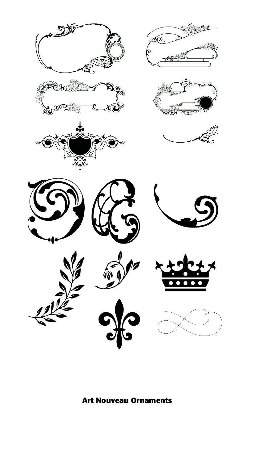
Art Nouveau Ornaments

Art Nouveau Beauty
“There are a few people in the world who hate Art Nouveau. The same people also hate flowers and puppies. Everyone else loves this beautiful style that flourished (literally) between 1890 and 1910.”
(French and D’Andrade, The Type Project Book)
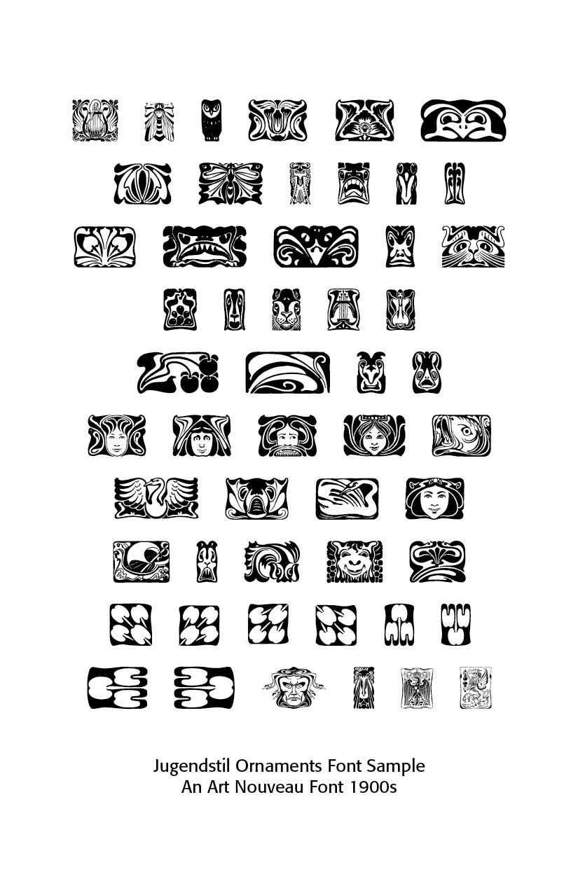
ART NOUVEAU departed from the “heaviness” of the Victorian period with organic forms, flowing lines and artistic unity. Grasset Regular is an art nouveau typeface based on some of the artwork offered by Lewis F. Day’s Alphabets Old and New, London, 1910.[1] Typefaces mimicked natural shapes, like vines, tendrils and flowers, as in the P22 Art Nouveau Extras glyphs samples shown.
Art Nouveau took its name from the Maison de l’Art Nouveau, a Parisian gallery that exhibited the works of artists and designers who were associated with the movement. The style was characterized by flowing, curvilinear forms inspired by natural shapes and motifs such as flowers, vines, and insects. It also incorporated elements from other artistic traditions, such as Japanese art and the Arts and Crafts movement. Typography wasn’t just functional but rather integrated into the overall artistic composition of posters, magazines and books. Much of the art and even typefaces were hand-drawn, borrowing from calligraphy and even medieval scripts, adding a romantic quality to the resulting art.
Other characteristics of Art Nouveau were a sense of dynamism and movement, often given by asymmetry or whiplash lines, and the use of modern materials, particularly iron, glass, ceramics and later concrete, to create unusual forms and larger open spaces.
Art Nouveau was a reaction against the academicism, eclecticism and historicism of nineteenth century architecture and decorative art. The new art movement had its roots in Britain, in the floral designs of William Morris, and in the Arts and Crafts movement founded by the pupils of Morris.
Art Nouveau declined in popularity after World War I, as artists and designers began to embrace new, more modernist styles. However, its influence can still be seen in many aspects of contemporary design, and it remains an important and influential movement in the history of art and design.
New technologies in printing and publishing allowed Art Nouveau to quickly reach a global audience. Art magazines, illustrated with photographs and color lithographs, played an essential role in popularizing the new style. The Studio in England, Arts et idèes and Art et décoration in France, and Jugend in Germany allowed the style to spread rapidly to all corners of Europe. Aubrey Beardsley in England, and Eugène Grasset, Henri de Toulouse-Lautrec, and Félix Vallotton achieved international recognition as illustrators.
Origins & Background
By the 1880s, the heavy blackletter of Germany and the strict Didone and transitional serifs dominating print (Bodoni, Didot) felt outdated for avant-garde artists. Lettering became a vehicle for breaking convention. Led by figures such as William Morris (1834–1896), there was a decided reaction against industrialization, seeing machine-made goods as dehumanizing and ugly. Handcraftmanship, honesty in materials and utility fused with beauty made up much of what was called the Arts & Crafts Movement. That movement was rooted in medieval guild ideals and morality in design.
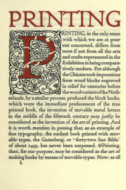
Morris in his essay on Printing emphasized these new points. He says that
It is discouraging to note that the improvement of the last fifty years is almost wholly confined to Great Britain. Here and there a book is printed in France or Germany with some pretension to good taste, but the general revival of the old forms has made no way in those countries. Italy is contentedly stagnant. America has produced a good many showy books, the typography, paper, and illustrations of which are, however, all wrong, oddity rather than rational beauty & meaning being apparently the thing sought for both in the letters and the illustrations.[2]
On typography he notes that “it is obvious that legibility is the first thing to be aimed at in the forms of the letters; this is best furthered by the avoidance of irrational swellings & spiky projections, and by the using of careful purity of line. Even the Caslon type when enlarged shows great shortcomings in this respect: the ends of many of the letters such as the t and e are hooked up in a vulgar and meaningless way.”[3]
Even the use of the paper on which the type was printed did not escape his criticism —
"The paper that is used for ordinary books is exceedingly bad even in this country [Britain], but is beaten in the race for vileness by that made in America, which is the worst conceivable. There seems to be no reason why ordinary paper should not be better made, even allowing the necessity for a very low price ; but any improvement must be based on showing openly that the cheap article is cheap, e.g. the cheap paper should not sacrifice toughness and durability to a smooth & white surface, which should be indications of a delicacy of material and manufacture which would of necessity increase its cost.
Therefore, granted well-designed type, due spacing of the lines and words, and proper position of the page on the paper, all books might be at least comely and well looking, and if to these good qualities were added really beautiful ornament & pictures, printed books might once again illustrate to the full the position of our Society that a work of utility might be also a work of art, if we cared to make it so."[4]
Devoting himself to the socialist cause, he regularly lectured at meetings across Britain, hoping to gain more converts, although was regularly criticized for doing so by the mainstream press. Politically, Morris was a staunch revolutionary socialist and anti-imperialist, and although raised a Christian he came to be an atheist.
The Movement stressed simple, functional, and durable forms. with inspiration from nature but rendered in stylized, often geometric patterns (floral or foliate motifs). Heavy emphasis was placed on natural materials—wood, stone, textiles. Earthy colors and solid craftsmanship were key characteristics. Morris’s ethos was that one should “have nothing in your houses that you do not know to be useful or believe to be beautiful.”
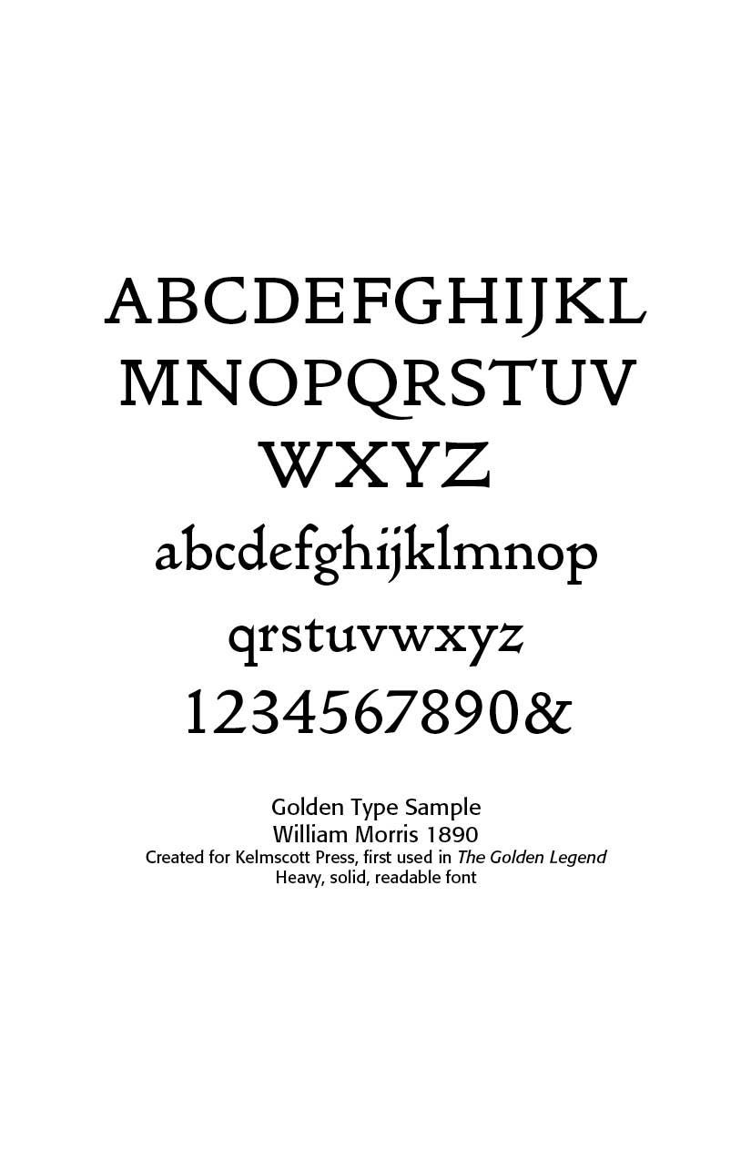
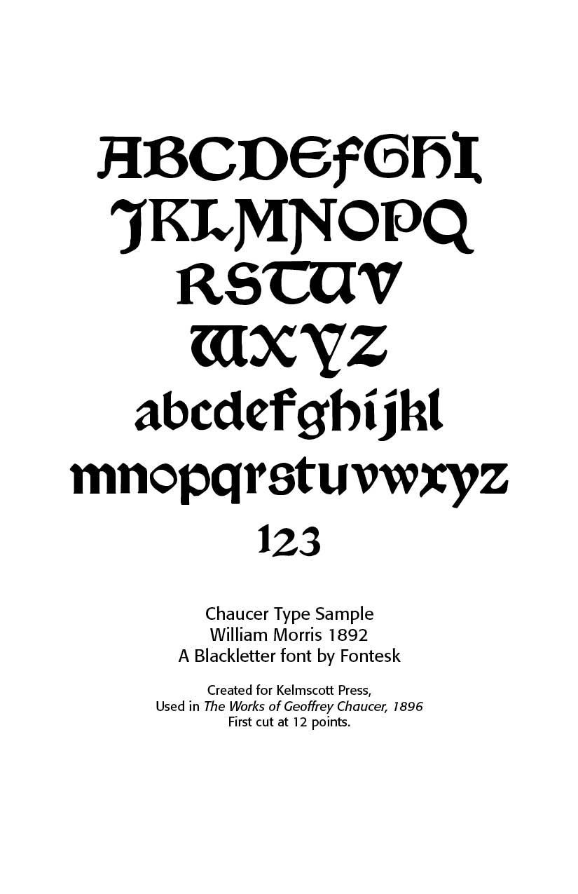
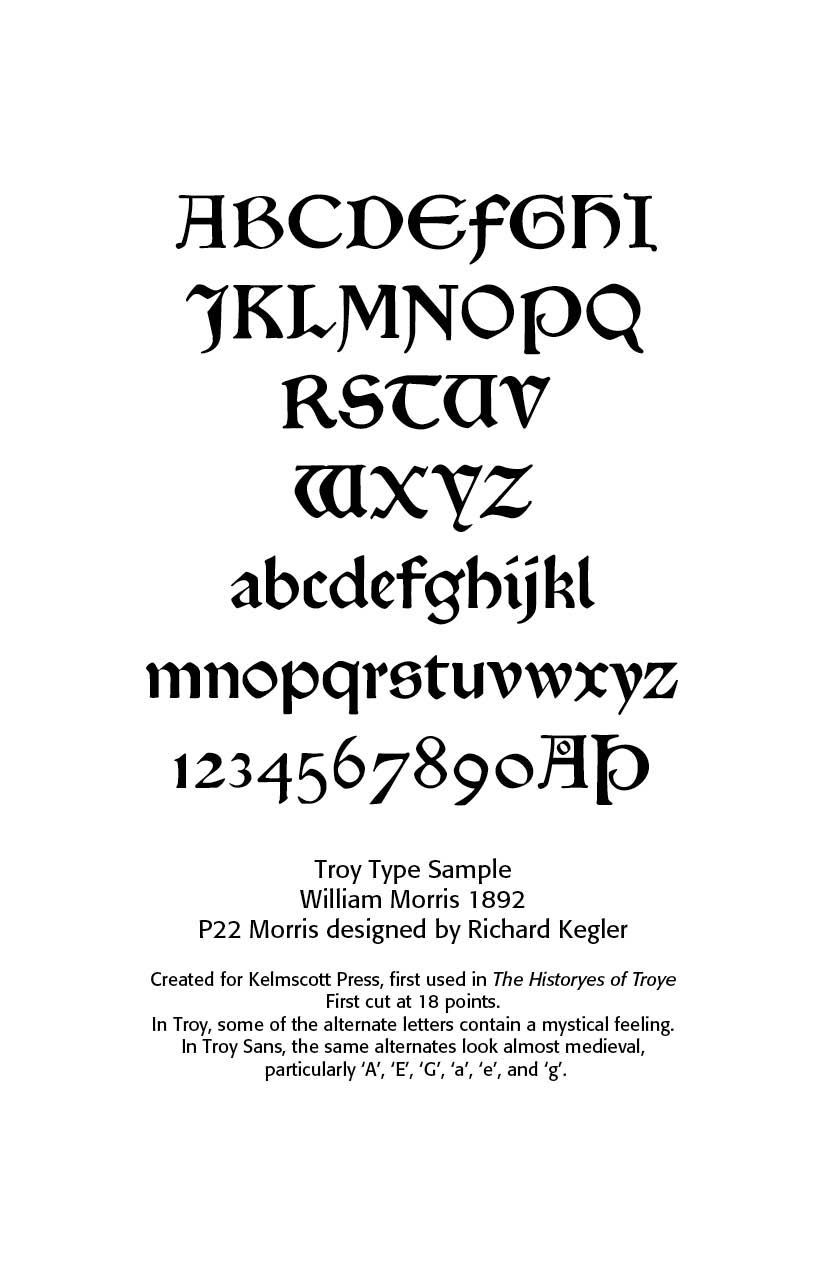
Morris created three main typefaces for the Kelmscott Press —Golden Type (roman), Troy Type (blackletter), and Chaucer Type (smaller blackletter). These remain his lasting contributions to typography.
Art Nouveau Type
Art Nouveau Type (1890-1914). While The Arts and Crafts Movement was about honest, handcrafted simplicity rooted in morality and tradition, Art Nouveau embraced ornament, sensuality, and new modern aesthetics, often using industrial methods for decorative ends. This new art movement had its roots in Britain, in the floral designs of William Morris, and in the Arts and Crafts movement founded by the pupils of Morris.
It rejected imitation of past styles, but embraced modernity and innovation. It celebrated the idea that art should unify with life—“total art” (Gesamtkunstwerk). Art Nouveau was open to new technologies (iron, glass, print posters). Ornament as beauty, unifying art and life was the key idea.
Characteristics of Art Nouveau Lettering —
• Curvilinear strokes (“whiplash” lines).
• Organic ornament: vines, flowers, tendrils.
• Highly stylized serifs and terminals (sometimes melting into plant-like extensions).
• Heavy contrast between thick and thin strokes.
• Asymmetry and playful letter proportions.
• Often uppercase-dominant, designed for display.
Main typographers of this style included Eugène Samuel Grasset, Maurice Pillard Verneuil, George Auriol, Otto Eckmann, Rudolf Koch, Peter Behrens, Will Bradley, Arnold BÖcklin. and Hermann Ihlenburg.
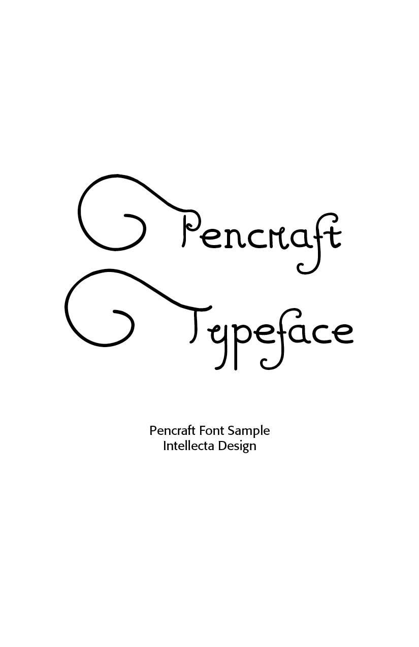
Pencraft and other display alphabets were issued by ATF, Barnhart Bros. & Spindler, U.S. foundries, an Art Nouveau type for advertising. Pencraft has a long history in the North-American typography. It was first designed by Hermann Ihlenburg, born in Germany in 1843, where he studied art and worked for several German type foundries. He emigrated to the USA in 1866 and worked for the L. Johnson & Co. foundry, later MacKellar, Smiths & Jordan. Ihlenburg died July 31, 1905 in Philadelphia. Sidney Gaunt, working as a type designer for Barnhart Brothers & Spindler foundry, in Chicago, added in 1914 the Pencraft Oldstyle series (BB&S later ATF). Pencraft, from Intellecta, is a free-interpretation from Pencraft Specials, an ornamental variation (with few lowercase, an incomplete alphabet) from Pencraft Oldstyle series, as displayed in the BBS catalog from 1922. The research and development of this font is work by Chyrllene K, a designer at Intellecta. The capitals were inspired in “Swagger Capitals”, an original design from Carl Stephen Junge, at Barnhart Brothers & Spindler. Carl was an illustrator and poster designer in Chicago in the 1920s and 1930s, who lived from 1880.
Eugène Samuel Grasset (1845 – 1917) was a Swiss decorative artist who worked in Paris, France in a variety of creative design fields during the Belle Époque. He is considered a pioneer in Art Nouveau design.
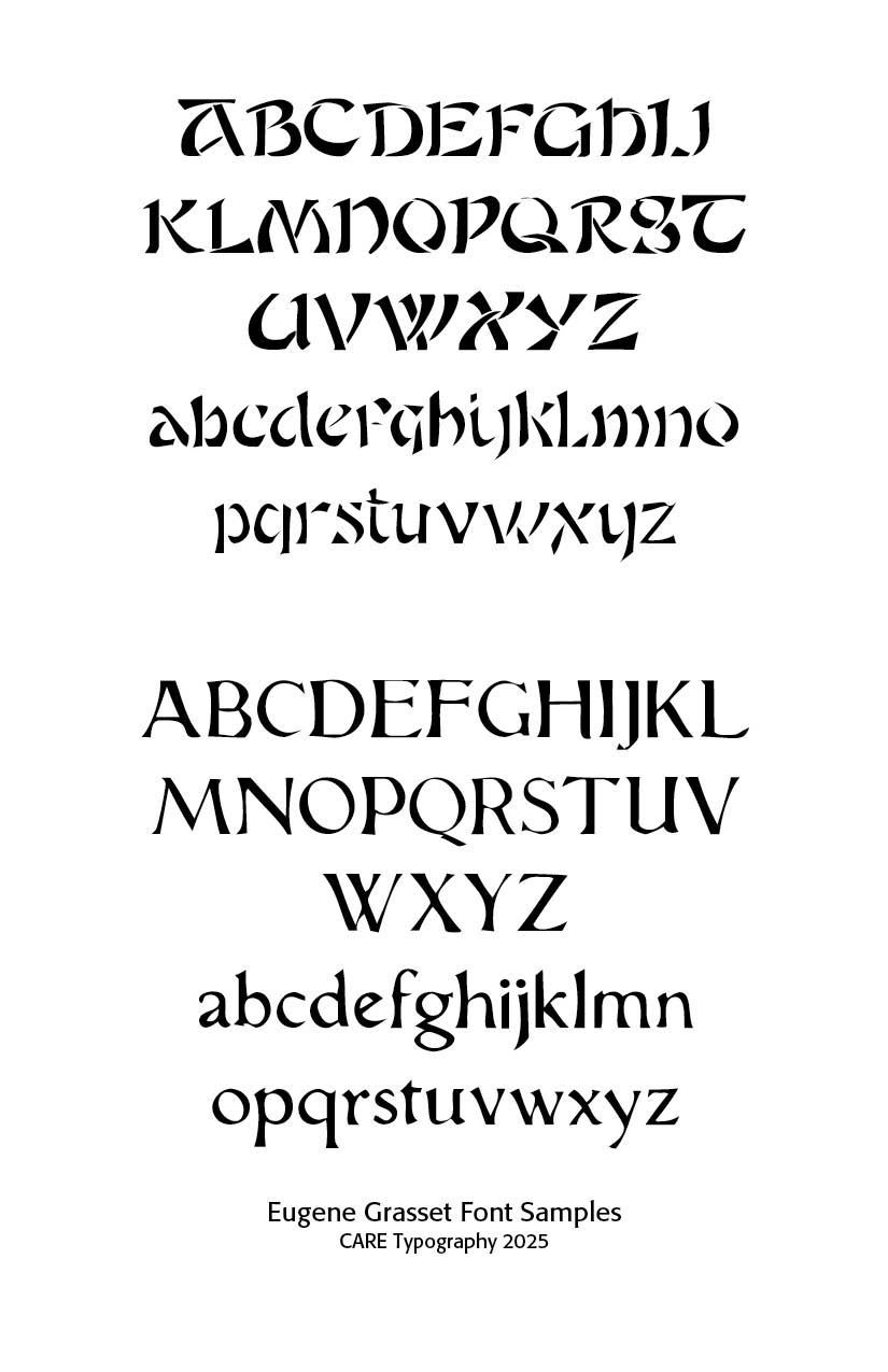
Grasset taught design at the École Guérin from 1890 to 1903, at the École d’Art graphique in the rue Madame from 1903 to 1904, at the Académie de la Grande Chaumière from 1904 to 1913, and at the École Estienne in Paris. Grasset had freely adapted the alphabet of Nicolas Jenson (1471) with the intention of using it to print a book on his own method for ornamental composition, inspired by the courses he gave to the Guérin school. Georges Peignot acquired Grasset’s alphabet and obtained an official patent on 7 October 1897 for the typeface under the name, “Grasset”. He then gave Henri Parmentier, the workshop’s punchcutter, the mission to engrave it.[5]
Maurice Pillard Verneuil (29 April 1869 – 21 September 1942) was a French artist and decorator in the Art nouveau movement. He was born in Saint-Quentin, France. Maurice Pillard Verneuil learned his trade from the Swiss designer Eugène Grasset. Maurice Pillard Verneuil then went on to become a well-known artist and designer. He was inspired by Japanese art and nature, particularly the sea. He is known for his contribution to the art deco movement and, in particular, his use of bold, floral designs in ceramic tiles, wallpapers and other furnishing textiles.
His designs covered both the Art Nouveau and Art Deco periods subsequently transitioning into his much acclaimed geometric patterns. Verneuil also produced numerous poster works in France alongside the well-known artists such as Toulouse-Lautrec and Chéret.
The Grasset Typeface from Lewis F. Day’s Alphabets Old and New, London, 1910, shows that art nouveau flair for which these men were famous. The font has been digitized by CARE Typography.
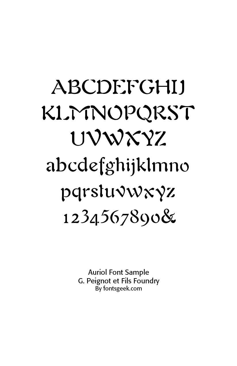
Auriol (1901, George Auriol, France), produced by G. Peignot et Fils foundry, was one of the most widely used Art Nouveau fonts in Paris. It was inspired by Japanese calligraphy. Japanese calligraphy, called Shodo or Shuji, heavily influenced Art Nouveau type.
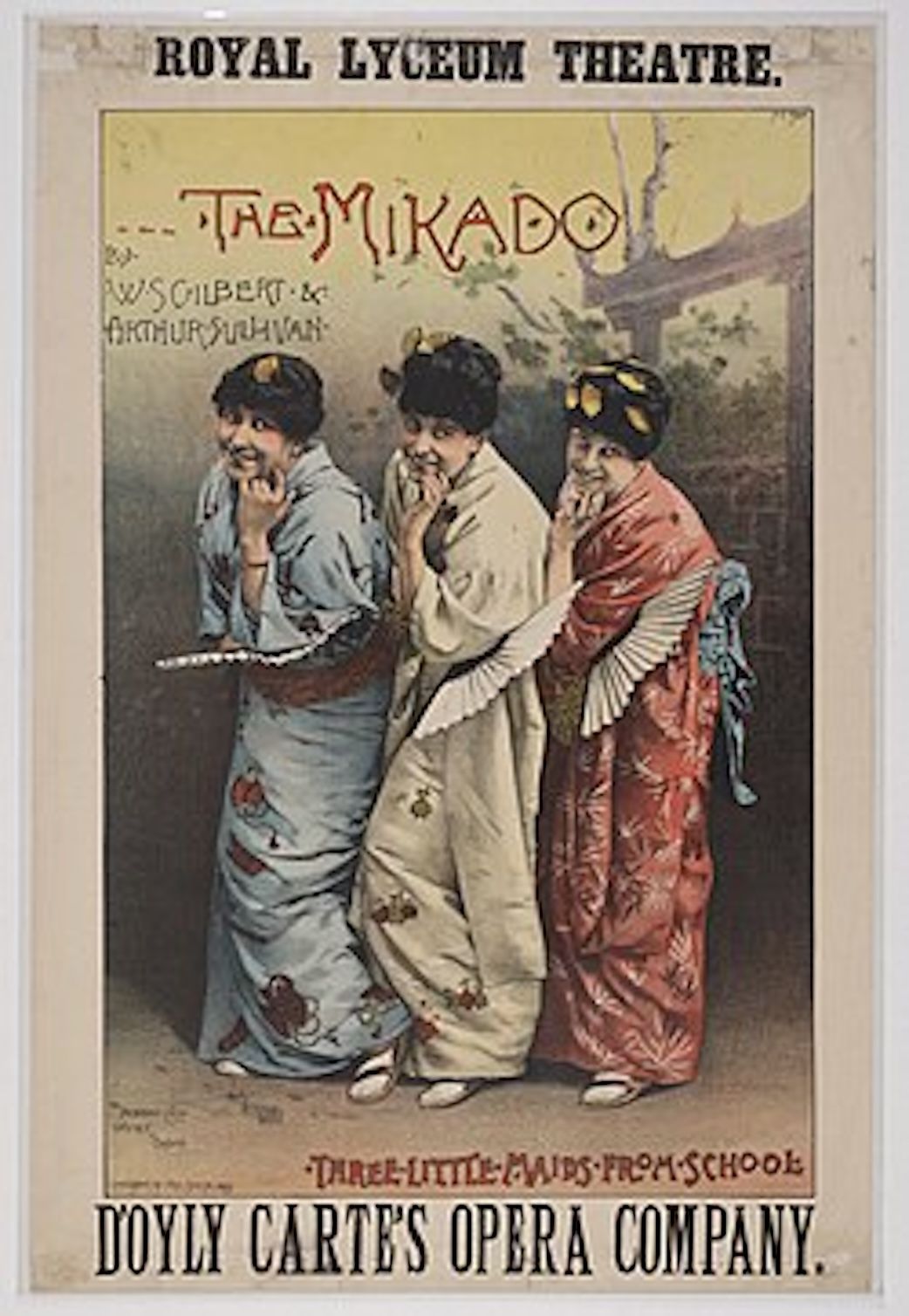
Japanese woodblock prints (Japonisme) introduced flowing lines, asymmetry, and decorative motifs to European typographers. Japonisme is a French term coined in the late nineteenth century and refers to the popularity and influence of Japanese art and design among a number of Western European artists in the nineteenth century following the forced reopening of foreign trade with Japan in 1858. Japonisme was first described by French art critic and collector Philippe Burty in 1872.
While the effects of the trend were likely most pronounced in the visual arts, they extended to architecture, landscaping and gardening, and clothing. Even the performing arts were affected; Gilbert and Sullivan’s The Mikado is perhaps the best example.
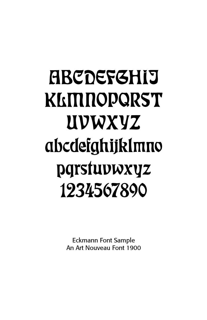
Otto Eckmann (1900) created Eckmannschrift, one of the first typefaces specifically associated with Art Nouveau. Influenced by Japanese art and medieval calligraphy. Eckmann used woodblock print for his work on Jugend magazine similar to Japanese prints and later-adapted French styles. Eckmann’s work differed from others in the Art Nouveau movement in that he used dimensionality in his designs, where most designers used a flat look Eckmann’s work shows a clear background, middle-ground and foreground. From 1900 to 1902, he designed the fonts Eckmann (in 1900) and Fette Eckmann (in 1902), probably the most common Jugendstil fonts still in use. Eckmann was also proficient in tile design and furniture design.
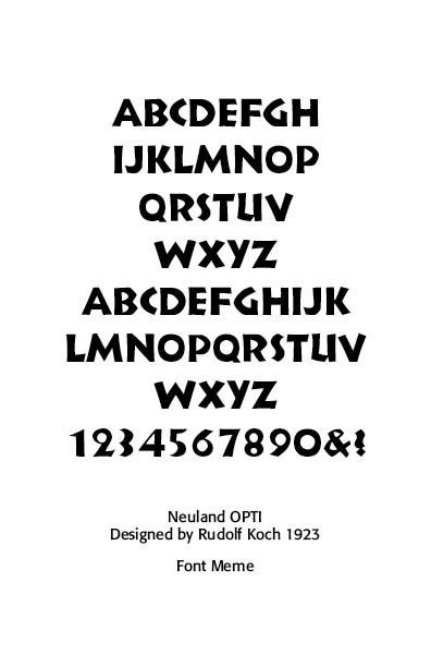
Rudolf Koch (1876–1934) blended Jugendstil (German Art Nouveau) with medieval forms. Rudolf Koch was born on November 20, 1876, in Nuremberg, Germany, a city with a deep legacy of printing and calligraphy. He initially trained as a lithographer, which gave him a strong grounding in letter drawing and reproduction. Koch later studied at the Kunstgewerbeschule (School of Applied Arts) in Nuremberg, where he developed a deep interest in historical scripts, especially blackletter (Fraktur and Textura) traditions.
A committed Christian, Koch infused much of his work with biblical texts, devotional themes, and symbolic imagery. His religious convictions shaped his resistance to purely mechanistic modernism; while he engaged with modern forms, he never abandoned the hand, the tool, or historical continuity. This stance put him in tension with the more radical functionalism of the Bauhaus, even as his work paralleled it chronologically.
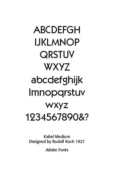
His major typefaces include Koch-Schrift (1909), an expressive blackletter that helped revive interest in medieval forms, Neuland (1923), Perhaps his most famous design, carved directly into metal rather than drawn, giving it a rough, primal quality; widely used in posters, book covers, and later in film and popular culture. Kabel (1927) is a geometric sans serif that responded to modernist trends (often compared with Futura), but with more humanist proportions and calligraphic influence. Wilhelm-Klingspor-Gotisch (1926) is a refined, monumental blackletter, often considered his masterpiece. Jessenschrift, Marathon, Deutsche Schrift are additional designs reflecting his range from historicism to modern display.
Koch believed that letters were not merely functional forms but moral and spiritual expressions. He viewed typography as a vocation shaped by patience, humility, and reverence for tradition—ideas that placed him closer to Arts and Crafts thinkers like William Morris, though his work was distinctly German in character.
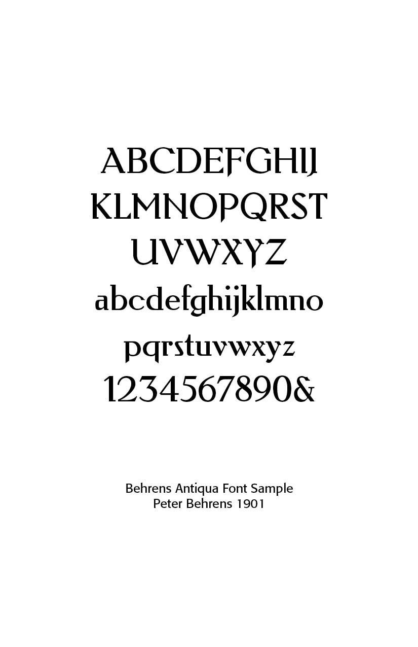
Peter Behrens (1901) designed Behrens Antiqua and other lettering styles—bridging Art Nouveau to modernism. Peter Behrens (1868 – 1940) was a leading German architect, graphic and industrial designer, best known for his early pioneering AEG Turbine Hall in Berlin in 1909. He had a long career, designing objects, typefaces, and important buildings in a range of styles from the 1900s to the 1930s. He was a founding member of the German Werkbund in 1907, when he also began designing for AEG, pioneered corporate design, graphic design, producing typefaces, objects, and buildings for the company.
Unfortunately associated with the German Nazi party, Behrens was one of the most influential architects and designers of the early twentieth century, widely recognized as the pioneer of modern industrial design. Behrens designed trademarks that exist today, such as the iconic Dem deutschen Volke (To The German People) above the portal of the Reichstag building in Berlin.
In 1902 he created a new German type which served, for example, as the official German type for the world expositions in 1904 and 1910. He notes that for this type “he took the technical principle of the Gothic script, the stroke of the quill feather. The proportions of height and width and the boldness of the strokes of the Gothic letters were also decisive for me in producing a German character. A cohesive character could be hoped for by avoiding all non-necessities and by strictly carrying out the design principle of holding the quill at an angle.”[6] Behrens bridged Art Nouveau with modern graphic design in the Arts and Crafts Movement.
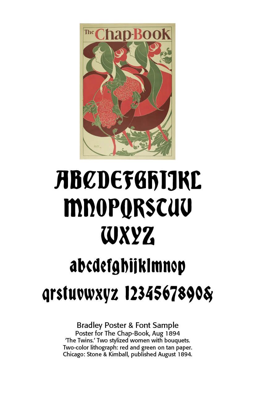
In the United States, Will Bradley (b. 1895) was largely self-taught as an artist. Bradley executed a number of designs to promote The Chap-Book, a short-lived but important publication based in Chicago. His 1894 design for Chap-Book, titled “The Twins,” has been called the first American Art Nouveau poster. This and other posters for the magazine brought him widespread recognition and popularity. Bradley was well acquainted with the stylistic innovations of his European counterparts. Like many French artists, he borrowed stylistic elements from Japanese prints, working in flat, broad color planes and cropped forms. He appropriated the whiplash curves of the Art Nouveau movement so dominant in Europe at the turn of the century and was influenced by the work of the English illustrator Aubrey Beardsley.
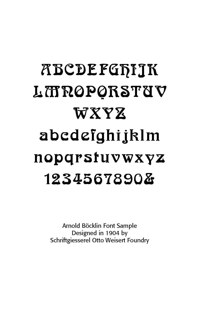
Arnold Böcklin (1904, Germany, still popular in the 1970s hippie revival) – eccentric, ornamental, and perhaps the most widely recognized Art Nouveau revival type. Arnold Böcklin (1827 – 1901) was a Swiss Symbolist painter. He is associated with the Düsseldorf school of painting. Schirmer, who recognized in him a student of exceptional promise, sent him to Antwerp and Brussels, where he copied the works of Flemish and Dutch masters. Böcklin then went to Paris, worked at the Louvre, and painted several landscapes.
Arnold 3556 is a typeface for display use that was designed in 1904 by Schriftgiesserei Otto Weisert foundry. Probably the best-known Art Nouveau typeface, the font had a renaissance in the 1960s and 1970s as part of the general Art Nouveau revival in popular design. Its influence can be seen in the work of illustrators such as Roger Dean and the Stuckist artist Paul Harvey, and on Donovan’s 1960’s album cover.
Arnold Böcklin is highly stylized, following Art Nouveau aesthetic principles in vogue at the time of its design. Many letters feature an unorthodox bottom-heavy contrast, and are adorned with swooping, botanical ornaments. The underlying skeletons of the letterforms are primarily based on classical Roman forms, but occasionally borrow from Uncial and Blackletter, as seen in letters like “H”, “N”, “M”, as well as the single-story “g” and the looped “k”. Due to its highly ornamental nature, Arnold Böcklin is primarily suitable for typesetting at large display sizes.
Art Nouveau posters were often used for cultural events, like plays, cabarets, or exhibitions. Famous examples include the works of Alphonse Mucha (1860–1939), a Czech painter, illustrator and graphic artist. He was known for his decorative theatrical posters, especially those of Sarah Bernhardt, a French stage actress of the late nineteenth and early twentieth centuries. He returned to his native land in his fifties to complete a series of twenty monumental symbolist canvases known as The Slav Epic, depicting the history of the Slavic peoples.
Wikipedia notes that he became devoutly religious — “For me, the notions of painting, going to church, and music are so closely knit that often I cannot decide whether I like church for its music, or music for its place in the mystery which it accompanies.”[7] At the Paris Universal Exposition of 1900 he depicted a future society in the Balkans where Catholic and Orthodox Christians and Muslims lived in harmony together. Mucha was a devoted Catholic mystic —
"I had not found any real satisfaction in my old kind of work. I saw that my way was to be found elsewhere, little bit higher. I sought a way to spread the light which reached further into even the darkest corners. I didn’t have to look for very long. The Pater Noster (Lord’s Prayer): why not give the words a pictorial expression?"[8]
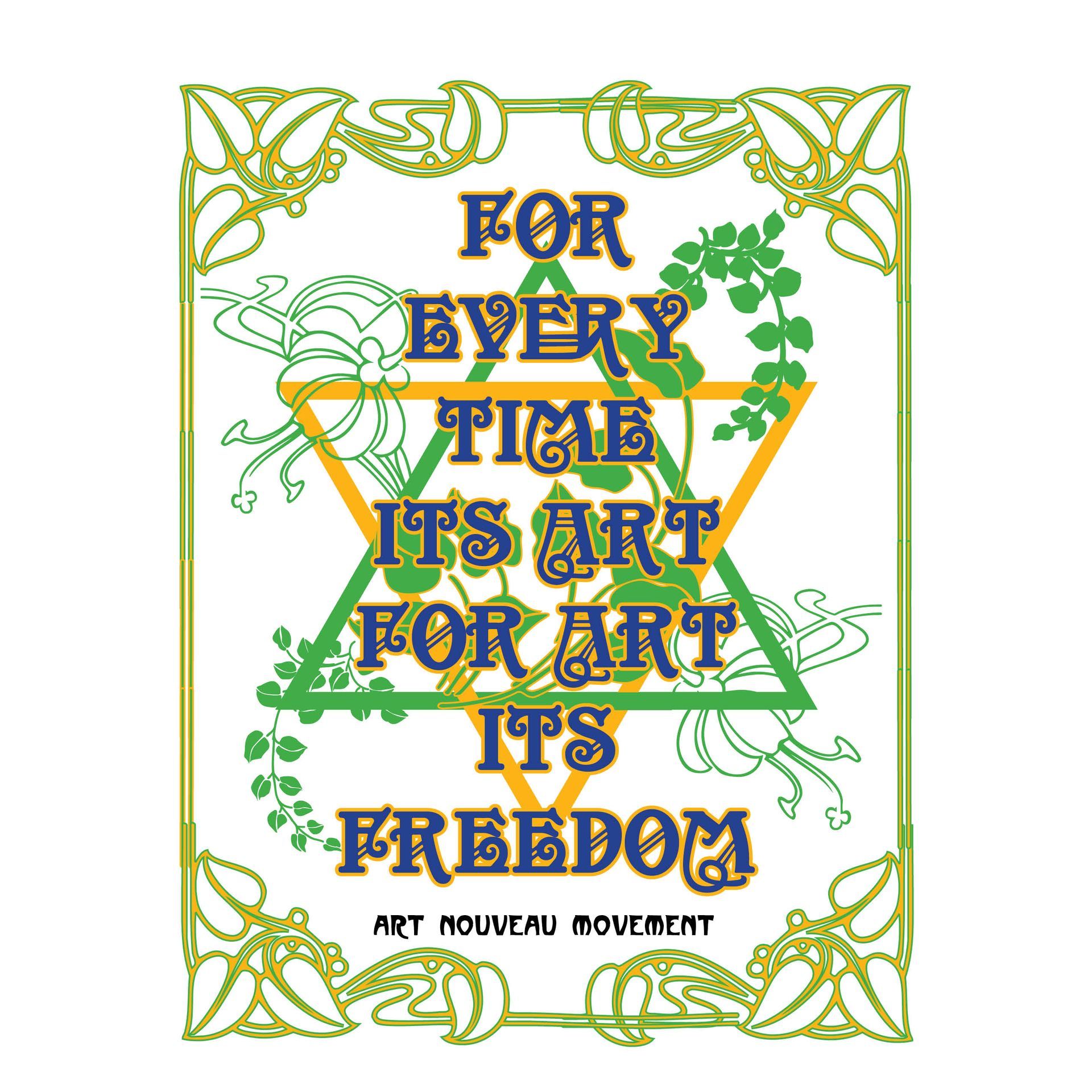
One art nouveau project I attempted was a poster redrawing adapted from French and D’Andrade’s The Type Project Book on Art Nouveau styles, using Adobe’s InDesign program and FontLab’s Fontographer. How this piece of Art Nouveau was accomplished reveals some of the beautiful intricacies involved, especially for non-professional graphic artists or art majors.[9]
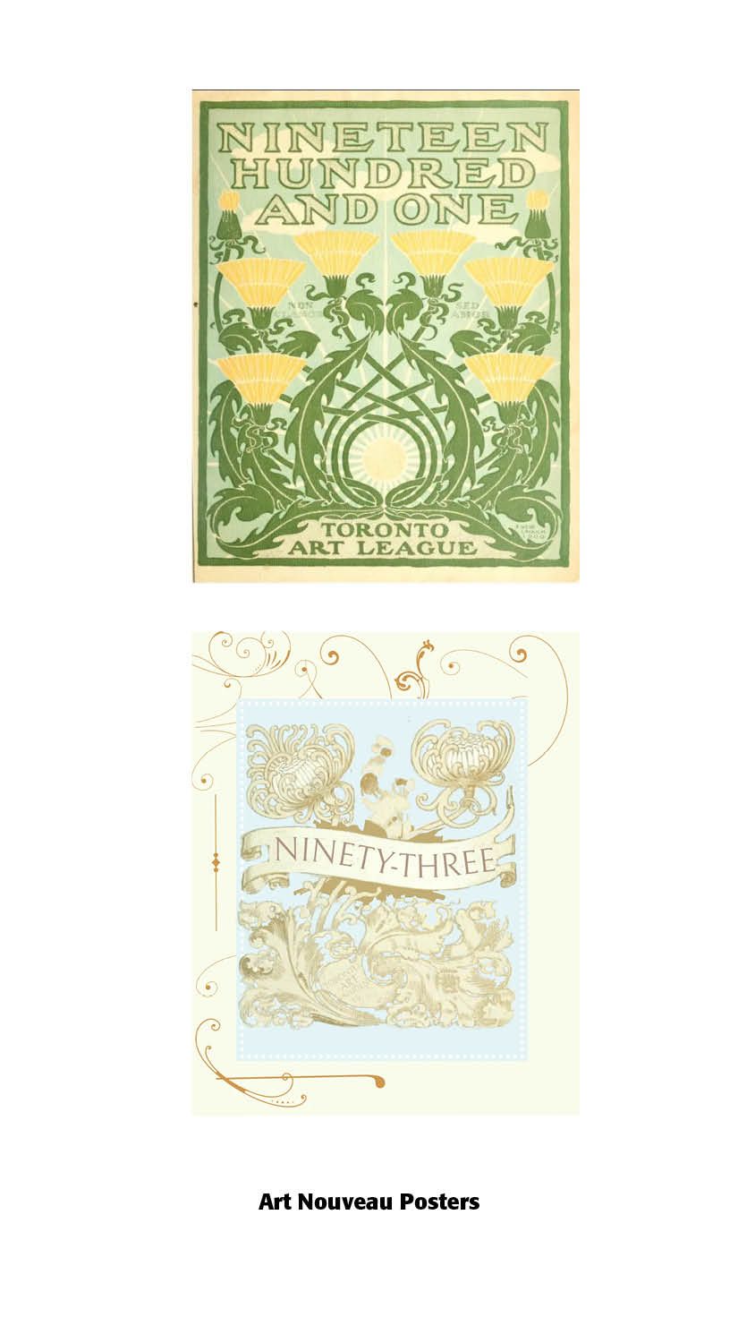
Two more art nouveau posters were also created by me from old adapted 1893 and 1901 calendars found on Internet Archive[10].
Rather than relying on standardized typefaces, designers often handcrafted letters to match the style and rhythm of their artwork. Art Nouveau laid the groundwork for modern design movements like Art Deco and Bauhaus. This was a fluid and elegant typographic language that broke with tradition.
By 1910, Art Nouveau was fading. It was seen as overly decorative and was replaced by Art Deco, Plakatstil (poster style), and modernist sans-serifs (e.g., Futura, 1927). Still, Art Nouveau typefaces remained popular in advertising for certain luxury goods. In the 1960s–70s counterculture revival, fonts like Arnold Böcklin were rediscovered and associated with psychedelic posters, bringing Art Nouveau back into fashion.
Art Nouveau fonts were display-oriented, highly decorative, and tied to the broader artistic revolt against rigid academic styles. Fonts like Eckmann, Auriol, Bradley, and Arnold Böcklin remain the most recognizable products of the period
Is Art Nouveau beautiful? I start with the subjective opening quote from Nigel French and Hugh D’Andrade that you either love it or hate it. And many people love the organic, flowing flowers and stems and fancy type that adorns Art Nouveau posters and advertisements. However, looking more deeply at our starting description of beauty, we can make several observations.
A few of the Art Nouveau designers did attempt to bring glory to God and reflect his creation as a gift. Others not so much, especially Behrens. Art Nouveau certainly illustrated the principle of harmony or unity of expression as well as diversity. Art Nouveau crossed geographical and social boundaries well. Some of it was “fitting” in terms of beauty and objectifiably outstanding, like the Behrens designs. Art Nouveau served as a graphical and artistic bridge to later graphic arts. I find the typefaces bold and matching the hand drawn art of the period, but not very suitable for textual composition.
Notes
1. Lewis F. Day, Alphabets Old and New: For the Use of Craftsmen, With An Introductory Essay on ‘Art in the Alphabet’” (London: B.T. Batsford, 1910). Accessed through Internet Archive at www.archive.org.
2. William Morris & Emery Walker, Printing: An Essay by William Morris & Emery Walker, From Arts & Crafts Essays by Members of the Arts and Crafts Exhibition Society (Part Ridge: The Village Press, 1903).
3. Ibid.
4. Ibid.
5. Wikipedia article on Eugène Grasset at https://en.wikipedia.org/wiki/Eugène_Grasset.
6. In 1902, Peter Behrens (1869—1940), architect, designer and typographer, created a new ”German“ type which became very successful very quickly for the Rudhard’sche Gießerei (foundry which later became Gebr. Klingspor AG) in Offenbach am Main. It served, for example, as the official German type for the world expositions in 1904 and 1910. Behrens himself writes about the development of this type. https://www.dafont.com/behrensschrift.fontcom. Also, see Peter Behrens and Symbolisms of Industrial Design: The Case of AEG, https://pikark.com/en/listing/peter-behrens-industrial-design/
7. https://en.wikipedia.org/wiki/Alphonse_Mucha.
8. Ibid.
9. Adapted use of “Art Nouveau: Tangled Up In Vines,” The Type Project Book: Typographic Projects to Sharpen Your Creative Skills & Diversify Your Portfolio, Nigel French & Hugh D’Andrade (Pearson Education, Inc., 2021). I used Adobe InDesign rather than Illustrator and Apollo ASM and Metropolitain fonts rather than the classic Vienna Workshop. The interlocking triangles diagram was adapted from John McWade, “How To Draw and Interlace Two Equilateral Triangles,” Before & After, Vol. 4, No. 3, 1994. Out of print.
10. Ninety-three: a calendar for the year of our Lord MDCCCXCIII; with verses by some of the Canadian writers of verse and drawings by members of the Toronto Art Students’ League & Toronto Art League Calendar of 1901 at https://www.archive.org The Apollo ASM and Metropolitain fonts were downloaded from https://www.1001fonts.com/art-nouveau-fonts.html. The Apollo ASM font was designed by Peter Weigel © 2010. Adaptation using Fontographer 5.