Theology & Type
Finding the Glory of God in Typography

God In Typography
"There is not a square inch in the whole domain of our human existence over which Christ, who is Sovereign over all, does not cry: ‘Mine!’”[1]
(Abraham Kuyper)
MOST MODERN TYPOGRAPHERS would automatically jettison such a bold statement about their craft. Indeed, the early colophons, called Printers Marks, made by many early printers were constituted of crosses, indicating subservience to a Divine plan and purpose, but later Enlightenment scholars and writers would call their marks questionable and “unenlightened.” Later typographers, like the very religious German, Rudolf Koch, in the Art Nouveau movement, were excluded from being notable simply because of their religious commitments.
Typography and art have always been influenced by religious thought. The early monks before Gutenberg’s printing press, carefully penned religious inspired versals (opening letters to written works). The Lindisfarne Gospels composed in the eighth century featured fantastic hand-crafted art and lettering. Printers in the Gutenberg era wrote books with what are called “printers’ marks,” symbolizing the cross of Christ with a globe and initials at the bottom indicating a humble submission to the Lordship of Jesus Christ over the earth and its inhabitants, inclusive of the printers themselves.
Victorian ornamentation advanced type and art that spoke loudly of the rule of God in life and thought. Art Nouveau artists like Alphonse Mucha (1860–1939) gave us posters from a devoutly religious Catholic lifestyle — “For me, the notions of painting, going to church, and music are so closely knit that often I cannot decide whether I like church for its music, or music for its place in the mystery which it accompanies."[2]
According to noted typographer Robert Bringhurst, a typographer “must analyze and reveal the inner order of the text, as a musician must reveal the inner order of the music he performs. But the reader, like the listener, should in retrospect be able to close her eyes and see what lies inside the words she has been reading. The typographic performance must reveal, not replace, the inner composition.”[3] There is a “style beyond style” and “letters have a life and dignity of their own.”[4]
In other words, typography is a human exercise that communicates human aspirations, desires and employs human skill and emotion. This is where theological reflection comes in. Theologically, we are all made in the image of God. That image reveals what we think about God, whether we honor the Creator or autonomously rebel against Him.
God is concerned about our language and how we build or destroy his image. The builders of ancient Babel sought to construct a city to heaven — “Now the whole earth had one language and the same words. And as people migrated from the east, they found a plain in the land of Shinar and settled there. And they said to one another, “Come, let us make bricks, and burn them thoroughly.” And they had brick for stone, and bitumen for mortar. Then they said, “Come, let us build ourselves a city and a tower with its top in the heavens, and let us make a name for ourselves, lest we be dispersed over the face of the whole earth.” (Genesis 11:1–4)
It is notable that they had “one language and the same words.” There was one form of typography, one communication, one style. Yet, this typographical unity was used for one purpose — to defy their Creator God. The result of the universal fall into sin was to use their typographical oneness to dishonor God and make themselves gods. Their Babel was supposed to be a “gate to heaven,” the Akkadian meaning of the term.
Instead of “filling the earth,” the original purpose of creation in Genesis 1:28, they wanted to consolidate and build a city “lest they are scattered over the face of the earth.” They wanted to make a name for themselves, asserting their own autonomous authority. One interpretation of their action “sees the tower as a beachhead for launching an assault on God’s throne-room: a proud assertion of autonomous technological capability on the part of a culture that has turned its back on God.”[5]
What does God do? “God is not against technology, as if he were a divine Rocky who eschews all artificial aids and prevails through natural means. He is against sin, and the proposed tower is the headquarters of autonomous human sinfulness.”[6] God does not destroy them nor their building project, but rather in grace scatters them over the face of the earth with diverse languages —”Come, let us go down and there confuse their language, so that they may not understand one another’s speech.” So the LORD dispersed them from there over the face of all the earth, and they left off building the city. Therefore its name was called Babel, because there the LORD confused the language of all the earth. And from there the LORD dispersed them over the face of all the earth.” (Genesis 11:7–9)
“The spirit of Babel continues in our own day. What we see in contemporary society, poignantly, is that the usurpation of the creator’s right to define the meaning of life can be experienced as a burden. Success in life is now seen as the individual’s responsibility alone, and if someone is not supremely successful, they are at fault because the only thing stopping us following our dreams is our lack of desire.”[7]
Type is a basic and essential way of asserting something. A study of the different periods of typography display this assertion. Theology joins with typography precisely at this juncture. We can either craft type to honor the Creator or to assert our own independence from the Creator. We can either honor the image of God in us or twist that image to our own desires, dreams and wishes.
The patient and meticulous calligraphy of ancient scribes working on biblical texts demonstrate the care and love for the Creator. The ancient Printers Marks in crosses showed the world on printed page the desire to submit to and glorify God. A study of those marks clearly shows this. The lasting beauty and use of the Swiss type style Univers by the religious Calvinist Adrian Frutiger demonstrates the order which God wants in our words and our type.
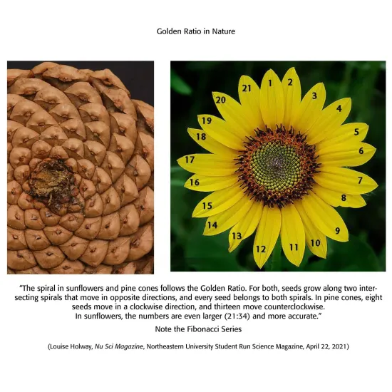
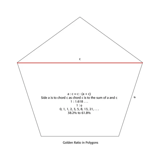
The preferred use of the Golden Ratio in page layout and typesetting displays God’s order in the universe and even in our minds. The Golden Ratio is a mathematical and organic ratio of 1:1.618 . . . found inherent in simple geometric figures, like the equilateral triangle, the square, the regular pentagon, hexagon and octagon. Not only are these dimensions pleasing to the human eye and sense, they are found universally in many aspects of nature, like the pine cone, sunflower, hurricanes, seashells and even the human brain.
Robert Bringhurst in his masterful The Elements of Typographic Style notes that the Golden Ratio and other proportions “occur repeatedly in nature, and pages that embody them recur in manuscripts and books from Renaissance Europe, Táng and Sòng Dynasty China, early Egypt, pre-Columbian Mexico and Ancient Rome. It seems that the beauty of these proportions is more than a matter of regional taste or immediate fashion. . . Working and playing with them is a way of developing good typographical instinct, and they serve as useful references in analyzing old designs and calculating new ones.”[8]
Typographers have been using the Golden Mean and Golden Ratio, therefore, for centuries. Laying out a page with such a proportion is not merely good typography but resonates with our brains and our inner sense of proportion in the universe. Indeed, “a 2019 study from John Hopkins University compared 100 human skulls. The Nasioniac arc connects the tip of the nasal bone to the inion, a small bump on the back of the skull, and the Bregma is a curve on the top of the skull that follows a similar path that a headband would. In all of the 100 skulls researchers studied, they found that the bisection of these points creates two arcs whose distances exhibit the Golden Ratio.”[9] In other words, our brains are “hard wired” to notice this ratio universally, certainly in page layout projects.
Forming grids on pages that are pleasing to the eye should take such proportions as the Golden Ratio into account. To be sure, modern magazine layouts are not slavishly tied to such proportions, but our aesthetic sensibilities often demand them and we can see things as “off” in page layouts without them.
On the other hand, the non-sense type of Dadaism and the socialistic construct of De Stijl in typography, along with radical Psychedelic, Punk, and Grunge type, demonstrate the old Babel desire to “make a name for ourselves” and rebel against any divinely given order in type design and style. The following chapters clearly demonstrate this “style beyond style,” as Bringhurst has said.
There are several attitudes and ways a Christian based typographer can interact with society and culture. We can “defend against” culture and cocoon ourselves and our type, seeking to replace what we consider corrupt use of type and calligraphy. We can culturally engage or accommodate current typographical trends. We can withdraw from typographical pursuits, a neo-Anabaptist form of withdrawal from “worldly” structures and practices. We can become typographical Luddites, resistant or skeptical of new AI typographical technology, and want to restore “old order” type standards and production.
Theologically, I believe in a “faithful presence” approach to culture and life, including typography, living faithfully and coherently in every sphere of life — work, family, community and culture — by embodying the love, justice and shalom of God. We should therefore participate in networks of influence and institutions that embody those Jesus-like values over time. We should focus less on managing history or controlling outcomes, and more on witnessing to Christ’s life and love in concrete contexts.[10] I would maintain that those Christian based typographers and calligraphers in the history of type whose work lasts through changing cultures did just that.
Notes
1. Abraham Kuyper (1837–1920) was a Dutch theologian, journalist and prime minister of the Netherlands, most often associated with Reformed Christianity, but having influence in politics, education, sociology and cultural theory. Followers are often called “Kuyperians” and the movement Kuyperianism.
2. https://en.wikipedia.org/wiki/Alphonse_Mucha.
3. Robert Bringhurst, The Elements of Typographic Style (Vancouver: Hartley & Marks, 1992 edition), 21.
4. Ibid, 18-19.
5. Christopher Watkin, Biblical Critical Theory: How the Bible’s Unfolding Story Makes Sense of Modern Life and Culture (Zondervan Academic, 2022, Kindle Edition), 208.
6. Ibid, 210
7. Ibid, 212.
8. Bringhurst, 130.
9. Louise Holway, “The Golden Ratio: Myth or Magic of Mathematics,” Nu Sci Magazine: Northeastern University’s Student Run Science Magazine, April 22, 2021.
10. ChatGPT summary of James Davidson Hunter, To Change the World: The Irony, Tragedy and Possibility of Christianity in the Late Modern World (Oxford University Press, 2010).
Related Articles

“Creational realities have not spilled out randomly without purpose; rather, they reflect the wisdom, design, and intention of the good God who made them. It’s our job, then, to observe and learn. . . . "
(Matthew C. Bingham, A Heart Aflame for God: A Reformed Approach to Spiritual Formation (Wheaton, IL: Crossway Books, 2025)
What is it that we do that a machine will never be able to do? What is an essentially “human” typographic experience? Can AI be fully commanded, and interrogated, or will technology sanitize our vision and overthrow our own artistic hands?

Nothing Really New
Current Typographical Trends
This has been the story of all cultural movements, including typographic movements. They reflected their cultural morés of the times, but the bold, audacious, violent, raucous types always gave way to what we internally want and desire — a return to simplicity, functionality and order and type viability.
Contact us
We’d love to hear from you. Call us now at 717-385-6468 or send a message using the form below we’ll get back to you as soon as we can.
Contact Us
We will get back to you as soon as possible.
Please try again later.