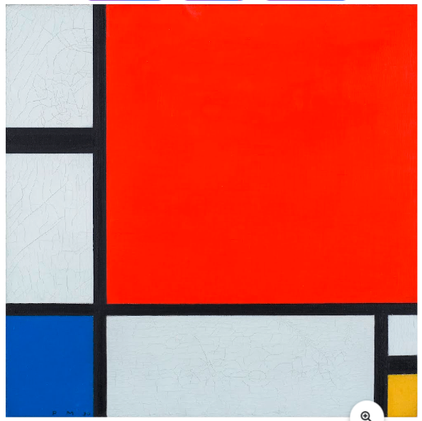
Composition with Red, Blue and Yellow by Piet Mondrian, 1930.
Oil on canvas, in the Kunsthaus Zurich Online Collection.
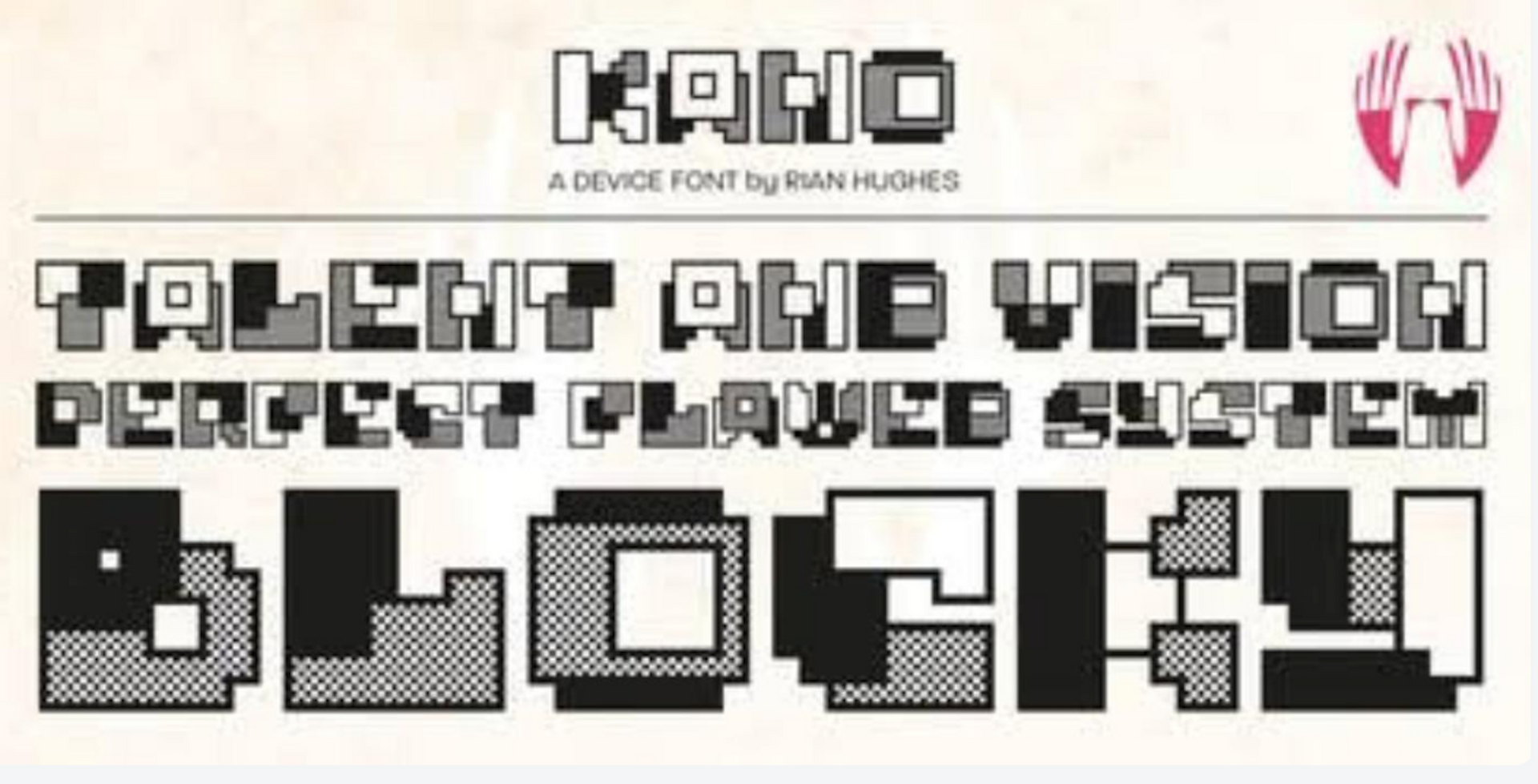
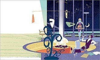
An illustration by Rian Hughes,
a designer, illustrator, writer and typographer working for the British and American publishing, music, advertising and comic book industries.
De Stijl Beauty
“Deeply influenced by Neo-Plasticism, a theory developed by Piet Mondrian, which sought to depict reality in its purest and most universal form, this typographical movement was also shaped by Theosophy, idealism, and a strong desire for spiritual and aesthetic harmony
after World War 1.”
(The De Stijl Movement, ChatGPT)
DE STIJL (Dutch for “The Style”) typographical and art movement emerged around 1917 and significantly influenced modern art, design and thought itself. In the wake of the chaos of World War I, the movement sought to express a new vision of harmony and order. De Stijl was not just an art style, but a comprehensive aesthetic philosophy. It sought universal beauty, as abstracted from individual beauty, and a visual language and typography based on simplicity, geometry and primary colors, namely red, blue and yellow.
Its core characteristics were the use of straight horizontal and vertical lines, the use of rectangles and squares, an emphasis on asymmetry, and the favoring of pure abstraction. De Stijl was deeply influenced by the philosophy of Neo-Plasticism, a theory developed by Piet Mondrian, which sought to depict reality in a pure, universal form. Behind this philosophy was the religious thrust of Theosophy, particularly the spiritual writings of Helena Blavatsky (1831–1891) and Rudolf Steiner (1861–1925).
Typography and art have always been influenced by religious thought. The early monks before Gutenberg’s printing press, carefully penned religious inspired versals (opening letters to written works). The Lindisfarne Gospels composed in the eighth century featured fantastic hand-crafted art and lettering. Printers in the Gutenberg era wrote books with what are called “printers’ marks,” symbolizing the cross of Christ with a globe and initials at the bottom indicating a humble submission to the Lordship of Jesus Christ over the earth and its inhabitants, inclusive of the printers themselves.[1]
Victorian ornamentation advanced type and art that spoke loudly of the rule of God in life and thought. Art Nouveau artists like Alphonse Mucha (1860–1939) gave us posters from a devoutly religious Catholic lifestyle — “For me, the notions of painting, going to church, and music are so closely knit that often I cannot decide whether I like church for its music, or music for its place in the mystery which it accompanies.”[2]
The movement of Dadaism gave way to the beauty of Constructivism, which in turn birthed Bauhaus functionalism and eventually Swiss Type beauty in the enduring work of the religious Calvinist, Adrian Fruitger and the Univers typeface.[3]
It should therefore be no surprise that De Stijl with its ideas of grid systems, sans-serif type and minimalism had its roots in spiritual thought and philosophy. However, unlike early typography and art, De Stijl sought to remove the “particular” (the individual, the emotional, the narrative) and express the “universal” — timeless and absolute truths through plastic means (form, color, and space).
Theosophy, as founded by Blavatsky in the late nineteenth century, presents a syncretistic worldview that combines Eastern religions (especially Hinduism and Buddhism), occult practices, esoteric traditions (e.g., Gnosticism, Neoplatonism), reincarnation and karma, along with a hierarchy of spiritual beings.
While some might seek comparisons with traditional mysticism in the Roman Catholic and Orthodox mystical theologies, all Christian based systems have rejected theosophy as severely inconsistent and detrimental to the Christian faith. Theosophy often views God as an impersonal absolute or a universal consciousness, not the personal God of the Bible.
In Christology, theosophy sees Jesus not as the unique Son of God, but as one of many “masters” or “avatars.” In salvation, instead of grace through Christ, theosophy teaches a form of spiritual self-realization through multiple lifetimes. The concept of reincarnation contradicts the Christian view that “man is destined to die once, and after that to face judgment” (Hebrews 9:27).
Helen Blavatsky (1831–1891) claimed to have received teachings from “ascended masters,” rejecting the uniqueness of Jesus Christ, the reliability of the Bible and the personal nature of God. She believed in an evolutionary spirituality in which humanity would evolve spiritually through various root races.
Rudolf Steiner (1861–1925) began in theosophy but later founded Anthroposophy, seeking to integrate Christian language with esoteric ideas. He taught that Christ was a spiritual being who incarnated in the man Jesus,
that reincarnation and karma are real and essential to spiritual growth, and that Christianity is one of several valid spiritual paths. He influenced Waldorf education, biodynamic agriculture, and other cultural movements. While Steiner used Christian terminology, his system redefines core doctrines, leading to theological confusion rather than alignment.
While these systems might use Christian language, they redefine its core truths. They are spiritually misleading, even dangerous, to Christian standards in denying the uniqueness of Jesus Christ, the reliability of the Bible, and the personal nature of God. Christ was much more than a spiritual being who was incarnated in the man Jesus of Nazareth. Christianity is not one of several valid spiritual paths. Jesus himself said He alone is “the way, the truth and the life” and the only way to God the Father. (John 14:6)
Piet Mondrian in his 1917 essay Neo-Plasticism in Pictorial Art, says that
Although art is the plastic expression of our aesthetic emotion, we cannot therefore conclude that art is only ‘the aesthetic expression of our subjective sensations.’ Logic demands that art be the plastic expression of our whole being: therefore, it must be equally the plastic appearance of the non-individual, the absolute and annihilating opposition of subjective sensations. That is, it must also be the direct expression of the universal in us, which is the exact appearance of the universal outside us. The universal thus understood is that which is and remains constant: the more or less unconscious in us, as opposed to the more or less conscious, the individual, which is repeated and renewed.[4]
His Composition in Red, Blue and Yellow (1930), seen in the opening graphic of this chapter, is dominated by a large red rectangle. The edge of the painting is delimited by two wide, sub-divided strips. The cris-crossing black bars are displaced far from the centre and meet in a corner at the bottom left. Deep blue and lemon yellow separated by whitish-grey surfaces form the counterpoint to the red note. He dubbed this “Neoplasticism.” He sought to give expression to the universal through the absolute harmony of the individual pictorial elements.
Neoplasticism rejected nature-based forms or figuration, as in Victorian art, diagonal lines, curved forms, ornamentation or decorative motifs and emotional or symbolic expression.
Major players in the De Stijl movement included Theo van Doesburg (1882–1931), its founder and key propagandist, Piet Mondrian, who developed the theoretical backbone of De Stijl, Gerrit Rietveld (1888–1964), famous for the Red and Blue Chair (1918–1923), and Bart van der Leck (1876–1958), who developed a distinctive visual language of simplified forms and bold color. Additional players included Robert van’t Hoff, an architect who influenced Frank Lloyd Wright and J.J.O. Oud who applied architectural De Stijl ideas to social housing.
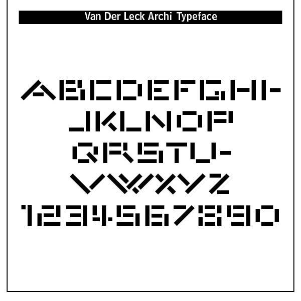
Typefaces that developed from De Stijl were Architype van der Leck designed by Bart van der Leck for the Dutch magazine Flax, a journal of the De Stijl art movement. Bart van der Leck was a Dutch painter and designer. With Theo van Doesburg and Piet Mondriaan he founded the De Stijl (abstract, geometric) art movement. In 1930, he was commissioned by Jo de Leeuw, owner of the prestigious Dutch department store Metz & Co. to design interiors, window packaging, branding and advertising. For these print materials van der Leck developed a rectilinear geometrically constructed alphabet.
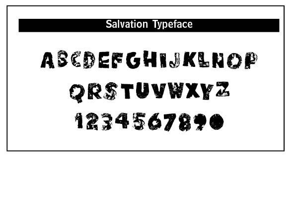
Typefaces inspired by van der Leck include Kinesis (2018, Rian Hughes), a modular headline font, constructed from white, black and grey overlapping rectangles. Hughes maintains that Kinesis were forays into purely pen-written forms and the extra-rational decision of being in the “zone” when working. Under the name Device he now provides design and illustration for the advertising, entertainment, publishing and media industries, working from Richmond, UK as a comic book artist. He has written and drawn comics for 2000AD and Batman: Black and White, and designed logos for James Bond, the X-Men, Superman, Hed Kandi and The Avengers. He creates mostly display type. The typeface Salvation (a potato cut font) is from him as well as the Kano font.
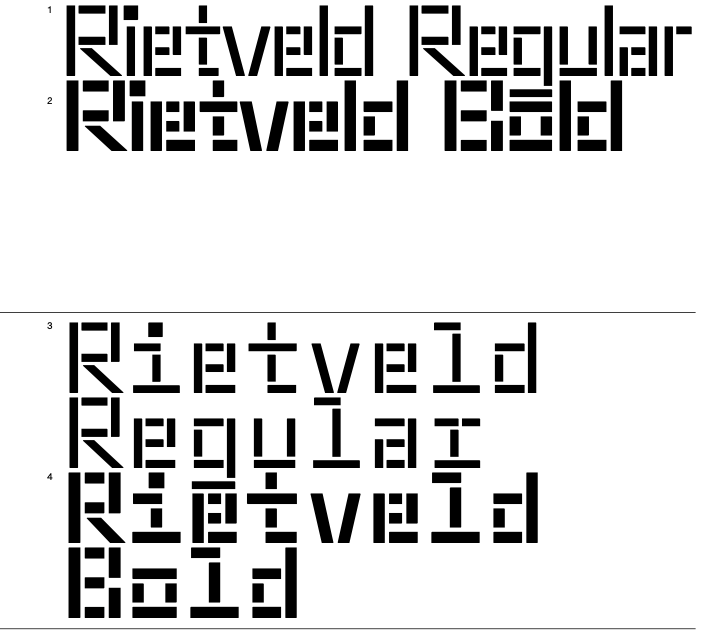
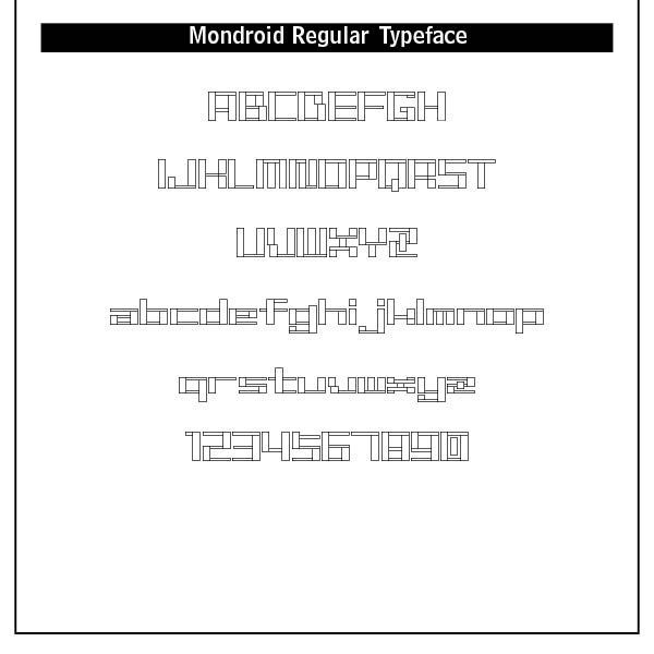
Rietveld Fatface (2007, Dries Wiewauters) and SM Maxeville (2017, Soft Machine) also flow from De Stijl. SM Maxeville is a sans-serif typeface designed in 2017 by Dutch designer Mark Niemeijer. The design was inspired by the De Stijl art movement and features distinctive, quirky forms such as the vertical tail on the y and the oversized square dots on the i. This neo-grotesk typeface family with geometric properties is available in a regular style as well as a constructed stencil cut style, each with matching italics. There are 14 styles and 2 weights available from SM Foundry, a digital type foundry in Apeldoorn, the Netherlands.(www.s-m.nu). Gerrit Rietveld was an architect and furniture designer who combined minimalist structure with dynamic use of color and space.
The danger of De Stijl in its rejection of nature-based forms or figuration, diagonal lines, curved forms, ornamentation and emotional or symbolic expression was that it laid the groundwork for modernist design principles, particularly in graphic design, furniture, architecture and typography. In divorcing the individual “particular” from the abstract “universal” it dichotomized them, creating a modernistic rift between faith and reason. The Christian theologian and philosopher, Christopher Watkin, in his Biblical Critical Theory discusses this aberration —
"Whereas modernity dichotomizes the universal and the particular, with the result that the universal becomes abstract and disembodied and the particular becomes of only local interest and useful only as a means for accessing the universal, the Bible diagonalizes that false dichotomy and brings the particular and the universal into harmony. The calling of Abram [Genesis 12:1–3] is “a particularistic means towards a universalistic end. . . God’s promise is realized not in the movement away from Abram’s particularity to an abstract absolute devoid of all specific traits but in the incorporation of particular Abram in a promise made to all particular people in their particularity. The universal comes down into the local without destroying its particularity."[5]
Interestingly, De Stijl as a typographical and art movement began to fracture in the late 1920s over ideological and aesthetic disagreements between Mondrian and van Doesburg. Van Doesburg’s death in 1931 effectively marked the end of De Stijl as a cohesive movement.
But, is De Stijl “beautiful?” In one sense, it fit the turbulent and desperate times after World War 1, seeking to give some order and uniformity to a fractured and war torn society. As we noted in our definitions of typographical beauty, “beauty is discerned via objective properties such as proportion, unity, variety, symmetry, harmony, intricacy, delicacy, simplicity, or suggestiveness." Something beautiful is “appropriate” in some way to the overall expression of it. In borrowing a radically foreign philosophy or theology, De Stijl’s rejection of nature-based forms with its diagonal lines and emotional or symbolic expressions forsook beauty.
True beauty needs to be purposeful in that it shows the creative purpose of God among humankind. Adoption of De Stijl theosophy rejected a personal God-given order in the world, injecting a humanistic autonomous view of culture and art.
Notes
1. See the previous chapter on Pre-Victorian Beauty, 41ff.
2. See Art Nouveau Beauty, 85ff.
3. See The Beauty of Constructivism, 117ff and Swiss Type Beauty, 147ff.
4. Piet Mondrian (1872-1944), Neo-Plasticism: The General Principle of Plastic Equivalence, found in https://art1010student.blog.brooklyn.edu/files/2018/01/Mondrian_Neo_Plasticism.pdf.
5. Christopher Watkin. Biblical Critical Theory: How the Bible’s Unfolding Story Makes Sense of Modern Life and Culture (Zondervan Academic, 2022, Kindle Edition), 233-234.