Gutenberg Bible
Aldine Anchor Mark
St. Albans Printers Mark
Aristotle Greek Italics
Aldus Italic Sample
Pre-Victorian Beauty
“His [Gutenberg] sense of duty to his convictions was manifested in his boundless faith in the ultimate success of his inventions; his courage was dauntless; no difficulties could deter him from following the path he was resolved upon pursuing; his diligence was unwearied; his perseverance indomitable.”
(Wimpheling, a German educator and theologian, 1450–1528 )
TYPOGRAPHY FROM THE fifteenth century to the early nineteenth century saw the evolution of type from a tool for reproducing manuscripts to a refined art form tied to Renaissance humanism, Enlightenment rationality and early industrial needs. Gutenberg’s moveable type printing around 1450 revolutionized written communication.
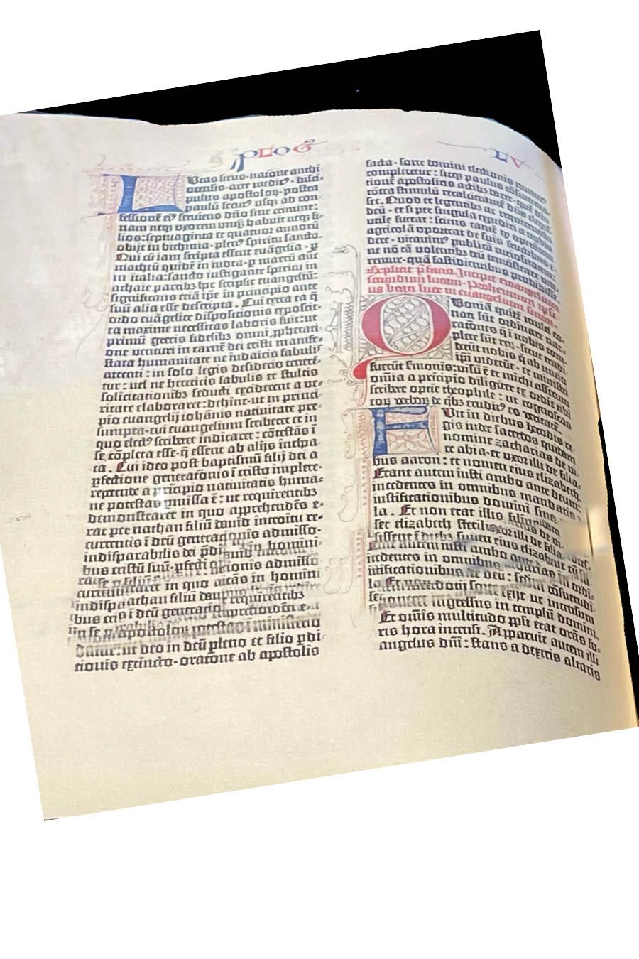
The Gutenberg Bible in 1455 used textura quadrata, a dense, angular type that suited the religious and scholarly tone of the time. The script which originated in northern France, gave the entire page a look like textured patterns with the sharp-cornered letters.
Textura is usually counted as “gothic” script or “blackletter.” The opening letter of this chapter is a version of textura quadrata. It endured until the end of the sixteenth century. Around 1400, nearly all books in Europe were in textura handwriting, and so, Gutenberg’s first movable type was based on this form. Wynken de Worde brought a textura font to England in 1480. Some Old English typefaces of the nineteenth century are sometimes based on this form. The massive Zwolle Bible written in textura took twelve years to complete (1464–1476) with more than 1700 leaves measuring 530 x 390 mm, in six volumes.
Blackletter Type
The use of blackletter fonts in academic and religious contexts dates back to the medieval period and is deeply tied to the history of early European universities. Fonts like Fraktur, Textura, and Gothic were the norm in the academic and religious world until the rise of modern typefaces in the eighteenth and nineteenth centuries. Even today, many universities, particularly in Germany and England, continue to incorporate elements of blackletter design into their official documents, crests, and seals.
The Blackletter typeface style, often associated with the gothic or medieval period, has a fascinating history in the context of religious institutions. The term “University” in relation to blackletter fonts typically refers to the use of these fonts in academic and religious contexts during the Middle Ages, and later in formal academic environments where tradition, authority, and history are emphasized. The most notable “University” blackletter fonts are linked to the old European universities and have been used in documents, manuscripts, and crests.
What Is Blackletter? Blackletter, also known as Gothic script, emerged in Western Europe around the twelfth century, during the medieval period. It was the dominant script used for writing and printing for several centuries, particularly in manuscripts produced by monks in monasteries. Blackletter fonts are distinguished by their sharp, angular strokes, tightly spaced letters, and intricate designs, which made them both highly decorative and somewhat difficult to read. The style was heavily influenced by the insular script, a form of handwriting that evolved in the British Isles, as well as by the Carolingian minuscule used in the Holy Roman Empire.
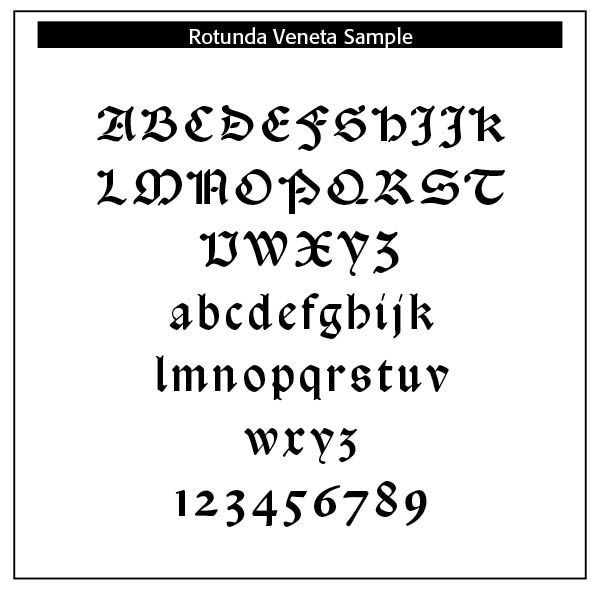
Three types of Blackletter typefaces were commonly used — Fraktur, Textura, and Rotunda.
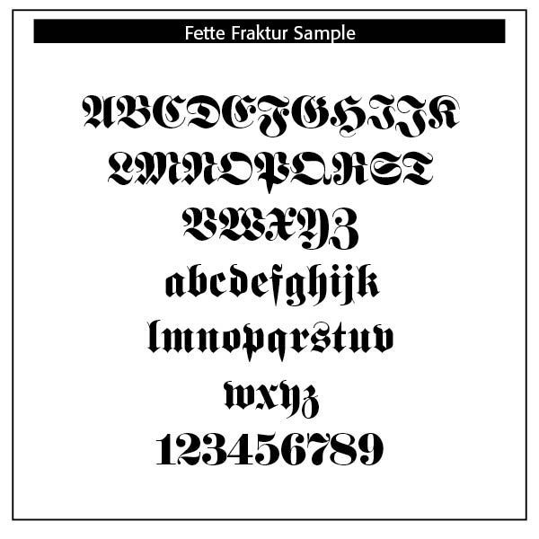
Fraktur, notably Fette Fraktur. A bold and heavy version of Fraktur, was commonly used in German-speaking countries for official academic, legal, and religious documents. Fraktur is one of the most iconic forms of blackletter, developed in the early sixteenth century by the German printer Johan Gutenberg and later popularized by German printing traditions. This specific style of blackletter was used extensively in Germany, especially in academic works, religious texts, and printed books. Many German universities, such as Heidelberg University, adopted Fraktur fonts for their academic works, titles, and official documentation. The use of Fraktur in these contexts emphasized a strong link to the medieval scholastic tradition.
This font is one of the most used broken letter fonts today. The lower case letters have a gothic character with only the ornamental flourishes making them broken letters, while the capital letters are more characteristic of broken letter typefaces. One could say Fette Fraktur is a true mix of styles, not unusual for typefaces created at the turn of the nineteenth century.[1]
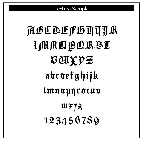
Textura, namely Gutenberg Textura, originated around the fourteenth and fifteenth centuries in Northern Europe, particularly in the Low Countries and Germany. This style was used extensively in manuscripts and printed books, and became one of the most prominent typefaces during the Gutenberg era. The Textura style is closely associated with medieval illuminated manuscripts, which were commonly used by universities, particularly in the University of Paris and Oxford University, to preserve important religious and scholarly texts.
Rotunda. Riccardo Olocco provides us some interesting insights to this blackletter typeface —
"An early expression of rotunda was the so called Littera Bononiensis, a hand developed at Bologna University and soon employed at the University of Padua and elsewhere in northern Italy. At the time Bologna was the major European centre of manuscript production for works of canon and civil law and it is noteworthy that as many as 139 scribes were recorded in Bologna just for the years 1265–1268. Canon and civil law were subjects that had to be mastered by ecclesiastics, notaries and anyone in charge of public offices all over Europe; thus rotunda script was well-known in northern Europe since the thirteenth century.
Rotunda shows important differences from Textura. They both display bold letters, with short ascenders and descenders and a high contrast between thick and thin strokes (‘shading’, to use the palaeographer’s term). But unlike textura, rotunda letters can be rather wide — they lack textura’s compactness — and have curves in the bowls (b, c, d, e, h, o, p, q and s), though some angularity is often found in letters a and g. Finally, in rotunda there is no sign of the typical gothic treatment of the feet of the letters, the diamond-shaped terminals that are found at the baseline of textura letters.
The earliest known rotunda type is the big face, suitable for headings and titles, employed by Ulrich Han in Rome from 1467 onwards (Han 150G, c. 21 pt). The earliest book set entirely in rotunda was a treatise on canon law printed by Vindelinus de Spira in 1471, Panormitanus’s Lectura super primo et secundo Decretalium. The text was set in Spira 99G (14 pt), the earliest known rotunda type for text, while the bigger Spira 200G (c. 28 pt) was used for headlines. Vindelinus had the right intuition: notaries and ecclesiastics who had to master civil and canon law had been used to reading books written in rotunda script for centuries. But in 1470–1473 some printers in Venice — including Spira himself — issued legal treatises in roman, the only type that was available at their presses. It was a miscalculation of the taste of the readers: evidently roman type was not what readers of legal books preferred because after 1474 legal textbooks or treatises were set in rotunda type.
It seems that after a few enthusiastic and confused early years, around the mid-1470s, the printers’ awareness of the market sharpened: probably — as Petrucci suggests — they looked more closely at the Italian book tradition which had already established different graphic models for each literary genre long before printing [Petrucci, pp. 144–145]. From that moment onwards, at least in Venice, the subject of the books defined its graphical aspect, notably the type in which the book was set. We have mentioned legal books, but in the following decades also religious (bibles, sermons, psalters, theological and devotional literature), scientific (including Aristotle and the scholastic philosophers) and many vernacular works were normally printed in rotunda type."[2]
But is blackletter “beautiful?” We are not asking, is it “pretty?” Rather, does it fit the marks of biblical beauty noted in Chapter One? Blackletter type is gratuitous in that it makes the Triune God available to the masses of the times. Instead of God’s revelation locked up in monasteries and only the favored few, everyone could now read the Bible in their own language, not merely ancient Latin.
Blackletter objectifies God in the sense that we have written revelation not obscure mystical teachings. Blackletter fails at typological differences, making it hard to read and decipher at times. Blackletter was desirable in the period in which it was used. Blackletter type certainly crossed geographical and language backgrounds in Europe and England and beyond. It was a boundary-crossing typeface. Lastly, blackletter was “fitting” for the times. It would be, of course, succeeded by more legible and elegant typefaces.
Printers’ Marks: The Crosses
Printers marks are symbols or logos that have been used as trademarks by early printers, starting in the fifteenth century. Before the introduction of copyrights, printers’ marks legitimized a printer’s work. Copyright legislation would not be introduced until the eighteenth century.
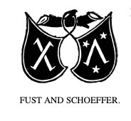
Such marks usually appeared on the last page of a printed work. The first known mark can be found on the Mainz Psalter, produced by Johann Fust and Peter Schoeffer in 1457 (See Example below). This mark depicted two shields bearing a saltire, a diagonal cross and a chevron surrounded by three stars. At the outset these were marks of the printer, but the practice was gradually adopted by publishers.[3]
In early works, a statement at the end listed the date of completion and the location. Sometimes the name of the printer or scribe or their initials were included. In printing and typography this is called a colophon, derived from the Greek word κολοφών, meaning summit, or finishing touch. The printer’s mark was added and gradually moved to the title page of the book.
The earliest marks were simple designs produced by using a woodcut stamp. Maggie Patton, in her excellent introduction to printers’ marks, notes that —
"the design of a printer’s mark used visual puns, wordplay or sometimes a rebus, a puzzle combining illustrations and letters to depict a motto or printer’s initials. Sacred symbols, the cross and the orb, real and mythical animals, heraldic symbols, and scientific instruments were used in thousands of combinations. The sixteenth century was the high point for printers’ marks, when lavish illustrations incorporating a printer’s mark decorated title pages.
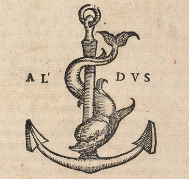
Many famous images and symbols originate from printers’ marks. The design used by Venetian printer Aldus Manutius depicts a dolphin wrapped around an anchor. The printer’s mark used by French printer Robert Estienne shows a man standing by an olive tree, symbolising the tree of knowledge. Christophe Plantin, in Antwerp, used a pair of compasses held by a hand extending from a bank of clouds, the compass points signifying labour and constancy.[4]
An extensive work on printers’ marks written by William Roberts in 1893 (Printers’ Marks: A Chapter in the History of Typography) showcases a number of printers through the centuries and their trademarks. His work has been reproduced by Project Gutenberg as an eBook.[5]
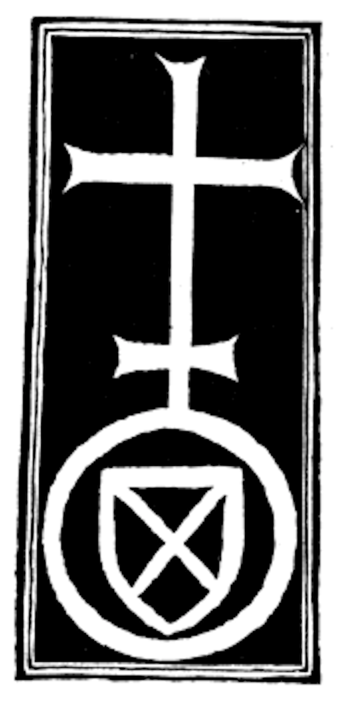
There is an extensive use of the symbol of a cross on many of the earliest printers’ marks. In researching and digitally reproducing these marks, as a typographer and theologian, I find Roberts’ discussion of this phase of printers’ marks unfortunate and demeaning.
He says that “there are many points which will forever remain in the region of doubt and obscurity. Tradition is proverbially difficult to eradicate; and all the glamour which surrounds the history of the Cross, and which found expression in, among other popular books, the Legenda Aurea, maintained all its pristine force and attractiveness down to the end of the sixteenth century. The invention of printing and the gradual enlightenment of mankind did much in reducing these legends into their proper place.”[6]
He goes on to question the marks with these words —
"Why at the extreme top of the cross is the lateral line formed into a sort of triangular four? Why, without this inexplicable sign, has the cross a number of cyphers, two, or even three, cross-bars? Why should the tail of the cypher 4 itself be traversed by one or sometimes two perpendicular bars which themselves would appear to form another cross of another kind? Why, among the ornamental accessories, do certain species of stars form several crosses, entangled or isolated? Why, at the base of the cross is the V duplicated?” All these are problems which it would be exceedingly difficult to solve with satisfaction."[7]
In my own study and exploration of these cross marks, what I have found is that the symbolism of the cross at the top with a globe and initials at the bottom indicated a humble submission to the Lordship of Jesus Christ over the earth and its inhabitants, inclusive of the printers themselves. Many of these symbols were crafted by religious men who, instead of capitulating to the times, wanted to express their faith stance for all to see. A carefully crafted redrawing of many of these cross printers’ marks, has been made available by CARE Typography as a typeface.
Thus, the cross mark, as Roberts has to point out, is “a very striking proof of what M. Delalain calls la persistance de la croix. It has appeared in all forms and in almost every conceivable shape. Its presence may be taken as indicating a deference and a submission to, as well as a respect for, the Christian religion, and M. Delalain is of the opinion that the sign “eu pour origine l’affliation à une confrérie religieuse.”[8]
The earliest printer’s mark by Fust and Schoeffer in 1457 indicated a diagonal cross. It was placed as a colophon at the end of the Psalter printing, the second work of Gutenberg. The Somachi Fathers operated a press, being a Catholic Order founded for men in Italy in the sixteenth century. Providing staff for boys’ homes and serving ninety-five parishes, as well as other ministries, their printer’s mark signaled a devotion to the Cross.
John Siberch (1476–1554) was the first Cambridge printer and an associate of Erasmus. He had links with some of the key figures in North European printing and book selling and, in turn, formed connections with leading theologians and scholars like Erasmus. Wikipedia notes that Siberch knew “the authors, translators and dedicatees who comprised many of the major contemporary figures of church, state and academia, including bishops John Fisher of Rochester and Nicholas West of Ely, Richard Pace, Secretary of State to Henry VIII, the royal physician Thomas Linacre and, above all, the great humanist scholar Desiderius Erasmus and his circle, while the books touched upon significant issues of the day, such as religious reform and the new humanist learning.”[9]
The St Alban’s Press was the third printing press established in England in 1479 as part of the Benedictine Monastery of St Albans, clearly a religious establishment that promoted the Cross as central to their printing. Erhart Oglin was a German printer focusing on printing music. In 1512 he was the first printer in Germany to produce “a printed sheet music, the Deutsche Liederbuch , which contains 43 German sacred and secular songs as well as six Latin songs.”[10]
Juan Rosenbach was a Spanish printer whose printer’s mark can be seen in the Library of Congress today. The evident Cross stands over a sacred “h” perhaps referencing ancient Horus.[11]
Bernardino Giolito de Ferrari, known as Stagnino, used at least three printers’ marks with variations —
"The device employed most often is reproduced here from his edition of the Roman missal, printed April 7, 1511: the letter B is enclosed within a heart, surmounted by a cross; the staff of the cross pierces the letter S. While the letters B and S presumably identify the printer, an alternate device shows the figure of St. Bernardino of Siena (1380-1444), an Observant Franciscan friar, with similar initials. Stagnino’s mark represented the saint with the IS monogram and three cast-off miters, symbolizing the three bishoprics he rejected in order to continue preaching his popular sermons against Catholic heresy and immorality."[12]
Indeed, a profoundly religious use of the mark.
The mark of Hercules Nani, with the Cross, above three hills or mountains, may imply meditation and heavenly communion —
The Mountains of Myrrh and the Hills of Frankincense, to which the writer of the Song of Solomon says he will retreat, are ideally the same as those ‘silver mountains’ over which, according to Sir Walter Raleigh, ‘My soul, like quiet palmer/ Travelleth towards the land of heaven.’ Among the Jews the three-peaked Mount Olivet was esteemed to be holy, and accounted to be the residence of the Deity.[13]
The point here is that this printer’s mark indicates much more than a mere cultural convenience or capitulation to the period.
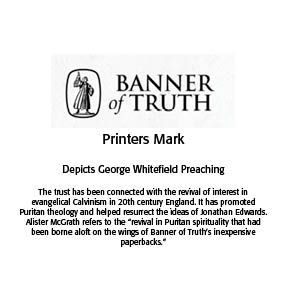
Modern uses of printers’ marks continue, with the example below of the Banner of Truth Trust. The Banner printer’s mark has a deeply religious meaning and message. Often these marks are on the copyright or title page of the book today. They may also adorn the cover of such books.
CARE Typography has meticulously digitized these marks and made them available as a typeface for your use. They are public domain images, free to use with the attribution — “Digitized by CARE Typography, 2024.”
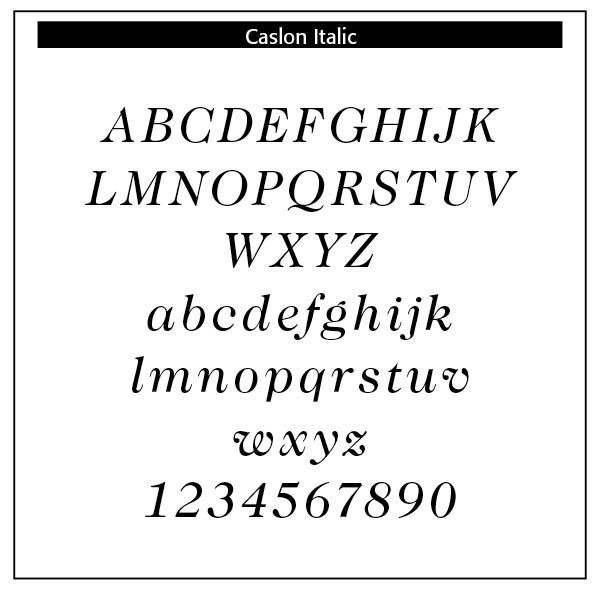
Italics
Typography historically received its most valuable improvements from the printers of Italy giving us three text-letters of greatest usefulness: (1) the Roman typeface, first founded by Sweinheym and Pannartz in 1465, and afterward perfected by Jenson at Venice in 1471; (2) Italic, and (3) Small Capitals, introduced together by Aldus Manutius at Venice.. The first volume entirely in Greek was printed at Milan in 1476, and the first book entirely in Hebrew, at Soncino in 1488.
The transition from Gothic to Italic typefaces was part of the broader evolution of typography that took place during the Renaissance period, driven by shifts in cultural, aesthetic, and technological factors. Gothic script was primarily used for religious texts, legal documents, and early printed books like the Gutenberg Bible. It symbolized tradition, formality, and authority.
Along with Blackletter and roman type, italics has served as one of the major typefaces in the history of Western typography. Italic takes notable influences from hand drawn calligraphy, with italic letters normally slanted slightly to the right. Upper case letters may have typographic swashes, flourishes inspired by ornate calligraphy. The name “italic” comes from their Italian use, to replace documents traditionally written in a hand-written style called chancery hand. Italic typefaces are defined by their slanted, cursive-like appearance, with letters that have a flowing, dynamic quality. It allowed for more text to be fitted on the page and mimicked the handwriting style of humanist scholars, like the handwriting of Petrarch.
The Renaissance, beginning in Italy in the fourteenth century, marked a revival of classical antiquity and a move toward humanism. This brought a renewed interest in the legible, flowing scripts of Roman and Greek antiquity, which were more readable and aesthetically simple compared to Gothic lettering. The development of the printing press by Johannes Gutenberg created a need for more versatile and legible typefaces. The emerging humanist values aligned with a preference for typefaces that resembled the clear, round, and graceful writing of ancient Roman scripts.
The Italic typeface was introduced by Aldus Manutius in Venice around 1501. Aldus Manutius (ca. 1450–1515), a native of Bassiano, Italy, was a scholar and teacher for whom printing represented a further means of disseminating classical languages and literature. Establishing a press in Venice in 1494, Aldus printed Greek and Latin classics as well as the works of contemporary writers, including immigrant scholars from Thessalonica and Constantinople.
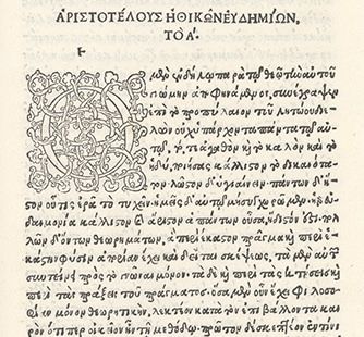
Aldus published the editio princeps of the complete works of Aristotle in five volumes between 1495 and 1498, the last volume of which is held by Bridwell Library. It was the largest work to be printed in Greek since the beginning of printing with moveable type in Europe. Each section opens with an elaborate woodcut initial and decorative headpiece.
The Aldine Press produced nine comedies of Aristophanes in 1498, and Pietro Bembo edited Petrarch’s poems that Manutius published in July 1501. In addition to editing Greek manuscripts, Manutius corrected and improved texts originally published in Florence, Rome, and Milan.[14]
Aldus was the first to suggest the printing of a polyglot Bible, a Bible with multiple versions. However, the first polyglot work ever printed was a Psalter, the literary work of Augustin Justinian, a Corsican bishop, of eight columns, each a different translation in Genoa, Italy in 1516. His typefaces were all designed and cut by the brilliant Francesco Griffo, a punchcutter who created the first roman type cut from study of classical Roman capitals. Type designs based on work used by Aldus Manutius include Bembo and Poliphilus.
Italic type was not only more elegant than the Gothic but also more efficient in terms of space. It became the preferred choice for printed texts that emphasized classical learning, philosophy, poetry, and humanist literature. Italic was initially used for entire texts but later became more common for emphasis (such as book titles, headings, or foreign phrases) alongside Roman type.
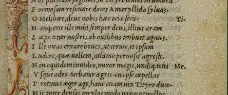
While modern italics are often more condensed than roman types, historian Harry Carter describes Manutius’ italic as about the same width as roman type. To replicate handwriting, Griffo cut at least sixty-five tied letters (ligatures) in the Aldine Dante and Virgil of 1501. Italic typefaces of the following century used varying but reduced numbers of ligatures.
Manutius sought to create more compressed elegant typefaces that could fit more text on a page, catering to the rising demand for smaller, portable books. Italic was based on the handwriting of Niccolò de’ Niccoli, a Renaissance scholar and calligrapher. The common italic “slope” was introduced in the sixteenth century —
The first printer known to have used them was Johann or Johannes Singriener in Vienna in 1524, and the practice spread to Germany, France and Belgium. Particularly influential in the switch to sloped capitals as a general practice was Robert Granjon, a prolific and extremely precise French punchcutter particularly renowned for his skill in cutting italics. Vervliet comments that among punchcutters in France “the main name associated with the change is Granjon’s.[15]
Note that the italic face used in Aldus’ Virgil of 1501 is separated from the small Roman caps on the margins. Here we have a demonstration of how the ancient italic face was duly distinct from time-honored regular type. It is also a demonstration that entire texts, not just words or captions or call-outs, were written and printed in all italics.
The insertion of an italic typeface alongside a roman face would wait until later to distinguish portions of a book not properly belonging to the work, such as introductions, prefaces, indexes, and notes, with the text itself being in Roman. Later, it was used in the text for quotations, and finally served the double part of emphasizing certain words.
It is not easy to fix the period at which the Roman and Italic became united and interdependent. Very few English works occur printed wholly in Italic, and there seems little doubt that before the close of the sixteenth century the founders cast Roman and Italic together as one fount. The Italic has undergone fewer marked changes than the Roman. Indeed, in many of the early foundries, and till a later date, one face of Italic served for two or more Romans of the same body. We find the same Italic side by side with a broad-faced Roman in one book, and a lean-faced in another. Frequently the same face is made to serve not only for its correct body, but for the bodies next above or below it, so that we may find an Italic of the Brevier face cast respectively on Brevier, Bourgeois, and Minion bodies.
This admixture of italic with Roman faces was noticeable. Chief variation would have been the capital letters and the long-tailed letters of the lower case. Due to Dutch influence the way was paved to the formal, tidy italics of a Caslon. The reform of the long “f” and its combinations is usually credited to John Bell, who discarded the long “f” in his British Theatre, about 1791. In 1749 Ames had done the same thing in his Typographical Antiquities and was labelled an eccentric.
Robert Bringhurst notes that —
"Early italic fonts had only modest slope and were designed to be used with upright roman capitals. There are some beautiful fifteenth-century manuscript italics with no slope whatsoever, and some excellent typographic versions, old and new, that slope as little as 2° or 3°. Yet others slope as much as 20°. . . . Renaissance italics were designed for continuous reading, and modern italics based on similar principles tend to have similar virtues. Baroque and Neoclassical italics were designed to serve as secondary faces only, and are best left in that role. Sloped romans, as a general rule, are even more devotedly subsidiary faces. Their slope makes sense only as a temporary perturbation of the upright roman."[16]
The characteristics of the Renaissance italic letter can be summarized as follows[17]
• stems vertical or of fairly even slope, not exceeding 10 degrees
• bowls generally elliptical
• light, modulated stroke
• humanist axis (slanted axis)
Italic typefaces were originally used separate from the roman face. In fact, Aldus wedded the italic face with small roman capitals in his Virgil of 1501 as noted. The custom of combining italic and roman in the same line “using italic to emphasize individual words and mark classes of information, developed late in the sixteenth century and flowered in the seventeenth. Baroque typographers liked the extra activity this mixing of fonts gave to the page, and the convention proved so useful that no subsequent change of taste has ever driven it entirely away. Modulation between roman and italic is now a basic and routine typographical technique, much the same as modulation in music between major and minor keys.”[18]
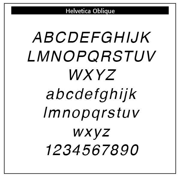
Many so-called italics are not true italics but rather sloped romans, as is the case in the sample Helvetica. Sloped romans as italics have wider lettering than their roman counterparts. Baroque and Neoclassical italics serve as secondary faces only. Sloped romans are even more subsidiary faces. It should be pointed out that a sloped roman is not a true italic at all, just a roman with a slope.
The English Neoclassical face Baskerville has a rationalist axis (straight up and down). Helvetica has seen a number of recent revisions. Times Roman is an historical pastiche drawn by Victor Lardent for Stanley Morison in London in 1931. Bringhurst notes that “The roman has a humanist axis but Mannerist proportions, Baroque weight, and a sharp, Neoclassical finish. The italic has a rationalist axis, but in other respects it matches point for point the eclecticism of the roman.”[19]
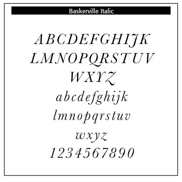
Italic Beauty
One of the most beautiful italic typefaces is Baskerville. Designed in 1757 by John Baskerville in Birmingham, England, Baskerville Italic demonstrates the outstanding qualities of harmony, precision and readability. “At a time when books in England were generally printed to a low standard, using typefaces of conservative design, Baskerville sought to offer books created to higher-quality methods of printing than any before, using carefully made, level presses, a high quality of ink and very smooth paper pressed after printing to a glazed, gleaming finish.”[20]
Such details included many of the intricate details of his italic, such as the flourishes on the capital N and entering stroke at top left of the italic ‘p’. He had clearly considered the topic of ideal letterforms for many years, since a slate carved in his early career offering his services cutting tombstones, believed to date from around 1730, is partly cut in lettering very similar to his typefaces of the 1750s.The result was a typeface cut by Handy to Baskerville’s specifications that reflected Baskerville’s ideals of perfection.[21]
He was much admired, notably by Pierre Simon Fournier, Giambattista Bodoni and Benjamin Franklin, who wrote him a letter praising his work.
The Wikipedia article on Baskerville notes that he was a truly original artist. He struck out a new method of printing in this country and may be considered as the founder of that luxuriant style of typography which at present so generally prevails; and which seems to have attained perfection in the neatness of Whittingham, the elegance of Bulmer and the splendour of Bensley.[22]
Italics use today range from emphasis (He is the only person here.) or stress in speech to titles of works, including books, albums, plays, movies or periodicals. While an underscore or quotes are often substitutes for italics, the desire is to use true italics whenever possible. The names of ships (The Titanic), foreign words (Homo sapiens), newspapers and magazines (New York Times and The Atlantic), defining terms, especially technical terms, algebraic symbols (the answer is x=2), mathematical constants and gene names in biology use italics. Italics are used in comics, and older writings use italics like in the King James Version of the Bible to de-emphasize words that have no equivalent in the original text but are necessary in the English translation (God saw the light, that it was good). Mentioning a word as an example of a word uses italics (The word the is an article)
As Enlightenment thinking grew, typography became more refined, rational, and mathematically structured. Transitional typefaces, like those by John Baskerville (1750s), bridged the gap between Old Style and Modern type. Features included greater contrast between thick and thin strokes, more vertical stress, and sharper serifs. Baskerville also revolutionized printing with smoother paper and better ink, enhancing typographic precision. The type reflected the values of the time—order, legibility, and refinement over expression or mass-market appeal.
Pre-Victorian typography evolved from the dense, calligraphic blackletter of the fifteenth century to the rational elegance of modern serifs by the early nineteenth century. It was shaped by Renaissance learning, Enlightenment rationalism, and the craft of fine printing, with typefaces designed for books, religious texts, and elite communication. The era laid the intellectual and technical groundwork for the display-heavy, mass-market typography explosion of the Victorian period. (ChatGPT)
Notes
1. Comments from Linotype Design Studio, myfonts.com.
2. Riccardo Olocco, “Notes on the rotunda types of the Renaissance,” CAST, June 23, 2020.
3. Why red? Robert Bringhurst, among others, points out that “in scribal and typographical tradition alike, where the budget permits, versals too are generally red or another color in preference to black.” (The Elements of Typographic Style (Hartley & Marks, 1992 edition), 61. However, too much red in setting text was normally frowned upon — “A recent number of the “Art Age,” in an elaborate review of the use of red ink, says, among other pertinent things, that the mistake most frequently made is in introducing red inappropriately in masses where it is neither ornamental nor part of the general composition.” (Charles Thomas Jacobi, The Printers Handbook of Trade Recipes, Hints, & Suggestions Relating to Letterpress and Lithographic Printing, Bookbinding, Stationery engraving, etc. with Many Useful Tables and An Index (London: The Chiswick Press, 1891)
4. Maggie Patton, “The Printer’s Mark: That Curious Penguin on the Spine of Your Favorite Paperback Isn’t There Just for Decoration,” Openbook, Autumn 2022.
5. William Roberts, The Project Gutenberg Ebook of Printers’ Marks, June 1, 2008, Ebook #25663, from inages made available by The Internet Archive.
6. Roberts, pp. 24–26
7. Ibid.
8. “the persistence of the cross;” “originated from affiliation with a religious brotherhood” quoted by Roberts, 24.
9. https://en.wikipedia.org/wiki/John_Siberch
10. https://de.wikipedia.org/wiki/Erhart_Öglin
11. Harold Bayley, The Lost Language of Symbolism: An Inquiry Into the Origin of Certain Letters. Words, Names, Fairy Tales, Folklore, Etc., 1912, p. 161, from Internet Archive Books.
12. Library Quarterly Information, Community, Policy, Vol. 83, No 1, pp. 39–41, The University of Chicago, 2023.
13. Bayley, Lost Language of Symbolism, 35.
14. https://bridwell.omeka.net/exhibits/show/earlygreek/classics/firstaristotle
15. Wikipedia on Italic Type at https://en.wikipedia.org/wiki/Italic_type
16. Robert Bringhurst, The Elements of Typographic Style (Hartley & Marks, 1992 edition), 54–56.
17. From Bringhurst, 114.
18. Bringhurst, 54–56.
19. Bringhurst, 93.
20. https://en.wikipedia.org/wiki/Baskerville
21. Ibid
22. Ibid