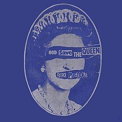
Album cover of God Save the Queen” by
Sex Pistols
Punk Type
“Then punk appeared and completely broke the rule book. It was shocking compared to everything else that was happening.”
(Sarah Hyndman)
RUB DOWN, HURRY UP LETRASET type was all the rage in Punk typography and artistry. Popular type faces that were used in Punk typography were the common Courier, Times, Time Bold Italic, Poplar (which is what this versal is in) and Helvetica Condensed, all available on rub down transfer sheets of the 1970s.
Punk type borrowed from Dada, Constructivism and situationist thinking, particularly in its use of cut-up text and ransom-note styling. Rejecting the grid systems of modernist design, Punk embraced disorder, distortion and noise. It was hand-made, urgent and gritty, sometimes illegible and always confrontational. It was fueled by do-it-yourself (DIY)ethics, anti-authoritarianism and the desire for disruption norms.
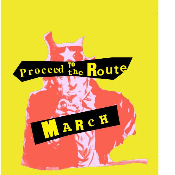
In the sample above, created by Adobe InDesign and using various standard fonts, with individual letters singly placed, we have a background poster of Uncle Sam’s World War Two call to arms, now quite distressed and used to promote a demonstration of sorts. The random placed type note is not all the same typeface, and the positioning looks like a child did this with cut up lettering. That’s the point of Punk. And Punk done rapidly with a clashing and obnoxious breaking out of any sort of grid.
In an interview of the typographer and designer Sarah Hyndman in London in 2016, she described the DIY sense of Punk typography this way — “There was no style– it’s all the types that were being used in the 1970s, but ripped up and mashed together in a mismatching way, then thrown back down on a page with felt tip scribbles. There was definitely no attention to kerning or leading. The theme that runs through is just this DIY immediacy.”[1] She goes on to say
It was completely new and innovative but there have been a few times in history where type has been ripped out of the grid and spilled across pages quite loosely and emotionally, such as the Dadaist and Futurist periods. But whereas before, revolutionary graphic posters would have had quite aesthetically beautiful typefaces, with punk it was clashing and obnoxious.[2]
Punk type was often printed at home using stick on Letraset or similar sheets of letters, or just cut up type from newspapers or magazines, or even just felt tipped pens to hand draw the type, and then plastered on walls, telephone poles and record shops. Flyers used cut-and-paste lettering, photocopied images, and handwritten text to announce shows quickly and cheaply. The typography mirrored the raw and confrontation mood of the 1970s.
A key designer of punk art was Jamie Reed who created iconic designs for the punk band, the Sex Pistols, with the song God Save The Queen, released during Queen Elizabeth II’s Silver Jubilee in 1977.[3] Reed, true to form, was also involved in direct action campaigns including the poll tax, Clause 28 and the Criminal Justice Bill in England. Reed was an avowed Druid.
Punk typography was anti-design by design. Breaking every rule of traditional typography, it reflected the urgency, anger and raw energy of the punk movement. Created with scissors, glue, typewriters and xerox machines, it made chaos a language of resistance and turned rough, messy type into a powerful voice for cultural dissent (ChatGPT). Punk typography paved the way for post-modern graphic design, influencing designers like David Carson and the grunge aesthetic of the 1990s.
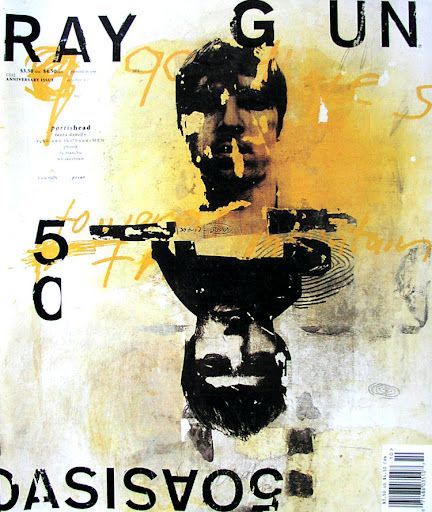
David Carson became a leading figure in post-modern graphic design. Trained as a sociologist and a professional surfer, Carson drew inspiration from surf culture, skateboarding, and an understanding of texture and movement in composition. He is most famous for his editorial design for magazines like Ray Gun (1992–1995), where layouts and typesetting challenge traditional magazine grid structures and pure functionality.[4]
Such typography also inspired later subcultures like hardcore, riot grrl, and DIY zine culture. Hardcore subcultural operates with a strong “us against the world” feeling, a lifestyle that abstains from alcohol, drugs and sometimes casual sex, and often aligns with ant-fascism, anti-capitalism, environmentalism and social justice campaigns.
Riot Grrl is a feminist punk movement that arose in the early 1990s predominantly in Olympia, Washington, Washington, D.C. and the Pacific Northwest. This, of course, was a defiant, DIY (Do-It-Yourself) response to the male dominated punk rock scene. It created space for women, queers and non-binary people.
DIY zine (pronounced “zeen”) is a self-publishing movement that emphasizes the values of punk typography. Zines are photocopies, handcrafted pamphlets or magazines outside the mainstream media. This is not a business venture, just a form of expression. Like Riot Grrl they can cover political activism and feminism. They also cover punk, metal, skate or comic-book culture.
Today punk type is often co-opted in fashion and advertising, though stripped of its rebellious roots.
Is Punk “beautiful” in our description? Obviously not. In fact, I would say that its “ugliness” typographically forces us to see God’s world in its desperate sin-ridden condition and the cross of Christ as its only answer. While this book is not meant as a theological treatise or evangelistic tract, typography like punk causes us not to overlook the depth and weight of the human sinful condition without the presence of God.
Notes
1. From an interview in the UK at https://www.designweek.co.uk/issues/24-30-october-2016/sarah-hyndman-punk-anti-helvetica/.
2. Ibid.
3. Information and graphics from Wikipedia at https://en.wikipedia.org/wiki/Jamie_Reid.
4. From ChatGPT about David Carson.