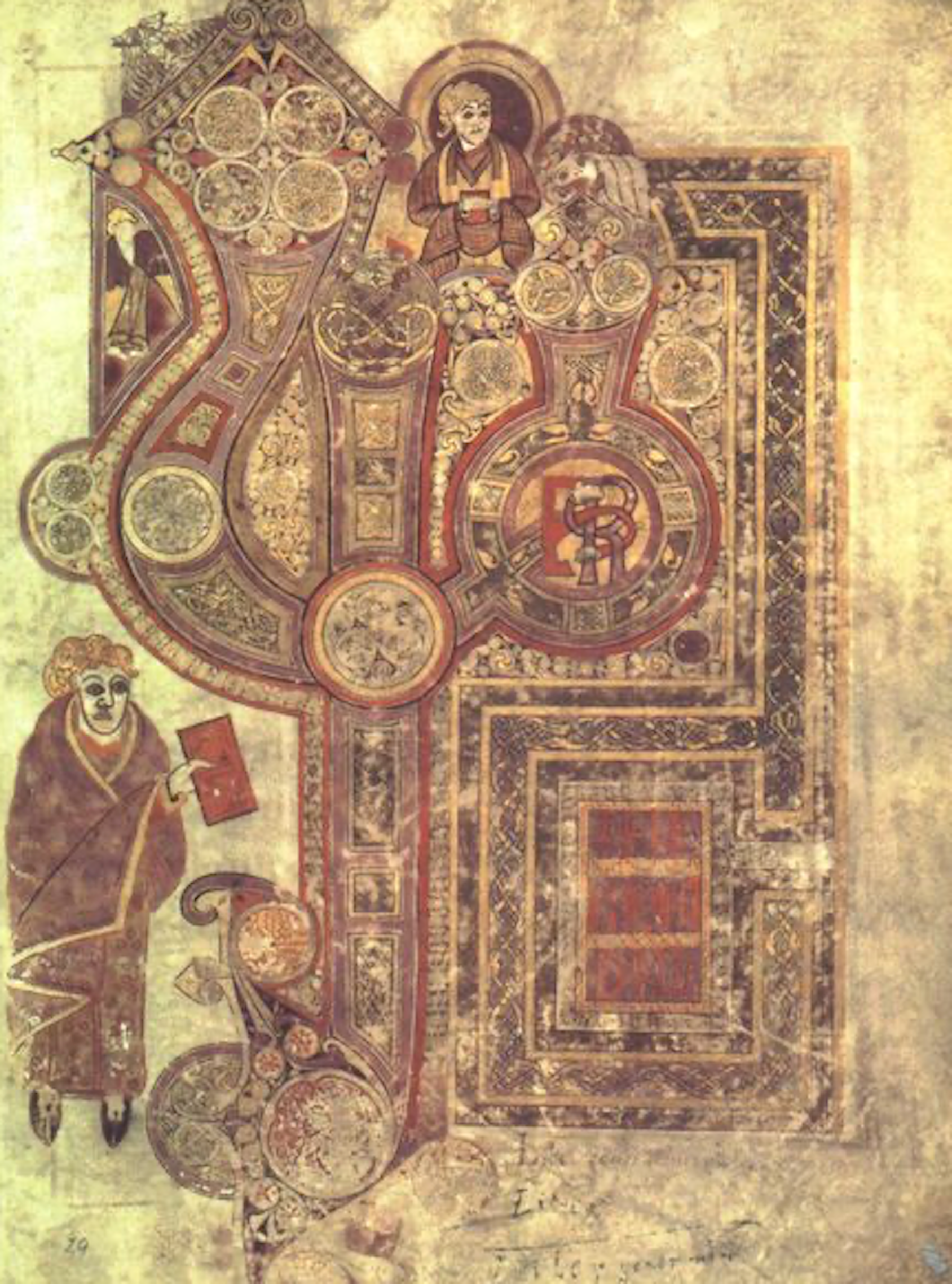
Kells Folio 29r
Incipid Matthew
(Wikipedia)
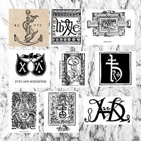
Selection of
Printers Marks
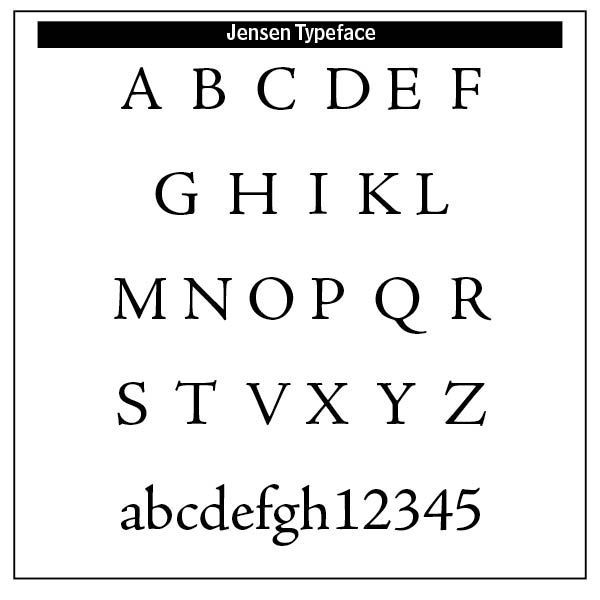
Sample Jensen Typeface
Typographic Beauty
“Type is one of the most eloquent means of expression in every epoch of style. Next to architecture, it gives the most characteristic portrait of a period and the most uncompromising testimony of a nation’s intellectual status.”
(Peter Behrens)
BEAUTY, ACCORDING TO JONATHAN KING, is “an intrinsic quality of things which, when perceived, pleases the mind by displaying a certain kind of fittingness.”[1] According to the Bible, such beauty flows from the presence of God — “One thing have I asked of the Lord, that will I seek after: that I may dwell in the house of the Lord all the days of my life, to gaze upon the beauty of the Lord and to inquire in his temple.” (Psalm 27:4)
Pierce Taylor Hibbs, a Senior Writer and Communications Specialist at Westminster Theological Seminary in Philadelphia, adds six descriptors to beauty.[2] Beauty is gratuitous, reflecting the eternal gratuity and self-giving of the Trinity. In a book about fonts and typeface development, this needs some explanation. There are three persons and one essence in what we call “God” — Father, Son and Holy Spirit. These three share one existence but act in three different ways to give meaning and life to people. For example, God the Father plans salvation. God the Son accomplishes salvation. God the Spirit applies salvation to the human race. God as Trinity reveals his purposeful plan in creation, including typeface development.
Beauty is objective, really there, not so much “in the eye of the beholder” as it is “before the eyes of the beholder.” Beauty is not first of all a subjective thing we feel but rather an objective truth we encounter.
Beauty involves both harmony or unity of expression as well as diversity, or the distinction between two or more things between which the harmony exists. Rather than being negatives, these distinctives help us distinguish one thing from another. Beauty is desirable, not in a possessive sense, but but rather in sharing it with others.
Beauty “goes across boundaries. Beauty doesn’t ‘stay in one lane.’ It goes across the barriers of tribe, tongue, and nation; it breaks through the borders of one culture’s preference and spills into others.”[3]
Then also, beauty is “fitting” according to Jonathan King in his The Beauty of the Lord. By this he means that “beauty is discerned via objective properties such as proportion, unity, variety, symmetry, harmony, intricacy, delicacy, simplicity, or suggestiveness.”[4] Something beautiful is “appropriate” in some way to the overall expression of it.
Beauty has divine purposefulness in it. God the Father, God the Son and God the Holy Spirit, the Trinity, have a comprehensive purpose with both reference to themselves and to creation. “Every purpose in existence, from a stone in a stream to the Son on a cross, emerges from the Trinity.”[5]
What all of this has to do with typography is apparent to typographers and the craft of making typefaces. Early on in the history of typology, scribes painstakingly making letters and books with quill and pen meticulously did so mostly for the glory of God. Many of these early typographers were religious monks or scribes working tirelessly not for profit or adulation but for God. Such care can be shown in lavish, hand-decorated Bibles such as the Lindisfarne Gospels of the eighth century and Gutenberg’s predecessors in the fourteenth century.
The Book of Kells is a copy of the Gospels written in the seventeenth century. It is notable because of the excellence of its decoration, the endless variety of initial letters, and the careful lettering. This was probably produced in the monastery of Kells, founded by St. Colombo. In such manuscripts, what is notable is the gold, red and blue lettering. Irish and English book artists gave us, along with their famous illumination, insular script admitting cursive features as ascenders (b, d, f, h, l), descenders (f, g, p, q) and the connections between letters.
William Skeen in his 1872 Early Typography celebrated what he called “The Art Sublime” referring to typography and its use for divine illumination
It is Divine, inasmuch as it is one of the grand instruments in the hands of Providence for the regeneration of fallen humanity. By it the mightiest movement the world has ever seen since the days when the Apostolic Twelve went about “turning it upside down,” — the Great Reformation of the Sixteenth century, — was mainly effected. Without it the Word of God could not have been diffused, as it has been, is being, and will continue to be, to every nation and tribe and people and tongue throughout the world.”[6]
During the pre-Victorian age of Gutenberg, book publishers used what are called printers marks. Many of these marks were used before copyrights were established to identify and legitimize a printer’s work. Many of these marks were designed to indicate a humble submission to the Lordship of Jesus Christ over the earth and its inhabitants, inclusive of the printers themselves. Many of these symbols were crafted by religious men who, instead of capitulating to the times, wanted to express their faith stance for all to see.
The gratuitous nature of beauty is inescapable in these early days of printing and typography. The central place of the cross and the visual displays of these printers and early typographers demonstrated a knowledge of and submission to the Triune God.
Enlightenment thinking in typography became more refined, rational and mathematically structured. Typefaces became more legible and elegant. Jenson’s Roman type emphasized balanced proportions, clear serifs and harmony, all still influential today. Such refinements illustrated the “fitting” or objective properties of beauty.
The ornamentation of the Victorian period laid the groundwork for modern graphic design. Type became a visual art form in its own right. In the Art Nouveau period letters had curvilinear, elegant and stylized forms. Text was often hand-drawn as part of the overall artwork. Alfons Maria Mucha (1860–1939) produced illustrations, advertisements and decorative panels as a devoutly religious mystic —
"I had not found any real satisfaction in my old kind of work. I saw that my way was to be found elsewhere, little bit higher. I sought a way to spread the light which reached further into even the darkest corners. I didn’t have to look for very long. The Pater Noster (Lord’s Prayer): why not give the words a pictorial expression?"[7]
A growing departure from the “fittingness” of beauty came from the movement called Dadaism, an avant-garde movement in the early twentieth century. World War 1 had scarred the world, destroying early utopian dreams and birthing a deeply growing skepticism toward authority and conventional typography. Meaning was derived from form, not syntax. Performance and phonetics triumphed over readability. Disruption, questioning and rejection of normal typographical standards assaulted beauty’s standards and convictions. Such thinking laid the groundwork for surrealism, situationism and punk graphic design.[8]
However, beauty’s revelational nature came through with Constructivism’s clarity and efficiency of mathematical visual language. While this movement emphasized utility, there was a fusion of abstract form with communicative clarity. Large scale lettering, banners and spatial typography promoted socialist ideals. Constructivist typology influenced modernist graphic design in the Bauhaus, Swiss design (International Typographic Style) movements.
The standardization of different sizes and weights of type with standardized paper sizes laid the groundwork for more beautiful type by Jan Tschichold (1902–1974). Constructivism’s legacy endures in the clarity, structure, and purpose-driven design that define much of modern typographical practice.
Bauhaus typography was treated as part of the spatial environment, functional and harmonized with its context. Its bold, sans-serif designs, strong diagonal lines and clear visual hierarchy communicated modernity, efficiency and social progress.
Adrian Frutiger (1928–2015), a Swiss typeface designer, influenced the direction of type design in the second half of the twentieth century. His career spanned the hot metal, phototypesetting and digital typesetting eras. His most famous designs, Univers, Frutiger and Avenir, are landmark sans-serif families for contemporary font design.
Most importantly for our purposes, Frutiger was a Calvinist who practiced the concepts of biblical beauty enumerated above. Fonts were designed to be legible, versatile, enabling consistent spacing, alignment and hierarchy, crucial for multilingual and complex layouts. Subway systems, airports and road signage often use Helvetica or Univers typefaces. Helvetica remains one of the most used (some would say overused) global typefaces today.
While anti-establishment psychedelic, punk and grunge typographies surfaced reflecting anger and chaos in language, creating typographical voices for cultural dissent, what remains in most of typography are the premises and concepts of biblical beauty. The next chapters examine these various typographical periods in the light of biblical beauty.
Notes
1. Pierce Taylor Hibbs, “Beauty Always Beckons,” Westminster Magazine (Vol. 5, Issue 2, Spring 2025), 28.
2. These descriptors are found in Hibbs article cited above, 25–33.
3. Ibid.
4. Quoted in Hibbs, 28.
5. Hibbs, 29.
6. William Skeen, Early Typography (Colombo: Ceylon, 1872), 12, 13.
7. https://en.wikipedia.org/wiki/Alphonse_Mucha.
8. Most of these typographical period summaries come from ChatGPT.