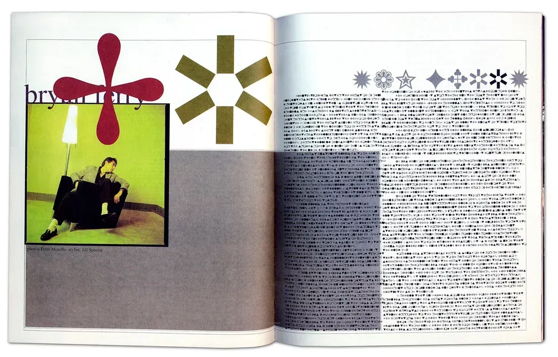
Ray Gun Interview with Bryan Ferry
Written entirely in Zapf Dingbats Font 1994
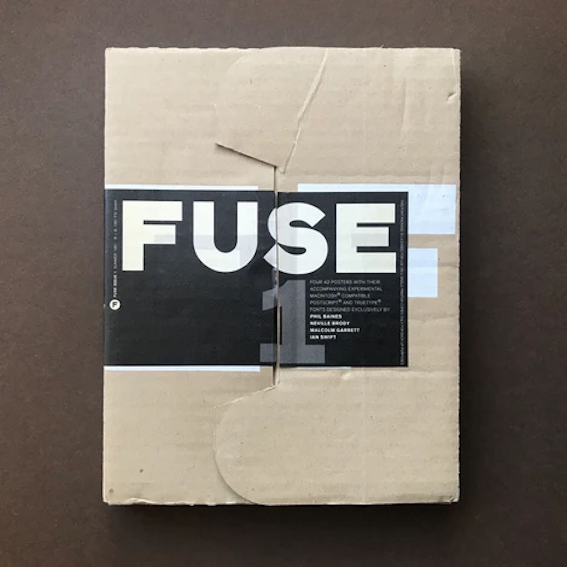
1991 Edition of FUSE Magazine
Grunge Type
“Grunge reflected a broader 1990s disillusionment with mainstream culture, perfectionism, and the sanitized aesthetics of the 1980s.”
(Chat GPT)
GRUNGE TYPOGRAPHY emerged in the early 1990s as a post-modern design trend. This type developed out of the Seattle music scene, from bands like Nirvana, Pearl Jam and Soundgarden. Deeply influenced by Punk and its underground culture, Grunge type reflected a broader 1990s disillusionment with mainstream culture, perfectionism, and the sanitized aesthetics of the late 1980s.
While Swiss typography emphasized clarity, objectivity, and overall beauty, grunge trumpeted texture, personality and imperfection. In fact the background to the pages of this chapter are purposefully “dirty,” providing a suitable backdrop to grunge type. Legibility was sacrificed to atmosphere and emotion, a rejection of commercial polish.
As noted in the previous chapter, David Carson, art director of Ray Gun magazine, was the most influential figure in grunge design. His layouts ignored typographic norms, using overlapping text, unconventional spacing and distressed fonts. Most of his work is shown on the covers of grunge inspired magazines, with a layering of photos and messy typography. Ray Gun magazine once published an interview with Bryan Ferry entirely in the symbol font Zapf Dingbats, unreadable but distinctive in appearance.
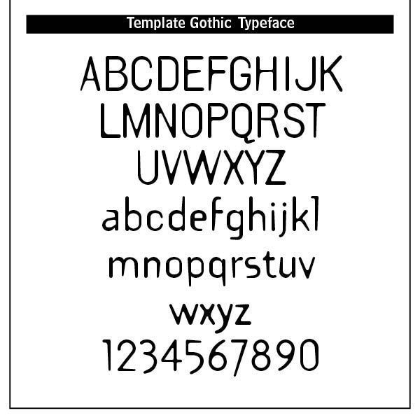
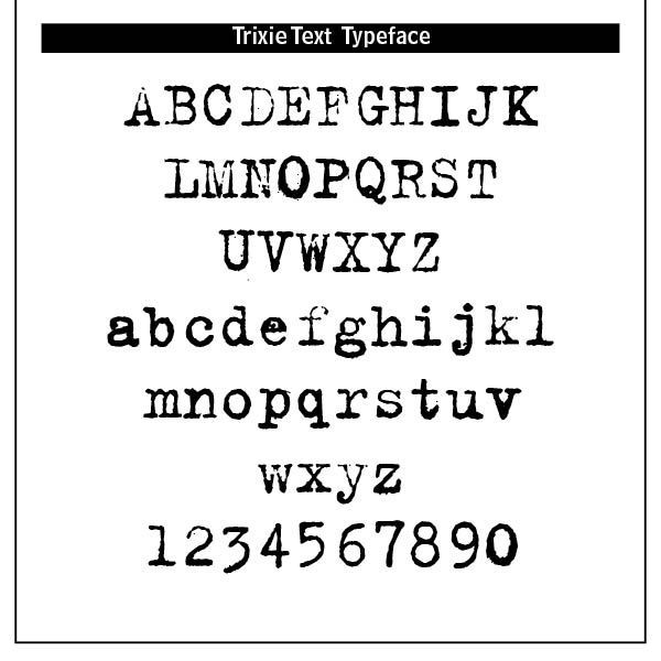
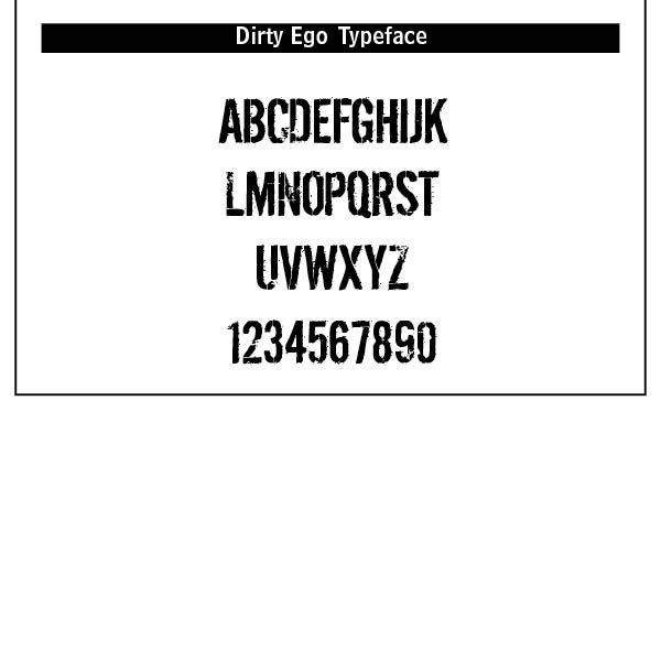
Distressed textured fonts with rough edges, eroded lines and smudges often make up grunge type. Layered, overlapping type that is difficult to read is a mark of grunge. Use of photocopier effects, handwriting and ripped, torn or splattered letterforms indicate grunge typography.
Designers like Neville Brody and Emigre magazine also pushed type’s boundaries. Neville Brody is an English graphic designer, typographer and art director. He is known for his work on The Face magazine (1981–1986) and Arena Magazine (1987–1990). Once Dean of the School of Communication at the Royal College of Art, London, he is now professor of communication.[1]
His typographical background was a comparison between Dadaism and pop art. He designed posters for student concerts at the college. He collaborated with Jon Wozencroft creating FUSE magazine in 1991.
Grunge typography reached its zenith with Ray Gun magazine, with 70 issues between 1992 and 2000. The monochrome or muted palettes, adding to the gritty, bleak mood and its shredded type appeared in grunge posters to signal rebellion, dirt and nonconformity. It fell out of mainstream usage by the late 2000s. However, grunge paved the way for handmade, experimental and anti-design approaches in digital typography. This type spoke directly to a generation that didn’t trust clean lines or polished surfaces.
Beautiful? No. Certainly not in a Christian context. Not even in a secular typographic setting of legibility, readability and proportionate spacing. However, grunge spoke volumes to a free-wheeling, post-Christian and post-modern generation looking for rebellious branding and kinky visceral type.
However, on a lighter note, I am reminded of the Charlie Brown character, Pigpen, who is a “human soil bank who raises a cloud of dust on a perfectly clean street and passes out gumdrops that are invariably black.” Some of us disdain characters such as Pigpen, but it is the Charlie Browns of the world who seek to help the Pigpens to fit in. Perhaps this is the more optimistic story of grunge typography.
Notes
1. From Wikipedia’s article on Neville Brody at https://en.wikipedia.org/wiki/Neville_Brody.
2. Charles M. Schulz’s comments on Pigpen at https://peanuts.fandom.com/wiki/%22Pig-Pen%22.