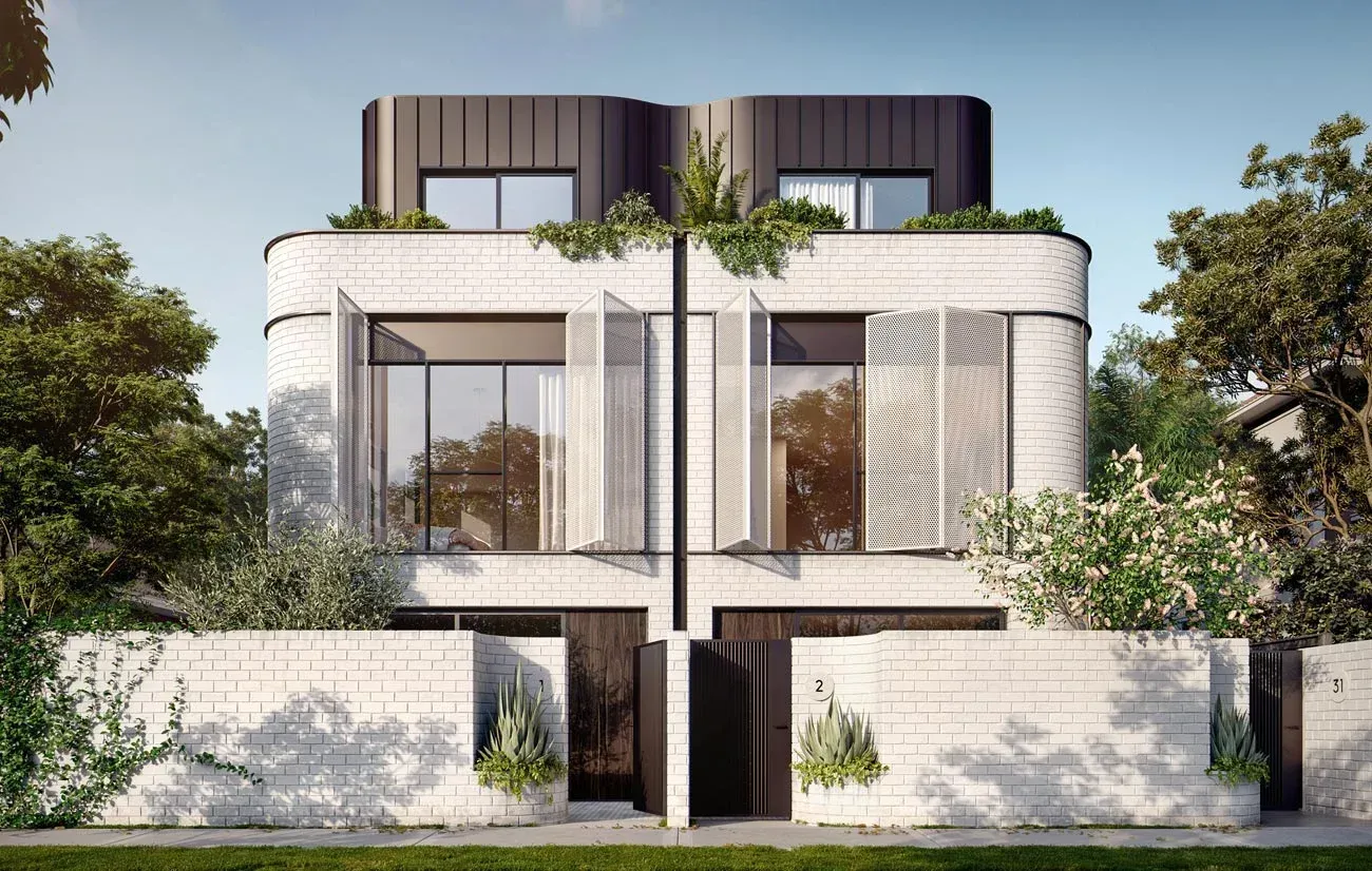
Cera Stribley Architects designed a series of eight, three storeyed townhouses in Melbourne in the Art Deco style architecture called Pine Ave.
Art Deco
Impressive Autonomy
“Sometimes we see that style and think ‘Great Gatsby.’ But last we checked, that’s one of the great novels of all time.”
(French and D’Andrade, The Type Project Book)
DRAMATIC, BOLD AND STYLISH typefaces in the Art Deco period mirrored the golden age of cinema. From the 1920s to the early 1940s, after World War One, this type and art style embraced elegance, ornamentation and stylization. Known initially as “le style moderne” or “Jazz Moderne,” the style received its current name in 1968. Art Deco originated in a time of intense aesthetic experimentation. Art movements such as the Bauhaus, Constructivism, Cubism, De Stijl, Futurism, Orphism, and Surrealism helped define the style’s inherent modernism.
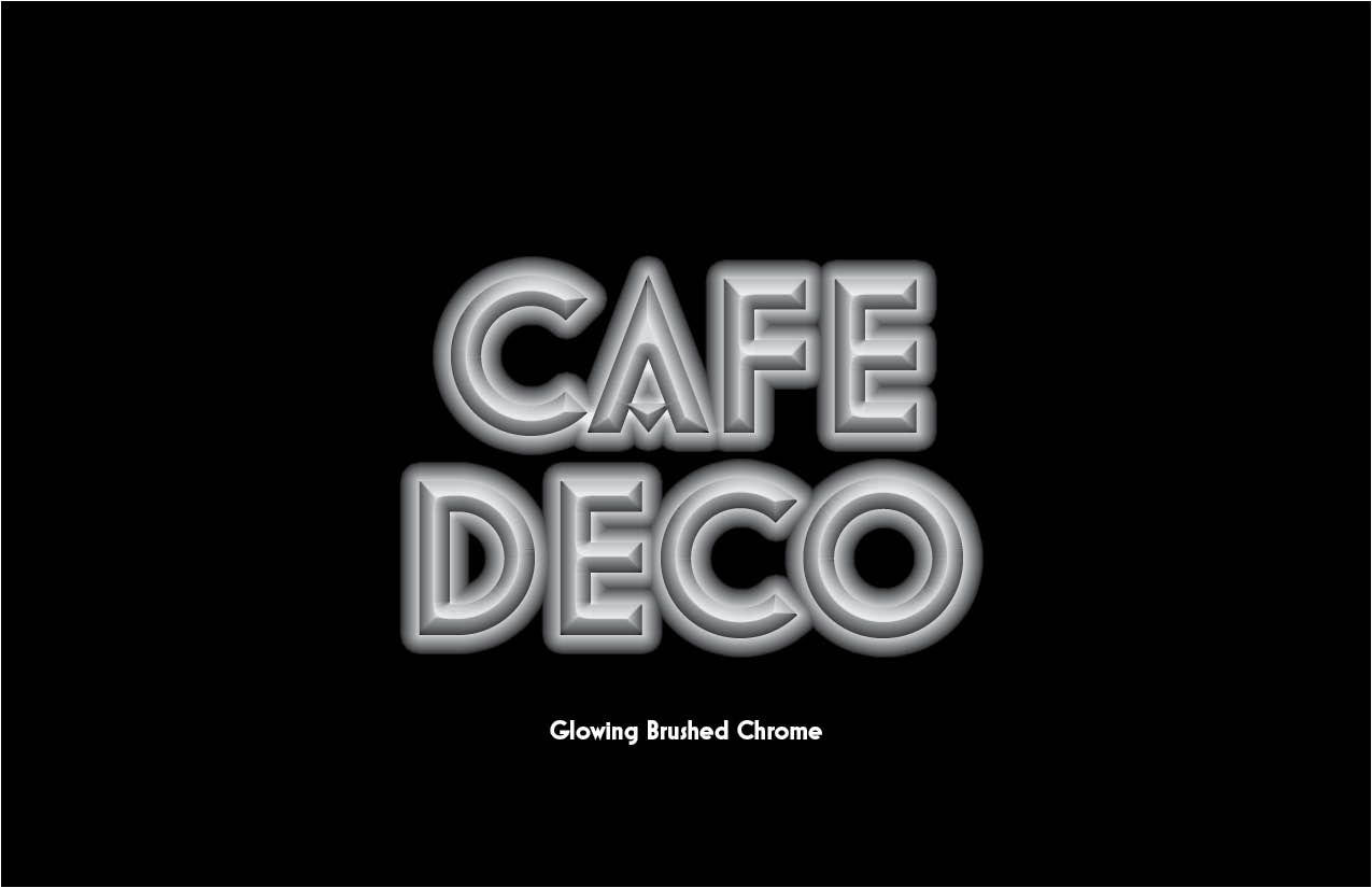
Many Art Deco typefaces were based on simple shapes, such as triangles, circles and rectangles, but combined into elegant, futuristic forms. It was the machine age gone glamorous. The of chrome, glass, neon and metallics in architecture and product design carried over into the look of display type, appearing sleek and shiny in print and signage.
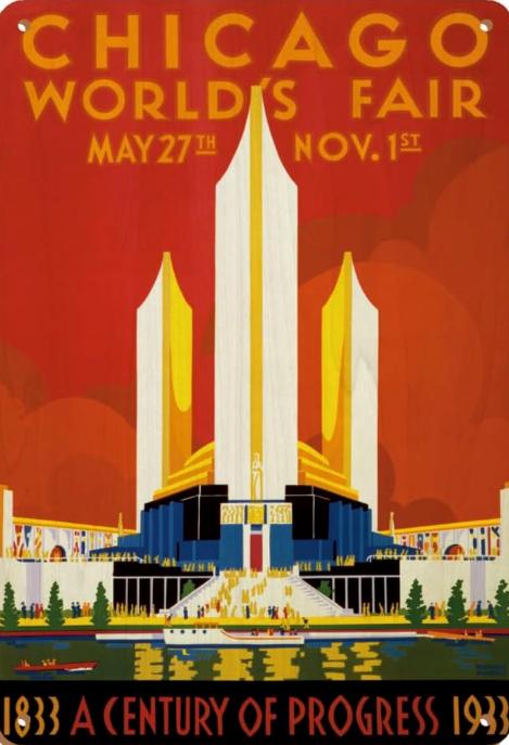
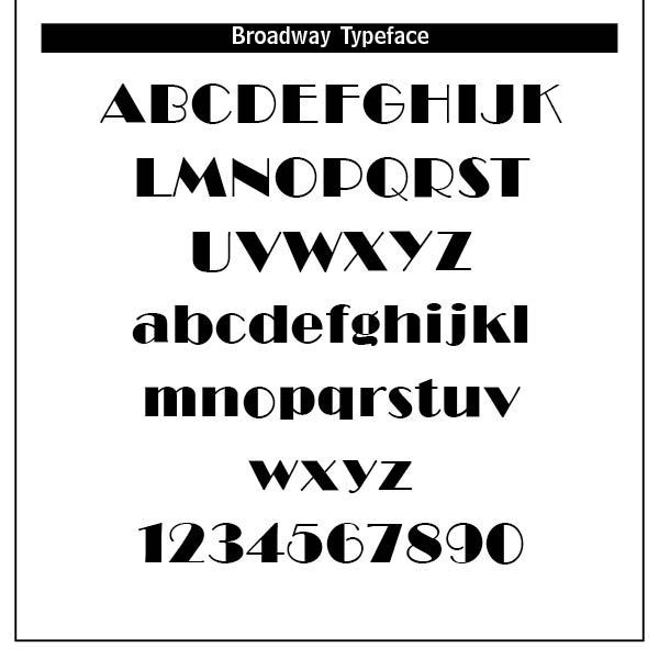
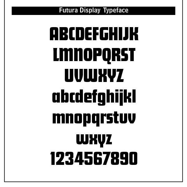
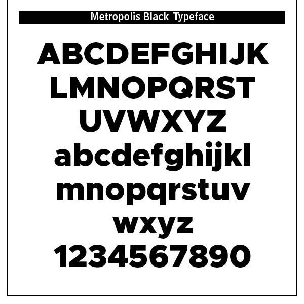
Art Deco marked the rise of display type — typefaces intended for large headings, signage, and advertising. Art Deco fonts like Broadway, Futura Display and Metropolis became iconic of the period. Note that the letterforms were stylized with angular, elongated lines, sharp corners, stepped forms and symmetrical embellishments. They were visually heavy, strong and yet, like the font Broadway, conveyed sophistication and style. Movie posters and theater marquees featured such typefaces.
Typography in the Art Deco period was ornamental, geometric and celebratory. It reflected the optimism, luxury and modernity of the interwar years, combining traditional craftsmanship with industrial precision. Art Deco was meant to dazzle — perfect for the jazz age, cinema, and the dawn of mass consumerism. (ChatGPT)
Art Deco and Theology
Art Deco’s philosophy can be summarized as modern life should be beautiful, sophisticated, energetic, and visually impressive. It combined modern technology with an appreciation for luxury and craftsmanship. Its major intellectual and artistic influences included Cubism in its geometric simplification and multiple viewpoints, Futurism in its drive for speed, machinery, movement, and technological progress, Constructivism in its strong geometry and structural organization, and De Stijl in its abstraction and geometric order. It also pirated from ancient Egyptian, Mayan, African and Near Eastern cultures and motifs. It was heavy into machine aesthetics — streamlined forms suggesting automobiles, ships, airplanes, and skyscrapers. Art Deco therefore wasn’t simply an abandonment of ornament. Instead, it modernized ornament.
Modern life deserves a modern visual language. They did not believe that modern technology should be represented using nineteenth-century visual conventions. The automobile should look modern. The train should look modern. The building should look modern. The typography should look modern. Geometry communicates modernity. Geometry becomes a vocabulary for the twentieth century. Art Deco did not merely tolerate technology. It aestheticized technology. Airplanes, trains, automobiles, radios, ocean liners, skyscrapers, electricity, and machinery became symbols of an exciting new civilization
Art Deco typography produced geometric letterforms, strong verticals and horizontals, circles, triangles, diamonds, and zigzags, exaggerated proportions, high contrast between thick and thin strokes, condensed and elongated letters, symmetrical compositions, decorative initials and display lettering, and stylized, sometimes futuristic alphabets. The typeface itself could become an architectural object.
Important examples and related designers include A. M. Cassandre, Robert Mallet-Stevens, and lettering associated with the Parisian Art Deco environment. Cassandre wasn’t primarily asking, “How can I make an avant-garde work of art?” He was asking, “How can avant-garde visual language make this commercial message more powerful?” That makes him an important bridge between fine art, advertising, typography, and commercial culture.
Cassandre’s typography embodies several Art Deco principles, namely
geometric construction, letters becoming architectural forms, strong verticals and horizontals, and extreme scale contrasts. A single enormous word can dominate the entire poster. Perspectively, letterforms can appear to recede or advance in space. Narrow lettering permits large words to occupy relatively small areas. Text and image cease to be separate categories. This approach influenced later display typography and advertising enormously.
Cassandre’s type designs—including Bifur, Acier, and Peignot—show his continuing interest in the relationship between typography and geometric form.
Did Art Deco reflect Christian ideals and God-centered typographical principles? One article from the New York Public Library gives suggestive context to this discussion when it states that “Art Deco design exemplified opulent consumption, crass commercialism, and the acceleration of contemporary life summed up in the Futurist credo ‘Speed is beauty.’”[1]
Rejection of tried and true typography sets it on a course of modernistic chaos, as was demonstrated by future typographical periods of psychedelic and grunge type. Theologically, Art Deco is all about us, all about autonomous humankind seeking our own expression of what we want, how we want it, and when we want it. It rejects submission to God’s way — “See to it that no one takes you captive by philosophy and empty deceit, according to human tradition, according to the elemental spirits of the world, and not according to Christ.” (Colossians 2:8) Moderation in all things is superceded by what is glitsy, fast, modern and ostentatious.
Art Deco was a reaction to the shattered utopian dreams from World War One. People went on a binge of sorts against regimentation and sacrifice with Art Deco. Art was now combined with the machine age with designs that incorporated chic elegance, eclectic historical and national imagery with the Machine Age into decorative effervescence. Beauty’s revelation of the presence of God is rebuffed in Art Deco.
A renewed interest in Art Deco surfaced in the 1970s thanks to the release of the 1974 film, The Great Gatsby. In the 1980s, the style also influenced the Italian avant-gardist Memphis Group, which caused another resurgence. The Paradiso Ibiza Art Hotel in Spain (2018) along with Pine Avenue Housing in Melbourne (2018) are tributes to the Art Deco movement.[2]
Art Deco demands to be noticed. Its use of geometric forms gives a unified expression but rejects ancient artistic differences. It clearly crosses international boundaries and breaks through the borders of traditional art. It is “fitting” in the sense that it reflects the opulence and commercialism and looseness of the times, energizing it with the benefits of Machine Age advancements. Its purpose was to dazzle, and it did that with impunity.
Notes
1. Article on Art Deco from New York Public Library at https://www.nypl.org/node/171023.
2. Saumya Verma, “The Revival of Art Deco: Evolution, Characteristics, Building Examples,” published by Novatr, July 5, 2023 in https://www.novatr.com/blog/art-deco-revival/#4.