
Bauhaus Beauty
“The Bauhaus was an art school in Germany that set out to combine crafts and fine art under the banner ‘form follows function.’”
(French and D’Andrade, The Type Project Book)
THE BAUHAUS was one of the most influential design schools of the twentieth century. Founded by Walter Gropius in Weimar, Germany in 1919, many of Europe’s leading artists and designers were on its faculty — Anni Albers, Josef Albers, Herbert Bayer, Max Bill, Marcel Breuer, Johannes Itten, Wassily Kandinsky, Paul Klee, Lazlo Moholy-Nagy, and Piet Mondrian to name a few. When the Nazis came to power in Germany, many of the staff emigrated to the United States to found the new Bauhaus in Chicago in 1937.
Sans-serif typefaces became the hallmark of Bauhaus typography. The clean, legible, geometric forms were modern, efficient and aligned with machine aesthetics. A leading typographer and organizer of Bauhaus was Herbert Bayer.
Herbert Bayer was an Austrian-American designer. After completing an apprenticeship in arts and crafts in Linz, Bayer enrolled at the Weimar Bauhaus from 1921 to 1924. Heavily influenced by Constructivism, as well as the painter Wassily Kandinsky, Bayer became the director of the Department of Typography and Advertising when the Bauhaus relocated to Dessau in 1925.
Dissatisfied with teaching, he moved to Berlin in 1928 where he set up a design studio. There, he created cutting-edge advertisements that were featured in popular magazines such as Vogue and covers for the monthly periodical Die neue Linie. Bayer immigrated to the United States in 1938 and became one of the most influential designers of the twentieth century at the Aspen Institute for Humanistic Studies. While at Aspen, Robert Anderson, founder and president of the Atlantic Richfield Company (ARCO) hired Bayer as a design consultant for his company. His work involved everything from designing buildings, interiors, corporate graphics, furnishings, and tapestries for various headquarters.[1]
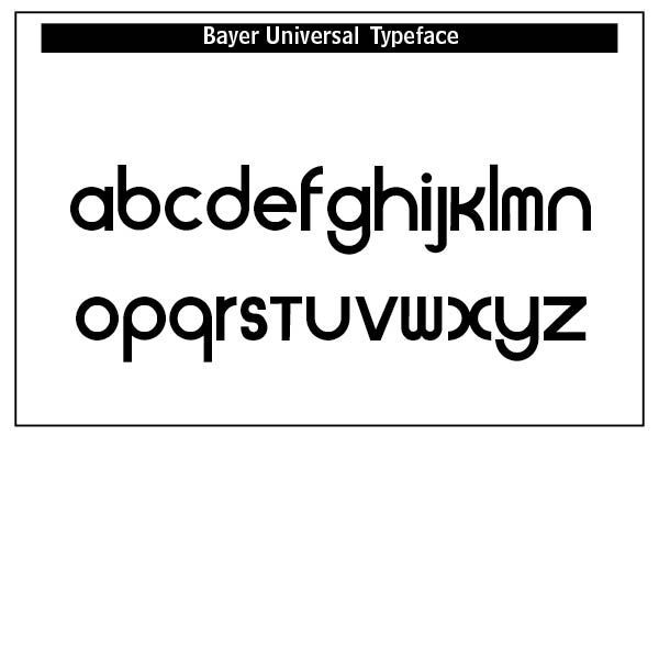
The Universal Typeface, 1925, was a geometric alphabet based on a bar and circle designed by Bayer. In rejecting the archaic and complicated gothic alphabet, Bayer abolished upper and lower case alphabets and replaced them with a single case. He renounced all suggestions of calligraphy.
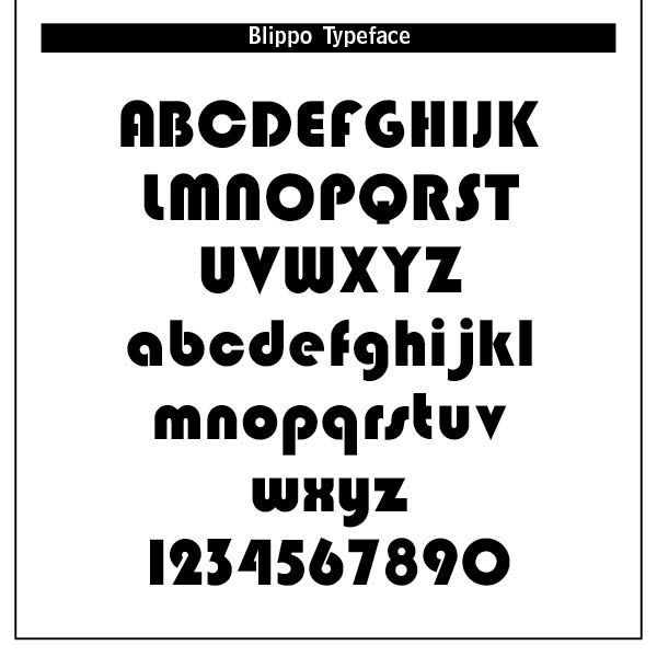
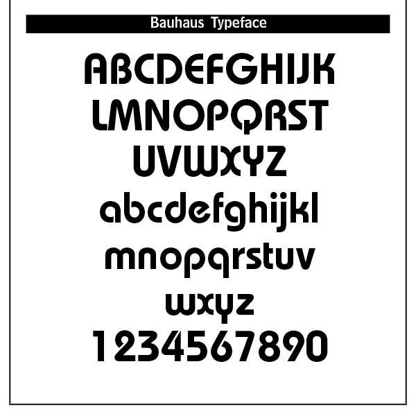
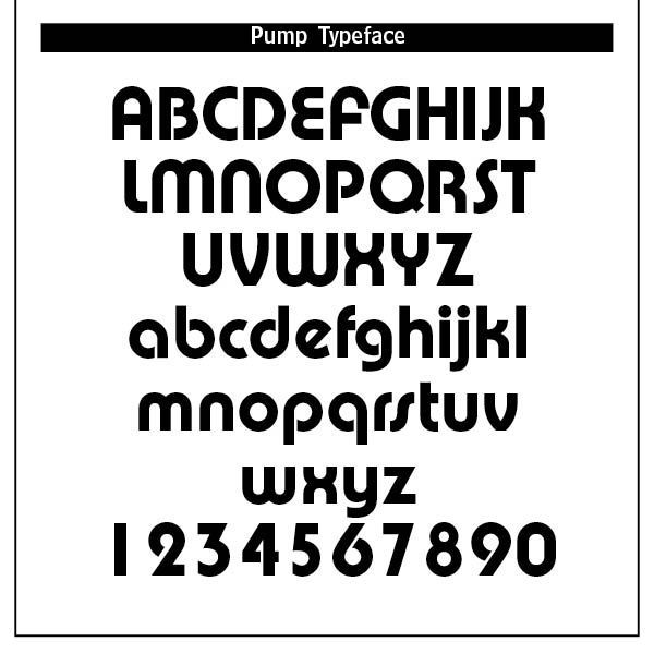
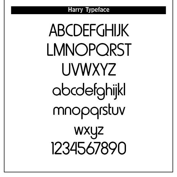
Other Bauhaus inspired type mostly from the late 1960s and early 1970s were typefaces like Harry (Mary Goldstein, 1960), Burko (David Burke, 1967), Blippo (Joe Tayor, 1969), Pump (Bob Newman, 1970), and Bauhaus (Ed Benguiat, 1969). The latter became ITC Bauhaus offered through Adobe type.
Adobe type is celebrating the 100 year anniversary of the Bauhaus type with Bauhaus samples of its own. Bauhaus, of course, is not limited to Bauhaus typography but includes craft, technology and design thinking. Bauhaus posters often featured bold, sans-serif type, strong diagonal lines and clear visual hierarchy. They communicated modernity, efficiency and social progress. The Bauhaus vision was also applied to industrial design of logos, packaging, branding and products.
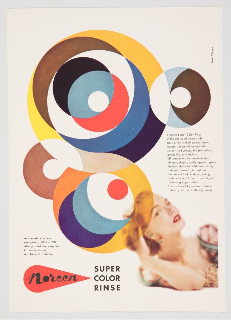
Wassily Kandinsky, one of the school’s founders, assigned the colors red, blue and yellow to the square, circle and triangle. A theoretical study of such colors and shapes was a major part of the curriculum. The “S” was particularly challenging in my Adobe InDesign program, as it is also in Adobe Illustrator, the suggested program to use.[2]
The Bauhaus typographic principles laid the foundation for the International Typographical Style (Swiss Style) and much of modern graphic design. The designer Josef Muller-Brockmann (1914–1996) was a pioneer of the International Typographic Style, with his simple designs and clean use of typography inspiring many graphic designers in the twenty-first century.[3] Bauhaus type aesthetics still influence UI/UX design and minimalist information design today.
Is Bauhaus beautiful typographically? Its clean lines, geometrically styled logos and posters, and crisp sans-serif type styles might suggest so. The evidence for a Christian based beauty of this style is as minimal as its minimalistic design standards. While unity and uniformity in type style is at the maximum, diversity is lacking in the type. Bauhaus clearly crossed all geographical and cultural barriers, setting the stage for later type worldwide.
We believe as Christians that the sovereign, objective God oversees and reveals creativity to all things so that nothing happens, including Bauhaus, by what is called pure contingency. Otherwise all creativity is lost in the swirl of chance, a place where anything and everything happens “just because,” violating the existence and meaning of everything —
"As the absolute and independent existence of God determines the derivative existence of the universe, so the absolute meaning that God has for himself implies that the meaning of every fact in the universe must be related to God."[4] And this includes The Bauhaus with its many designers and artists.
Notes
1. This summary taken from both https://thebayercenter.org/about-herbert-bayer/ and the Wikipedia article on Herbert Bayer.
2. Nigel French & Hugh D’Andrade, The Type Project Book: Typographic Projects to Sharpen Your Creative Skills & Diversify Your Portfolio (Pearson Education, Inc., 2021), 18–21.
3. From https://en.wikipedia.org/wiki/Josef_Müller-Brockmann.
4. Quote from Cornelius Van Til, philosopher and former professor, at Westminster Theological Seminary, Philadelphia, PA by Pierce Taylor Hibbs, “Beauty Always Beckons.” Westminster Magazine (Vol. 5, Issue 2, Spring 2025), 28.