Pre-Gutenberg Beauty
“Typography is the craft of endowing human language with a durable visible form, and thus with an independent existence. Its heartwood is calligraphy — the dance, on a tiny stage, of the living, speaking hand — and its roots reach into living soul, though its branches may be hung each year with new machines.”
(Robert Bringhurst)
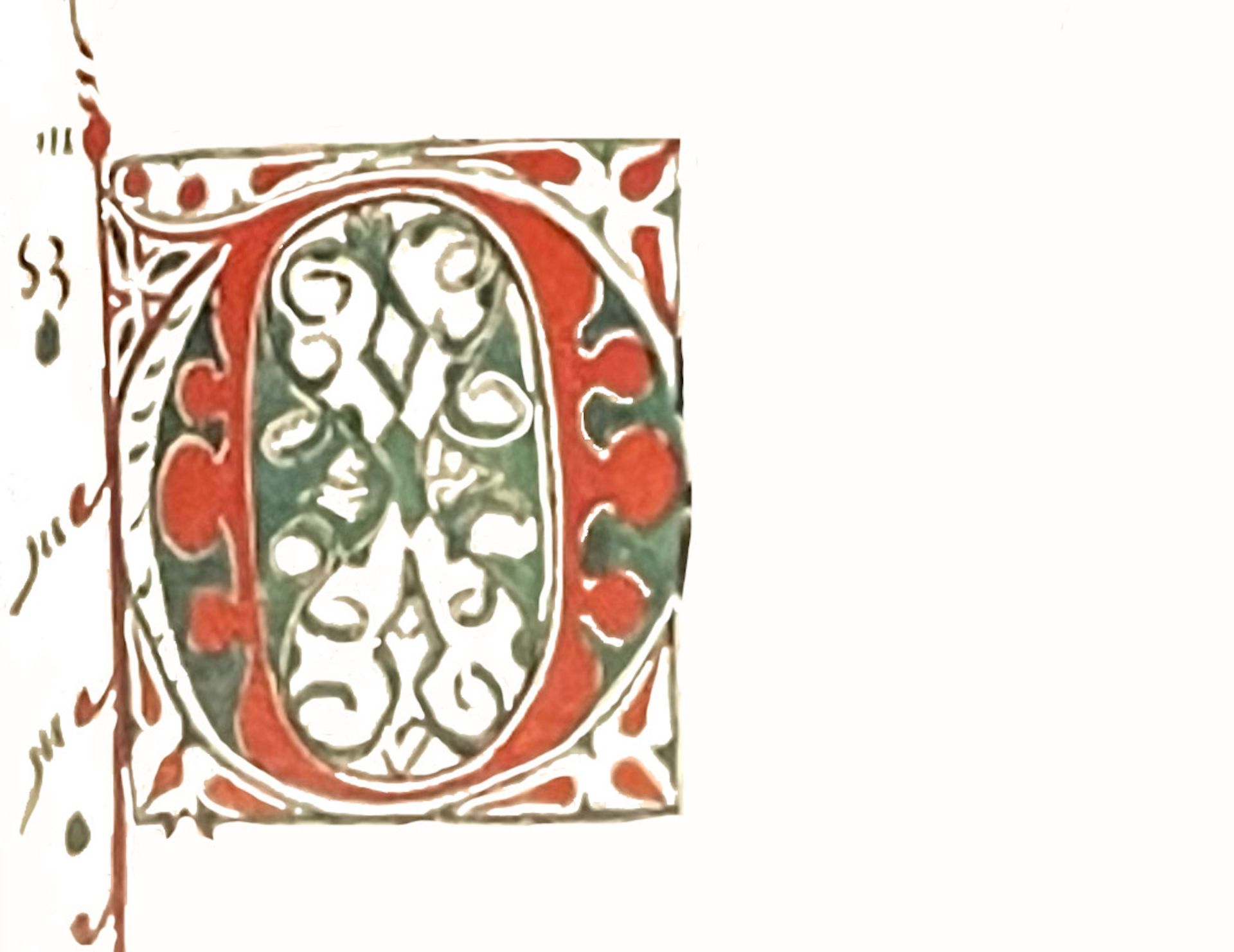
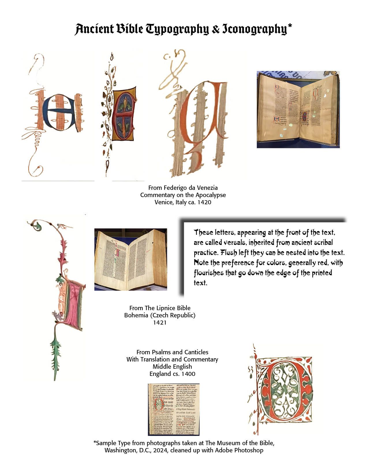
OF ALL PERIODS of typographic history, I must say that I am most fascinated with what is called the Manuscript Era (600 BC to 1450 AD). This era saw scribes meticulously handwriting manuscripts, using calligraphic scripts like Uncial. The fancy opening letter of this chapter is from Psalms and Canticles, With Translation and Commentary, Middle English, England, ca. 1400.[1] Illuminated manuscripts, decorated with ornate initials, illustrations and borders were created by gifted and skilled scribes and artists.
Insular script was a medieval script system originating in Ireland that spread to England and continental Europe under the influence of Irish Christianity. We had noted in the last chapter that beauty was “boundless” — “Beauty doesn’t ‘stay in one lane.’ It goes across the barriers of tribe, tongue, and nation; it breaks through the borders of one culture’s preference and spills into others.”[2]
Combined Irish and English book artists achieved the Insular half-uncial, based upon the standard uncial writing but admitting such cursive features as ascenders (b, d, f, h, l ), descenders ( f, g, p, q), and connections between letters. In more cursive form, another type of insular writing was developed at the end of the seventh century with possible connection to Roman models, made in primitive minuscule and not in semi-Uncial. It is called Insular Minuscule, characterized by “hatching” of letters, that is the use of closely spaced lines or strokes to create shading, texture, depth or tonal variation in letterforms. Often used in engraving, etching, woodcut printing and pen-and-ink calligraphy, there are sharp arches in the curves, prolonged descenders and some particular ligatures.
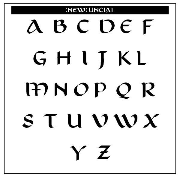
The New Uncial Display typeface below takes inspiration from uncial writing. Such writing came from an iconic medieval system found in religious manuscripts from 800 BC. The letter designs served as a basis for the development of the Roman alphabet in force in the Western world. The pictured font, New Uncial, was born from careful calligraphy, resulting in an open type display font with clean glyphs, upper and lower case characters, easy to apply and capable of bringing impact to graphic pieces that seek aesthetic appeal.[3]
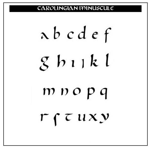
In the sixth through tenth centuries, lower case letters (called minuscules) were formed, with modern lettering evolving from the Carolingian scripts. The Carolingian Minuscule below develops from strictly capital letters to small lettering.[4] The Emperor Charlemagne used these letters as an educational standard. Wikipedia notes here —
"Early uncial script most likely developed from late rustic capitals. Early forms are characterized by broad single-stroke letters using simple round forms taking advantage of the new parchment and vellum surfaces, as opposed to the angular, multiple-stroke letters, which are more suited for rougher surfaces, such as papyrus. In the oldest examples of uncial, such as the fragment of De bellis macedonicis in the British Library, of the late 1st–early 2nd centuries, all of the letters are disconnected from one another, and word separation is typically not used. Word separation, however, is characteristic of later uncial usage. As the script evolved over the centuries, the characters became more complex. Specifically, around AD 600, flourishes and exaggerations of the basic strokes began to appear in more manuscripts. Ascenders and descenders were the first major alterations, followed by twists of the tool in the basic stroke and overlapping. By the time the more compact minuscule scripts arose circa ad 800, some of the evolved uncial styles formed the basis for these simplified, smaller scripts."[5]
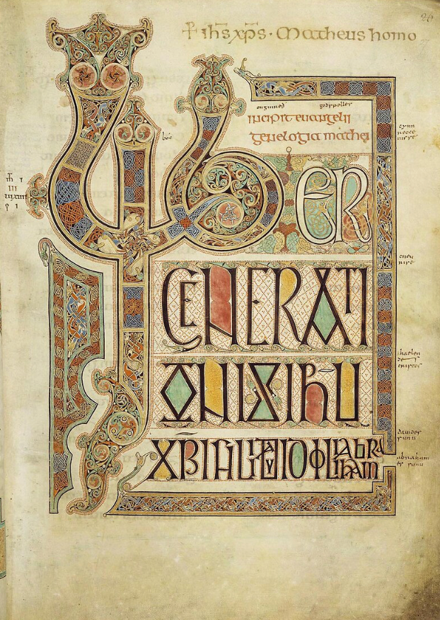
The Lindisfarne Gospels. Composed in the eighth century, this illuminated manuscript gospel book was produced in the monastery at Lindisfarne off the coast of Northumberland. The Gospels are presumed to be the work of a monk named Eadfrith, who became bishop of Lindisfarne in 698 and died in 721. They are richly illustrated in the insular style, originally encased in a fine leather treasure binding covered with jewels and metals. It took approximately ten years to create. Its pages are vellum. The book is 516 pages long, and the text is written “in a dense, dark brown ink, often almost black, which contains particles of carbon from soot or lamp black.”[6]
Typographers in Europe and the western world used frames, or coffins, made of planks of wood, in which rectangular hollows were cut the size of the pages to be printed, and these types, after having been string together, were placed in horizontal lines. Before this, printing of block books was done by placing the paper on an inked surface and rubbing the back.
Simply constructed presses, prototypes of the modern hand press, were used for printing playing cards and image prints. They were then colored by means of stencils. A French made printing card, dated 1423, is 8 x 11 inches in size and is the oldest dated specimen of such printing. Such means gave us the word “printing.” The Biblia Pauperum (Bible of the Poor) was another block book prior to the invention of typography.
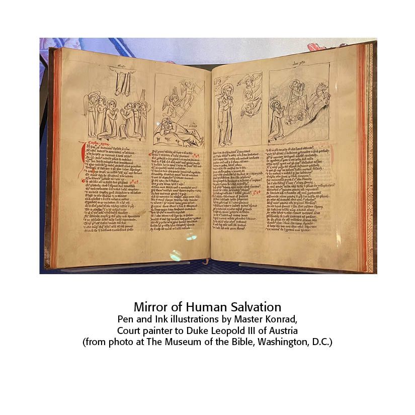
The Speculum Humanse Salvationis (Mirror of Human Salvation) represents the transition from block books to type printed books. Of the sixty-three pages, twenty are printed from wood blocks and forty-three from separate types. It consists of rhymed Latin couplets that show how events in the Old Testament prefigured events in the New Testament. The image below is from Austria, about 1370.
These hand-crafted letters and books reveal biblical beauty marks. They pre-date Victorian typography, being hand written and carefully transcribed onto vellum and other materials. A revival of calligraphic fonts is available online, many of them free to the user.
Notes
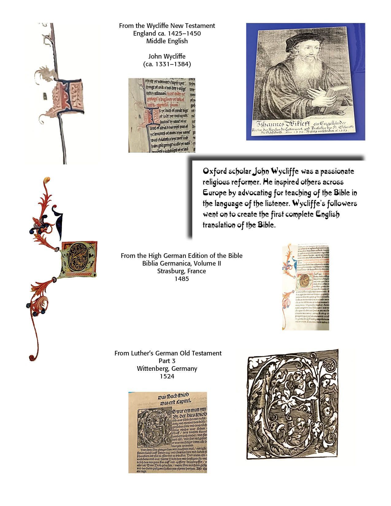
1. Many of the scribal versals and images used in this chapter come from a recent visit to the Museum of the Bible in Washington, D.C., 2024. They have been taken with my camera and then digitized for use in this text.
2. Pierce Taylor Hibbs, “Beauty Always Beckons,” Westminster Magazine (Vol. 5, Issue 2, Spring 2025), 28.
3. Thanks to Lucas Riedi for sharing this awesome typeface.
4. Thanks to J. Pemery (https://commons.wikimedia.org/w/index.php?curid=19018724)
5. From https://en.wikipedia.org/wiki/Uncial_script.
6. Information from Wikipedia at https://en.wikipedia.org/wiki/Lindisfarne_Gospels.