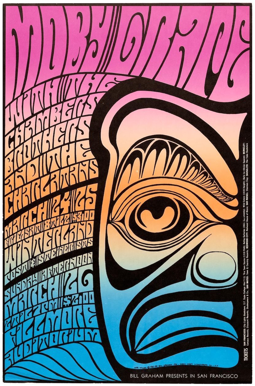
Wes Wilson Poster
Billy Graham Presents in San Francisco
Psychedelic Type
“I just put it out there to stir people up to thinking about things.”
(Wes Wilson commenting on his poster “Are We Next?”)
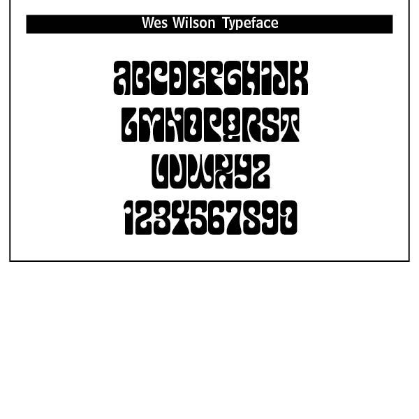
WRAPPING WORDS AROUND FREE-FLOWING AREAS in order to fill up space is the mark of Wes Wilson’s Psychedelic typeface. This face was in direct and distinct contradiction to the highly legible and clear Swiss type that preceded it.
Wes Wilson disappeared from the San Francisco scene as quickly as he and his contemporaries and their highly individual art form breezed in, heading for the Ozark mountains in Missouri in the early 1970s to live, apparently, a reclusive lifestyle. His legacy though is an incredible art form that forty-five years on is revered as truly classic of its time. Wilson’s style is also known as the Fillmore Poster lettering style.[1]
Psychedelic typography was countercultural, 1960s hippie driven, anti-establishment politics with a fascination for Eastern mysticism, altered consciousness and surrealist art. The San Francisco music scene played a dominant role in popularizing the style. This style was designed to overwhelm, mesmerize and provoke. According to Wilson, “It was a time of enlightenment. In the 60s, we used to think of Utopia as something that was really going to happen.”[2]
Psychedelic art drew from Art Nouveau, notably the ornate lettering of artists like Alphonse Mucha, Surrealism, and Pop Art. The use of vibrating colors, distorted forms, and fluid lines mimicked the visual effects of LSD and other hallucinogens.
I personally encountered such images and behavior at college in the late 1960s. Students for a Democratic Society (SDS) would regularly mock the ROTC army cadets as we marched from the campus to the football training field for exercises in combat warfare. They would shout and place flowers in the barrels of our rifles as we marched along. They often debated with whom they considered establishment professors.
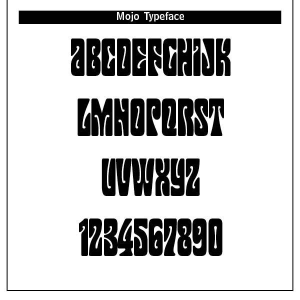
Typography became warped, hand-drawn, dense and illegible by design. Letterforms melted, twisted and expanded to become part of the image chosen. Designers used vibrating contours, contrasting colors and optical illusions to mimic the psychedelic experiences. Other faces that were based on Wilson’s psychedelic lettering were Mojo by Jim Parkinson (1966), Butterfield by David Balle, 1993, Genie and Jonah by Rebecca Alaccari, 2006, Roller Poster by HiH, 2006, and Peace and Love Solid by Leslie Cabarga.[3]
Most uses of psychedelic type was in rock concert posters for bands like The Grateful Dead, Jefferson Airplane, Jimi Hendrix and The Doors. Album covers using such design included The Beatles’ Sgt. Pepper’s Lonely Hearts Club, Cream and Pink Floyd.
Such type was also featured in underground newspapers, aligning with the counterculture’s anti-mainstream messaging. Typography extended into fashion branding, poster prints, drug culture paraphernalia and festivals. Such type was visual shorthand for rebellion and alternative consciousness. This type was about emotional impact, chaos and fusion of text and image, as ChatGPT says, “a typographical trip in itself!”
Psychedelic type influenced later nontraditional typography and movements like punk, grunge and rave. Today such elements are used to evoke nostalgia, surrealism and emotional intensity.
Interestingly, such a period and its typographical chaos has faded into the background of modern culture. The hippies of the 1960s are the business tycoons and CEOs of today’s wealthiest corporations. The stars of the movie, Field of Dreams, hearken back to their hippie college days as they have settled on an Iowa farm to resurrect a 1920s baseball team. They become outraged at a local school’s possible censure discussion of Catcher In The Rye, a book J.D. Salinger highlighting the struggles of growing up and preserving authenticity in a world that feels phony or shallow.
The question of beauty haunts psychedelic typography. Is cultural revolution fostered by such type a description of beauty that beckons us into the presence of God? While some far Eastern mystics might say and think so, I doubt the connection. The God of order, truth, and right and wrong does not inhabit chaotic alternative consciousness through drug induced trances and flights of fancy. This is why the 1960s did not last, and most of the hippies that I know forsook such a fast and free-loving lifestyle. It is also why psychedelic typography is only seen in limited retro art today.
Notes
1. Note by Luc Devroye in https://luc.devroye.org/fonts-51665.html.
3. In the Wikipedia article on Robert Wesley Wilson in https://en.wikipedia.org/wiki/Wes_Wilson.
3. Luc Devroye.