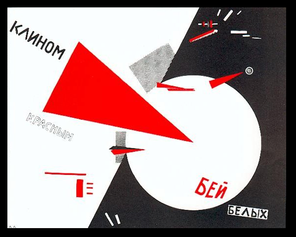
Beat the Whites with the Red Wedge
El Lissitsky, 1919
Constructivism & Beauty
“Its purpose was to celebrate the power of industrial civilization while projecting a confidence in the future and belief in social progress.”
(French and D’Andrade, The Type Project Book)
BOLD, DYNAMIC AND IMAGINATIVE reflects the typographic age of Constructivism. Art and design were tools for social progress. Typography behaved as a functional medium for communication. Constructivism was highly rational, utilitarian and politically driven, aiming to serve the new Soviet society through function and accessible design.
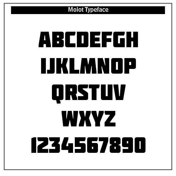
A dear friend of mine commenting on his tour of Russia in the 1990s noted that it was cold, dark and grey. Not exactly happy and inviting. Yet out of such greyness the Constructivist movement produced strong, sans-serif (without feet) fonts like the typeface molot used in the opening versal. Like Dadaism in some aspect, typography was bold, in-your-face, promoting Suprematism’s geometric abstraction and Futurism’s emphasis on dynamism.[1]
If you think of Bauhaus or the De Stijl movement in the Netherlands, you can attribute that to Constructivism’s bold dynamism. Type was no longer decorative, with fancy flowers and endless vines. Instead, strict grids using horizontal and vertical axes, creating a clean, mathematical language, were used.
Favorite Constructivist artists were Alexander Rodchenko, El Lissitzky and Gustav Klutsis. Note Lissitzky’s “Beat the Whites with the Red Wedge” as an illustration of the period[2] —
In this propaganda poster, the intrusive red wedge symbolizes the Bolsheviks, who are penetrating and defeating the White movement, during the Russian Civil War.
Constructivist typography was a tool for mass communication and education. Agitation propaganda trains and kiosks brought such posters to the masses. Publications like LEF (Left Front of the Arts) and USSR were masterpieces. Hierarchy, scale and contrast were powerful typographic tools used to gain the public’s attention.
In typographic history, Herbert Bayer and Jan Tschichold, though not Russian, advanced the Constructivist cause.
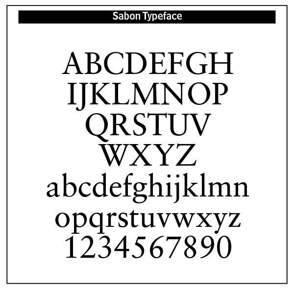
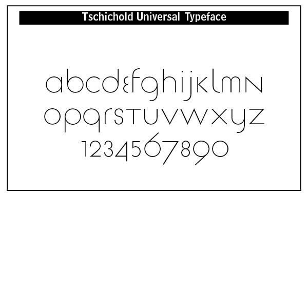
Jan Tschichold’s approach to typography was transformed after his first visit to the Bauhaus exhibition at Weimar. He became a leading advocate of Modernist design practices. But he was mostly interested in the practicality of typography. He developed the Sabon typeface, used by Bradbury Thompson in setting the Washburn College Bible.
Thompson, a descendent of a Presbyterian missionary in Kansas, was asked by Chicago publisher Marshall Field in 1969 to design a bible. Thompson used 10 x 14 inch pages and the Sabon type in 14-point.[3] He arranged the text in phrases, separating them where the reader naturally hesitated or stopped.
The project was abandoned in the early 1970s, but the Washburn College board accepted the offer of Olive White Garvey to underwrite the project. Its sales were to be used for a permanent display and tribute to Thompson and the Washburn Bible. The three-volume edition was published for sale in 1979. Oxford University Press published a smaller version, the Oxford edition of the Washburn College Bible, in 1980.
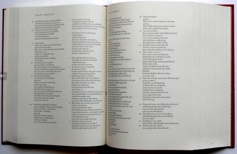
Being a practical Constructivist, Tschichold designed a “universal alphabet” to clean up the multigraphs (like ch and sch) and non-phonetic spellings in the German language. eu was replaced with oi, w with v and z with ts. The alphabet did not have capitals and was presented as one typeface in sans-serif style.[4]
Typography in Constructivism was a rational, disciplined and ideologically charged tool. It served society, especially early Russian forces, and reflected the spirit of the machine age. ChatGPT notes that the movement’s legacy endures in its clarity, structure and purpose-driven design that define much of modern typographic practice.
The beauty of Constructivism lies in its purpose driven uniformity and its legacy to the Bauhaus movement. Bold, clean lines of sans-serif type continue to influence poster and movement designers today.
In early Russia, theology was deeply Orthodox, mystical, and rooted in the lived experience of the Church. God was understood primarily through worship, icons, and ascetic practice, not abstract reasoning. Russian Christianity emphasized the mystery of God, the sanctity of the Church, and the union of divine and human through Christ. Typography was dominated by old-style Cyrillic typefaces rooted in religious and imperial traditions.
However, in the early 1900s a decisive shift toward functionalism and social progress dominated typography and art in Russia. This was a shift away from religious, God centered roots and into more Marxist oriented politics. Beauty in typography in its gratuitous form, reflecting the eternal gratuity and self-giving of the Trinity, was replaced by the State. Diversity was sacrificed for typographical uniformity.
Although Constructivism birthed Bauhaus typography, which became a worldwide typographical option, it was only as desirable as the political propaganda of the day required. Its purpose was State driven, not God driven or spiritually driven.
Notes
1. Founded by Kazimir Malevich, suprematism focused on pure abstraction and basic geometric forms and limited colors. Art was reduced to pure feeling and form. The imitation of natural shapes was rejected in suprematism.
2. See https://en.wikipedia.org/wiki/El_Lissitzky for a more complete description of Lissitzky.
3. Some sites say this Bible was set in 14 point Garamond, but Sabon was the typeface used.
4. Notes on Jan Tschichold from https://en.wikipedia.org/wiki/Jan_Tschichold. Tschichold Universal Font from fontsgeek.com.